| Up a level | ||||||||||
 |
 |
 |
 |
 |
 |
 |
 |
 |
 |
 |
| Argentina | Bolivia | Chile | Colombia | Costa Rica | Cuba | Dominican Rep. | Ecuador | El Salvador | Guatemala | Honduras |
| Up a level | ||||||||||
 |
 |
 |
 |
 |
 |
 |
 |
 |
 |
 |
| Mexico | Morocco | Guinea | Nicaragua | Panama | Paraguay | Peru | Philippines | Puerto Rico | Uruguay | Venezuela |
| Shortcuts to different sections | |||||||||||
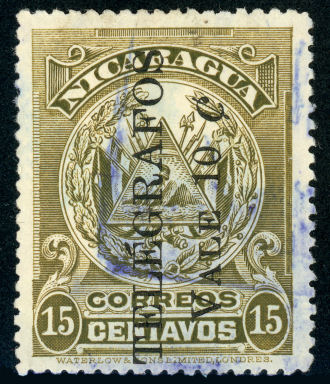
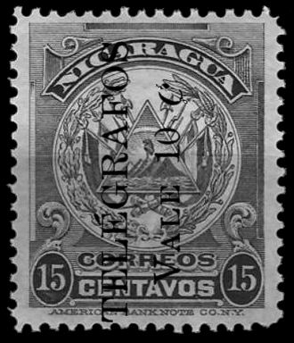
| Correos y Telegrafos | 1891 - 1899 | 1900 - 1907 | 1907 - 1911 | 1911 Railway stamps - 1921 | 1921 - 1933 | 1934 - 1949 | Semana de Com. | Bluefields | Cabo | Postal use | Stationery |
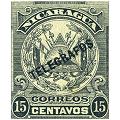
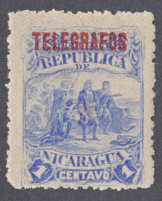
Nicaragua.
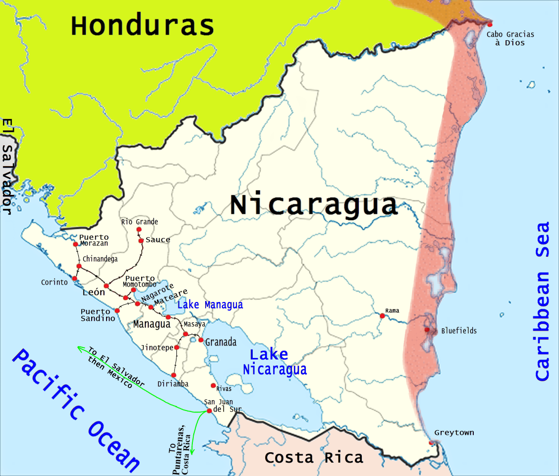
Map of Nicaragua showing Submarine cable and rail system in the West, together with European bastions in the East.
The pink area shows the approximate boundaries of the Kingdom of Miskito which was an Autonomous territory of Nicaragua from 1860 to 1894,
when it became part of Nicaragua. That includes the part in what is now Honduras, which did not become part of Honduras until 1960.
The telegraph service, inaugurated in 1878, was directly linked to the railroad between localities of Corinto and Momotombo.
From 1916 to 1920 copper wire on wooden poles were constructed from San Juan del Sur, passing through Rivas, Granada, Masaya, Managua, Chinandega to Corinto.
According to XplorHonduras.com, Nicaragua was connected to Honduras in 1879, which connected on to Guatemala.
From 1916 to 1920 copper wire on wooden poles were constructed from San Juan del Sur, passing through Rivas, Granada, Masaya, Managua, Chinandega to Corinto.
A list of 1906 for wireless-Telegraph stations lists only Bluefields, with Shoemaker system and a note " Six months in operation.
A list for 1908 gives Bluefields and Rama. Similar lists of 1910 and 1912 both give Bluefields, Rama, Managua, and Greytown."
Steve Hiscocks wrote in 1982:
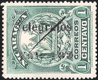
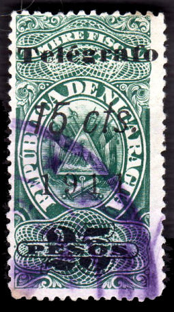
Nicaragua provides, of all countries, the most extensive and complicated range of national telegraph stamps. With the exception of two sets of
'proper' telegraph stamps in 1900 and 1921 – 34 all are provisionals based on those of 1900, on postage stamps, or on a variety of fiscal stamps.
However, in Nicaragua the production of provisional telegraph stamps was raised to a high art beside which the efforts of the Ceylon Telegraph
Department pale into insignificance. Stamps were altered from Railway to fiscal to telegraph usage and values were changed up to three times on a
single stamp. The authorities even resorted to overprints on the backs of stamps when no further space was available on the front. In addition there
were many systematic overprint and surcharge errors of all types and varieties of surcharge colours leading up to three surcharge colours on a single stamp.
In short this is a highly complex area and a worthy field of study for the collector who loves detail. By the same token the following listing is likely to
be in error in many places and I hope that readers will bring such errors to my attention.
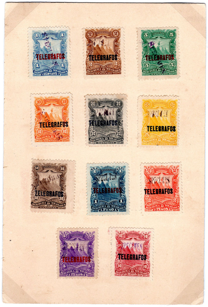
The activities of N.F. Seebeck have been briefly described in the introduction to the Ecuador section but it was in Nicaragua that his influence
on telegraph stamps was most felt. His contract ran from 1890 to 1899. The first Seebeck issue (1890) was specifically for 'postage and telegraph'.
Thereafter the sets of 1891, '92, '93, '94 and '95 were printed in colours different from those issued for postage and overprinted for telegraphic use.
Mint sets of 1892, '93 and to a lesser extent '94 and '95 were issued by Seebeck in quantity and are common as are imperforate and partly
perforate varieties most of which probably never went near Nicaragua. Used values from these sets are relatively scarce but it has been suggested
that some of these are not genuinely used. The collector must himself decide the status he affords to these issues.
A word should be said in explanation of the special overprints for the Province of Zelaya. This province was, early in this century, on a silver
currency base such that its peso was worth about double the paper peso used throughout the rest of Nicaragua. The temptation was therefore for
the Zelayans to use their hard currency to buy twice as many stamps elsewhere in the country and use them at home. To prevent this the local
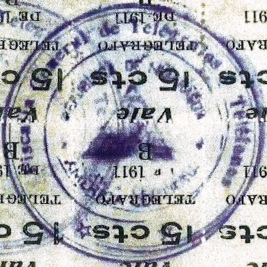
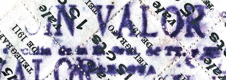
stamps were overprinted 'B' (for Bluefields — the main town of the province) or 'Cabo' (for Cabo Gracias à Dios — 'Cape Thanks be to God' —
on the northern tip of the east coast where the main port was situated) and only stamps so overprinted could be used in the province. The use of these
stamps ended with the introduction of the gold 'cordoba' throughout Nicaragua late in 1912.
My notes:
References to a port, or fishing village at Cabo Gracias à Dios, appear to be referring to Puerto Lempira in Gracias à Dios district to the north of the tip of the Cape.
At the time in question (1900-1912), that area was part of Nicaragua, but since 1960 has been part of Honduras. It would make sense for it to have had a radio-telegraph, but the
U.S. Department of the Navy Bureau of Steam Engineering that produced "Wireless Telegraph Stations of the World" for 1906, 1908, 1910 and 1912 list only
Bluefields(from 1906), Rama(from 1908), Greytown(from 1910) and Managua(from 1910) in Nicaragua. Honduras listed only Ceiba and Swan Island (United Fruit plantation 153km off coast).
I have seen no evidence of any telegraphy in the Cabo area at that time. Information would be welcome.
I have added quite a few items that I am told were obligatory at least certain times of the year.
Chief among these are the Semana de Communicaciones (week of Communications) that I am told were obligatory on all letters, telegrams and telephone
services within Nicaragua for just the second week of November from 1954 to 1970.
For those with a particular interest in the stamps of Nicaragua, there is a Nicaragua Study Group which produces a quarterly publication called Nicarao.
Both are readily findable with an internet search.
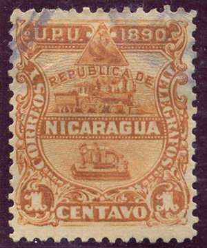
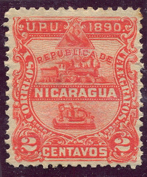
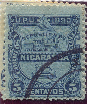
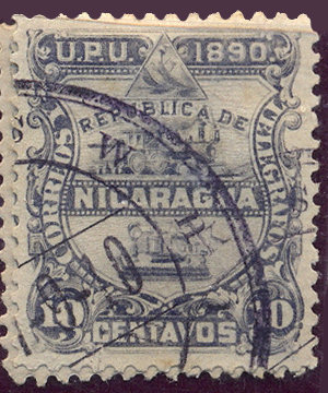
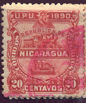
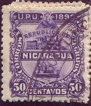
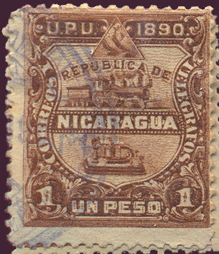
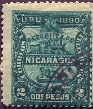
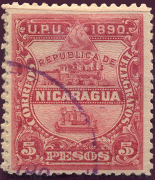
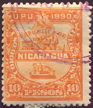
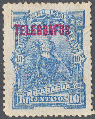
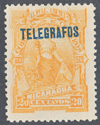
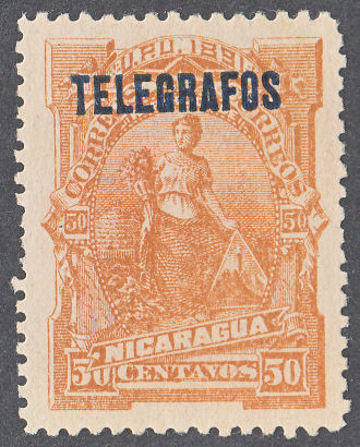
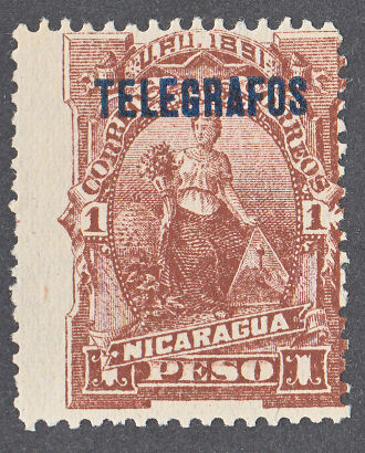
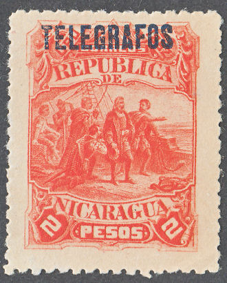
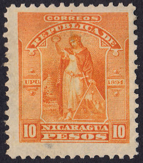
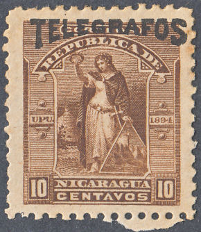
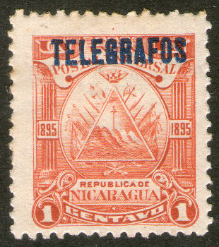
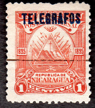
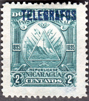
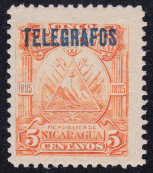
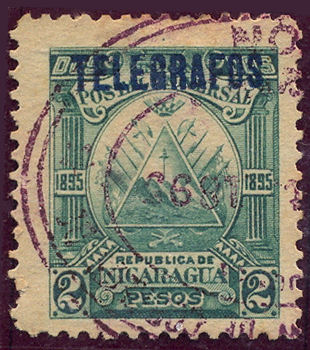
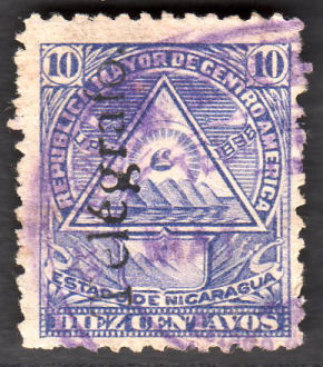
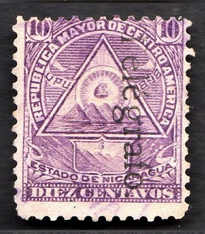
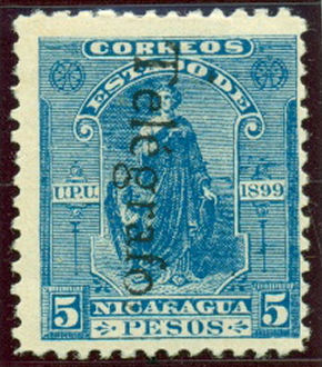
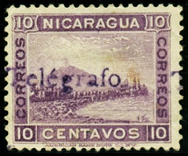
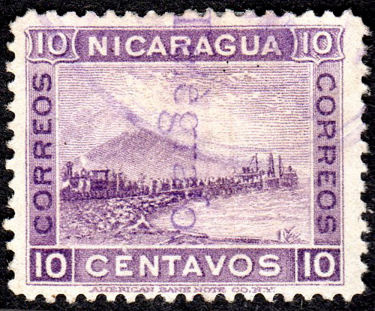
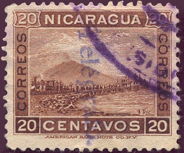
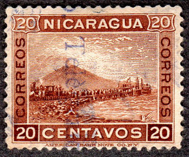
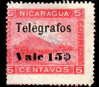
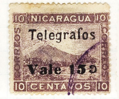
1890 Correos y Telegrafos.
Engraved by the Hamilton Bank Note Co., New York, for the N. F. Seebeck contract. No watermark. Perf. 11¾
These were not listed by Hiscocks since they were outside his scope as they were also for postal use.
I have listed them for completion
 |
 |
 |
 |
 |
 |
| Type CyT1. 1890 RHCyT1 - RHCyT5. Courtesy of Rolf Lamprecht. | Type CyT2. Official Overprint | ||||
 |
 |
 |
 |
 |
| Type CyT1. 1890 RHCyT6 - RHCyT10. Courtesy of Rolf Lamprecht. | ||||
According to the Scott Catalogue, imperfs. and part perfs. exist for all of these and say of the Officials "are known without overprint and most of them with inverted or double overprint, or without
overprint and imperforate. There is no evidence that they were issued in these forms." They also say that these are scarce with genuine cancellations with forged cancellations being plentiful.
Being Seebeck concoctions, there are a menagerie of "errors" and "varieties".
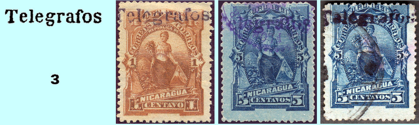
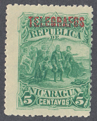
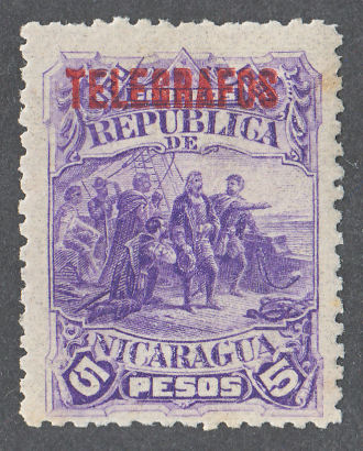
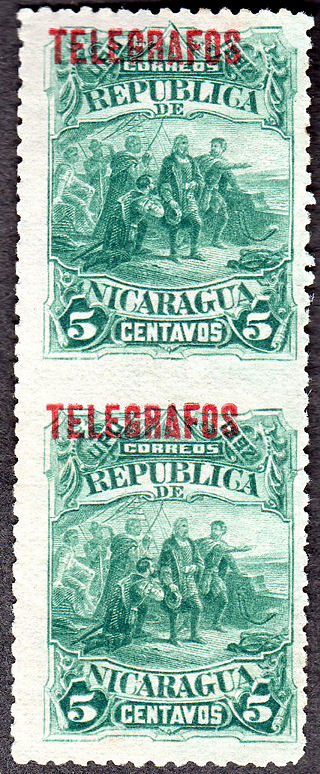
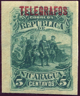
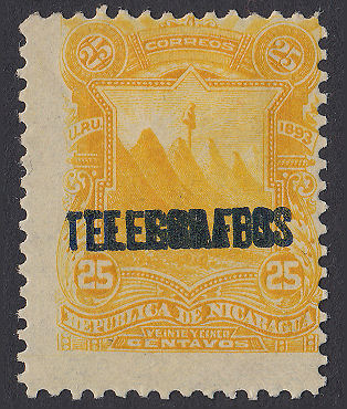
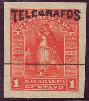
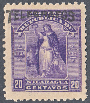
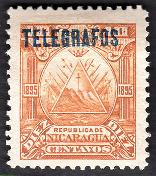
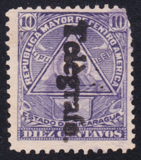
1891 Postage stamps of 1891 (SG 37-46) overprinted with Type 1 in various colours as indicated.
Lithographed on white wove paper. No watermark. Perf. 12
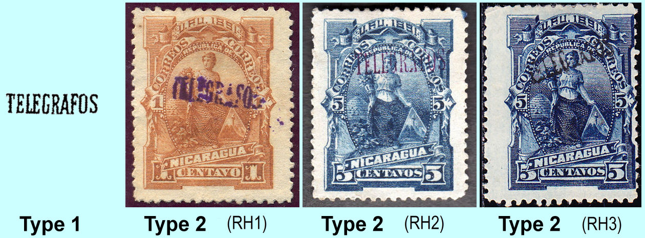
Hiscocks Type 1 (taken from page 202 of his book). Type 2, (RH2) from RL, and Type 2, (RH2) courtesy of Alan Slater., (RH3) courtesy of Courtney Hess.
| RH # | Hisc. | Type. | Description | Mint | Used |
|---|---|---|---|---|---|
| RH1 | H1 | 1, 2 | 1c orange-brown (DV or DDV) | 15.00 | 7.50 |
| RH2 | H2 | 1, 2 | 5c deep blue (V) | 10.00 | 5.00 |
| RH3 | H3 | 1, 2 | 5c deep blue (overprinted in black) | 15.00 | 10.00 |
Hiscocks added the following 2 notes:
| Note 1. For the above and following issues the colour of the overprint is black unless otherwise indicated by letters in brackets — (B)=Blue, (R)=Red, (P)=Purple, (V)=Violet, (C)=Carmine, (D)=dark and (DD)=very dark. There are many minor variations in these overprint colours which are not listed since they are not in my opinion significant. |
| Note 2. The overprints on Nos. 1-3 are usually indistinct and only partially printed. The stamps are usually poorly centred. |
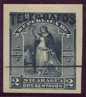
1891 As above but overprinted with type 3 in black.
Hiscocks type 3, taken from his book, RH4 and RH5 from RL, and RH6 courtesy of Alan Slater.
| RH # | Hisc. | Type. | Description | Mint | Used |
|---|---|---|---|---|---|
| RH4 | H4 | 3, 2 | 1c orange-brown | 20.00 | 15.00 |
| RH5 | H5 | 3, 2 | 5c deep blue (V) | 10.00 | 7.50 |
| RH6 | H6 | 3, 2 | 5c deep blue | 20.00 | 15.00 |
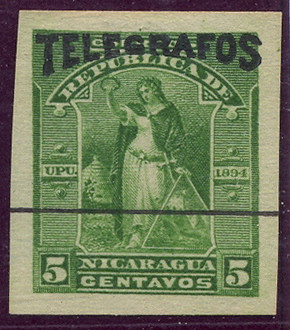
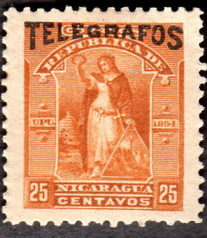
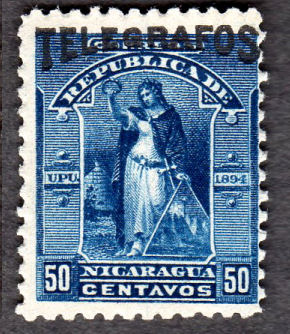
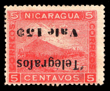
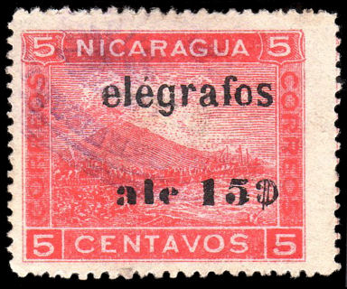
1891 As above but overprinted with type 4.
These stamps have different colours to the postal issue. Stamps with missing overprint may exist.
 |
 |
| Hiscocks types 4, taken from his book, together with RH9(postally used), RH9a and RH12 specimen, all courtesy of Alan Slater. | RH9 with shift, courtesy of Rolf Lamprecht. |
 |
 |
 |
 |
| RH7 5c. | RH8 10c. | RH9 20c. | RH10 50c. |
 |
 |
 |
 |
| RH11 1p. | RH12 2p. | RH13 5p. | RH14 10p. |
RH9b has been added due to the example shown. There may be other denominations like this.
According to Erick Rodriguez, this was likely to have been Cancelled at either JINOTEPE or JINOTEGA,
or just possibly JUIGALPA, though the serif on the second letter makes it doubtful.
Anyone have any other imperforates from this set ?
Hiscocks added the following 2 notes:
| Note 1. This and the following sets (Nos. 7 to 58) are of different colours from the corresponding postage stamps. |
| Note 2. A single copy of the 2c postage stamp (SG38) overprinted 'TELEGRAFOS' in violet thin sans serif capitals was reported in 1901. Its status is unknown. |
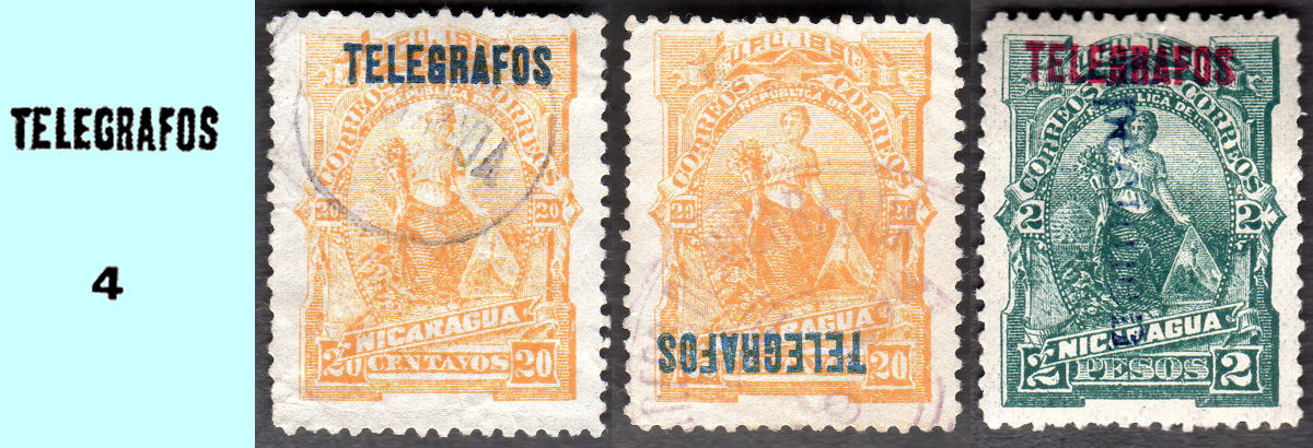
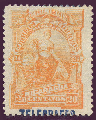
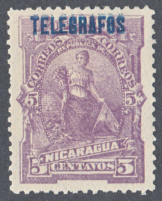
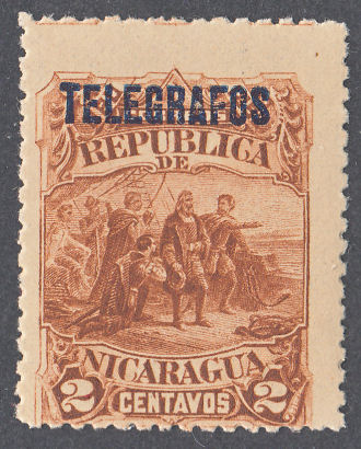
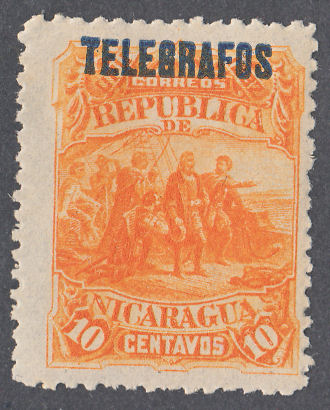
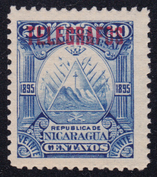
1892 Postage stamps of 1892 (SG 47-56) overprinted with type 4 or serifed, similar to type 1 but with 2½mm letters.
White wove paper. No watermark. Perf. 12
 |
 |
 |
 |
| RH15 1c. | RH16 2c. | RH17 5c. | RH18 10c. |
 |
 |
 |
 |
| RH19 20c. | RH20 25c. | RH21 50c. | RH22 1p. |
 |
 |
 |
 |
| RH23 2p. | RH24 5p. | RH25 10p. | Specimen of RH18 courtesy of Alan Slater. |
Hiscocks type 5
RH19a and used examples of the 1c and 5c, courtesy of Rolf Lamprecht.
Used examples of the 10c, 50c and 10 Pesos, courtesy of Rolf Lamprecht.
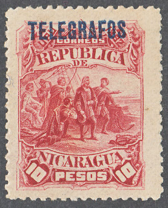
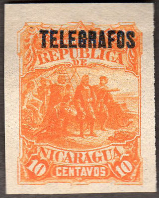
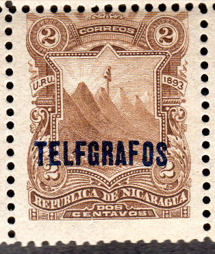
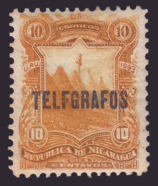
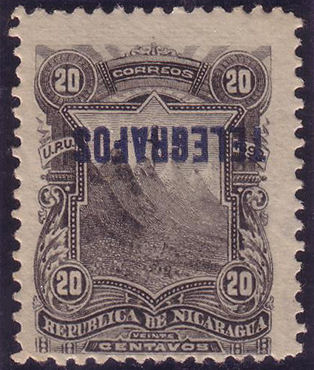
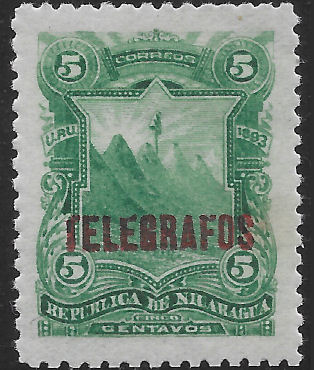
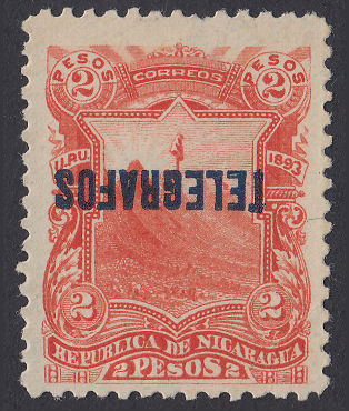
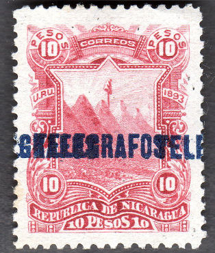
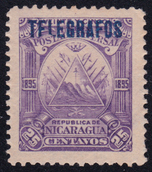
1893 Postage stamps of 1893 (SG 57-66) overprinted with type 4.
White wove paper. No watermark. Perf. 12.
Here is the basic set.
 |
 |
 |
 |
| RH26 1c. | RH27 2c. | RH28 5c. | RH29 10c. |
 |
 |
 |
 |
| RH30 20c. | RH31 25c. | RH32 50c. | RH33 1p. |
 |
 |
 |
 |
| RH34 2p. | RH35 5p. | RH36 10p. | Used 2c with interesting cancel - from RL. |
Overprint variety examples.
 |
 |
 |
 |
| Type 6 - RH27 - shifted Image courtesy of Rolf Lamprecht. |
Type 6 - RH27b ('TELFGRAFOS') Image courtesy of Alan Slater. |
Type 6 - RH29a ('TELFGRAFOS') Image courtesy of Rolf Lamprecht. |
Type 7 - RH30a (inverted) Image courtesy of Rolf Lamprecht. |
 |
 |
 |
 |
| Type 6 - RH28t (broken 'T') Image courtesy of Arkadiy Avrorov. |
Type 6 - RH31bt (double) | Type 7 - RH34at (inverted) | Type 6 - *RH36b (double) Image courtesy of Alan Slater. |
The broken 'T' is often found in combination with other varieties. The amount missing is variable, so is probably in a number of different positions.
Hiscocks type 6 and inverted, Type 7.
I have added overprint colours in brackets.
Another example, this showing the back with mail quantity statistics for 1890 to 1892.
It is interesting to see the range of different "Specimen" overprints. They match the ones above for each denomination except the 25c below has an extra, different one.
Also the bottom card has the highest denomination stamp swapped for another 50c.
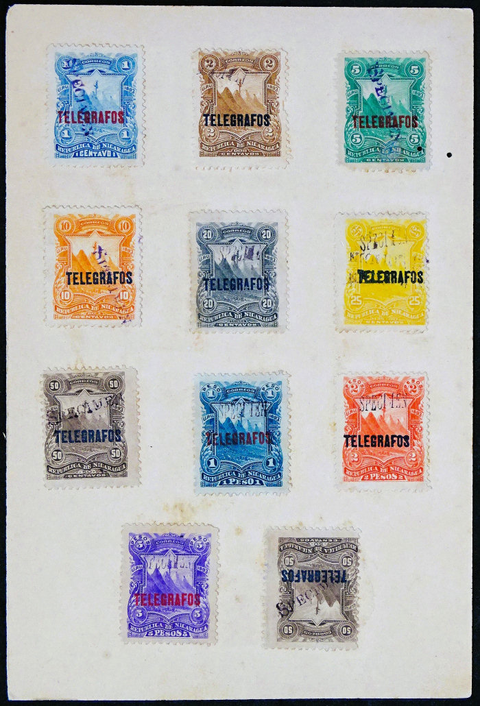
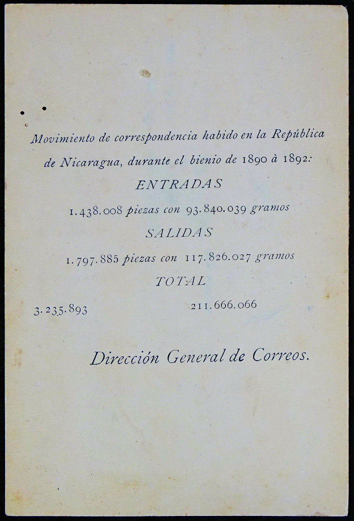
Images courtesy of Miguel Torres.
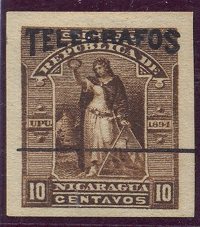
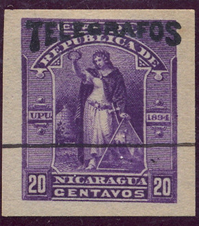
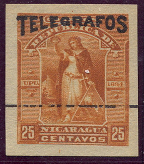
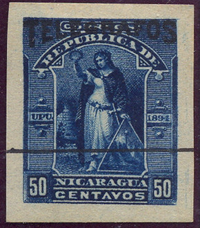
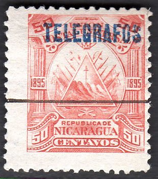
1894 Postage stamps of 1894 (SG 67-76).
The next two sets of overprints, except the 2c red below, used stamps of a different colour to the ones used for postage.
These are the colours used for postage:
 |
 |
 |
 |
 |
 |
| Type 1c | Type 2c | Type 5c | Type 10c | Type 20c | *Type 25c - not issued. |
 |
 |
 |
 |
 |
| Type 50c | Type 1p | Type 2p | Type 5p | Type 10p |
Images of what I presume to be proofs of the proposed telegraph issue - from RL.
 |
 |
 |
 |
 |
 |
| Type 1c | Type 2c | Type 5c | Type 10c | Type 20c | Type 25c |
 |
 |
 |
 |
 |
| Type 50c | Type 1p | Type 2p | Type 5p | Type 10p |
These appear to be in a very similar set of colours, simply re-arranged.
*It has been said that the 25c green without overprint was an unissued telegraph stamp.
These proofs though suggest that it was in fact originally intended as a postage stamp,
although was later overprinted for telegraph use.
1894 Postage stamps of 1894 (SG 67-76) overprinted in black with types 8, 9 and 10.
White wove paper. No watermark. Perf. 12
Hiscocks types 8, 9 and 10, taken from page 205.
|
 |
 |
 |
 |
| Without any overprint - *RH37d | Type 8 overprint - RH37 | Type 8 overprint - RH38 | Type 9 overprint - RH39b | Type 10 overprint - RH40 |
| One of mine. | Example overprints on Type 11, courtesy of Alan Slater. | |||
| RH # | Hisc. | Type. | Description | Mint | Used |
|---|---|---|---|---|---|
| RH37 | H37 | 8, 11 | 15c on 25c green-yellow | 20.00 | 10.00 |
| RH37a | H37a | overprint 'Telografos' | 30.00 | 15.00 | |
| RH37b | H37b | overprint 'Tclégrafos' | 30.00 | 15.00 | |
| RH37c | H37c | overprint 'Ceut' | 30.00 | 15.00 | |
| *RH37d | - | without overprint | 25.00 | 50.00 | |
| RH38 | H38 | 8, 11 | 20c on 2c red | 15.00 | 5.00 |
| RH38a | H38a | overprint double | 50.00 | 30.00 | |
| RH38b | H38b | overprint 'Telografos' | 30.00 | 10.00 | |
| RH38c | H38c | overprint 'Tclégrafos' | 30.00 | 10.00 | |
| RH38d | H38d | overprint 'Ceut' | 30.00 | 10.00 | |
| RH39 | H39 | 9, 11 | 30c on 25c green-yellow | 20.00 | 5.00 |
| RH39a | H39a | overprint 'Telografos' | 30.00 | 10.00 | |
| RH39b | H39b | overprint 'Tclégrafos' | 30.00 | 10.00 | |
| RH39c | H39c | overprint 'Ceut' | 30.00 | 10.00 | |
| RH40 | H40 | 10, 11 | 30c on 25c green-yellow | 60.00 | 20.00 |
| RH40a | H40a | overprint 'Telografos' | 90.00 | 30.00 | |
| RH40b | H40b | overprint 'Tclégrafos' | 90.00 | 30.00 | |
| RH40c | H40c | overprint 'Ceut' | 90.00 | 30.00 |
Hiscocks added the following note:
| Note. There is some doubt whether the 25c green-yellow was ever issued as a postage stamp. |
* My Note: According to the Scott catalogue, this was not used as a postage stamp, however it is known without overprint.
It should therefore be considered as one of the above with missing overprint. I have therefore added it as RH37d.
This 2c was in the same colour as the postage stamp.
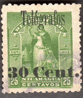
1894 Postage stamps of 1894 (SG 67-76) overprinted in black with type 12.
White wove paper. No watermark. Perf 12
 |
 |
 |
 |
| 1c Type 12 (RH41) | 2c Type 12 (RH42) | 5c Type 12 (RH43) | 10c Type 12 (RH44) |
 |
 |
 |
| 20c Type 12 (RH45) | 25c Type 12 (RH46) courtesy of Alan Slater. |
50c Type 12 (RH47) courtesy of Alan Slater. |
| RH # | Hisc. | Type. | Description | Mint | Used |
|---|---|---|---|---|---|
| RH41 | H41 | 12 | 1c red | 2.00 | 7.50 |
| RH41a | H41a | imperf. | 30.00 | - | |
| RH42 | H42 | 12 | 2c grey | 2.00 | 7.50 |
| RH43 | H43 | 12 | 5c green | 3.75 | 10.00 |
| RH43a | H43a | imperf. | 30.00 | - | |
| RH44 | H44 | 12 | 10c brown | 2.00 | 7.50 |
| RH44a | H44a | imperf. | 30.00 | - | |
| RH45 | H45 | 12 | 20c violet | 2.00 | 7.50 |
| RH46 | H46 | 12 | 25c brown-orange | 7.50 | 20.00 |
| RH47 | H47 | 12 | 50c blue | 2.50 | 10.00 |
These are in different colours to the stamps used for postage.
According to the Scott catalogue, these telegraph stamps are known with a missing overprint, distinguishable by the colours.
This includes a 25c green. See my note below RH40. The 1P, 2P, 5P and 10P values were also prepared as proofs (see above).
I have also seen a proof of a 4c that was not issued.
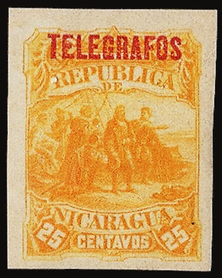
1895 Postage stamps of 1895 (SG 77-86) overprinted in various colours as indicated, with type 4.
White wove paper. No watermark. Perf. 12
 |
 |
 |
 |
| 1c Type 13 (RH48) | 1c Type 13 (RH48) with black line across*. Image courtesy of Alan Slater. |
2c Type 13 (RH49) Image courtesy of Alan Slater. |
5c Type 13 (RH50) |
 |
 |
 |
 |
| 10c Type 13 (RH51) Image courtesy of Alan Slater. |
20c Type 13 (RH52) | 25c Type 13 (RH53) | 50c Type 13 (RH54) with black line across*. Image courtesy of Alan Slater. |
 |
 |
 |
 |
| 1p Type 13 (RH55) Image courtesy of Alan Slater. |
2p Type 13 (RH56) Image courtesy of Alan Slater. |
5p Type 13 (RH57) with black line across*. Image courtesy of Alan Slater. |
10p Type 13 (RH58) with black line across*. Image courtesy of Alan Slater. |
*Apparently stamps given to UPU delegates were marked like this (as were at least some other specimens).
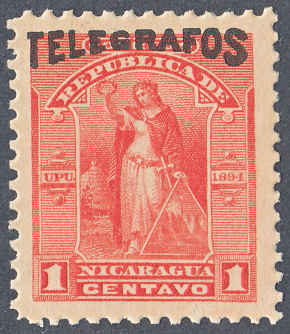
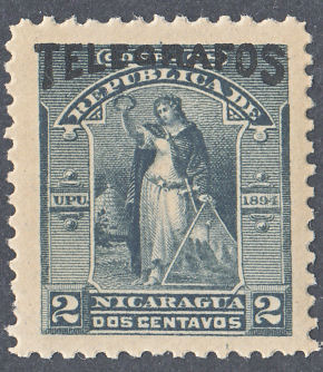
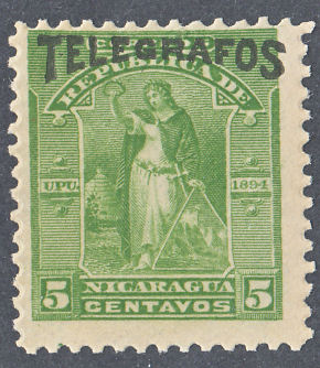
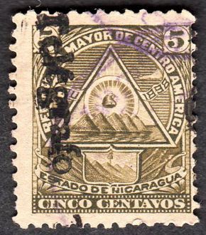
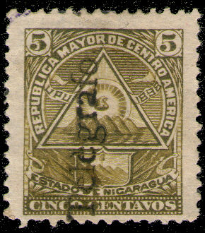
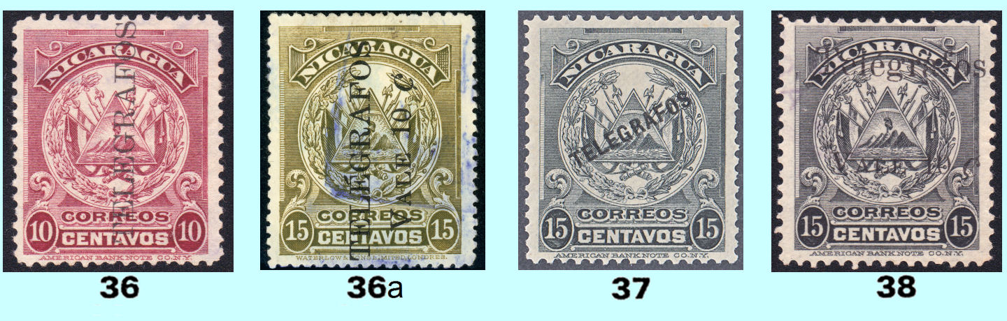
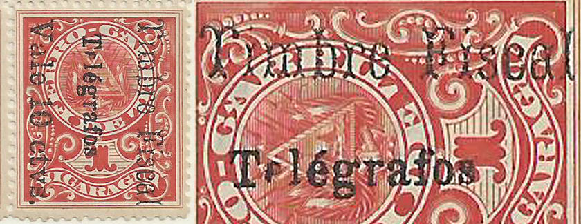
1898 Postage stamps of 1898 (SG 108 etc.) overprinted in black with type 14 or 14A .
White wove paper. Perf. 12. Hiscocks listed these as without a watermark, but the basic stamp was issued also with a multiple Liberty Cap watermark.
According to John Barefoot there are reports of some 5c, 10c and 15c existing with this watermark. In principle any of them could exist watermarked.
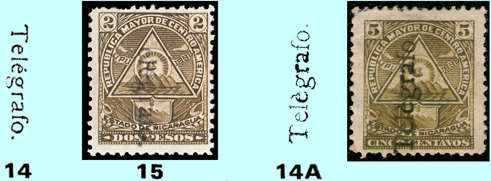
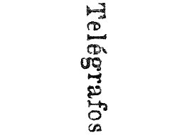
Hiscocks type 14, taken from page 206 and 15, one of mine reading down. Additionally a new type that I will call type 14A*.
This has the accent on the second 'e' as è rather than é. it is shown on the 5c. reading up. It is probably found on others.
My first guess was that Type 14A was one or more varieties within the sheet of Type 14 impressions.
However blocks suggest that the overprints were individually hand-stamped, so it should exist in blocks, and perhaps on all values.
These overprints, and the ones below tend to be very unclear.
 |
 |
 |
 |
 |
| 5c (RH59 - overprint 14, down) Image courtesy of Alan Slater. |
5c (*RH59c - overprint 14A, up) | 10c (RH60a - overprint 14, up) Image courtesy of Alan Slater. |
10c (RH60b - overprint 14, down) Image courtesy of Alan Slater. |
10c (*RH60f - overprint 14A), down |
 |
 |
 |
 |
| 15c (RH61 - overprint 14, down) Image courtesy of Alan Slater. |
20c (RH62 - overprint 14, down) Image courtesy of Alan Slater. |
50c (RH63 - overprint 14, down) Image courtesy of Alan Slater. |
50c (RH63a - overprint 14, up) Image courtesy of Rolf Lamprecht. |
 |
 |
 |
| 1p (RH64 - overprint 14, down) Image courtesy of Rolf Lamprecht. |
2p (RH65 - overprint 14, down) Image courtesy of Rolf Lamprecht. |
5p (RH66a - overprint 14, up) Image courtesy of Alan Slater. |
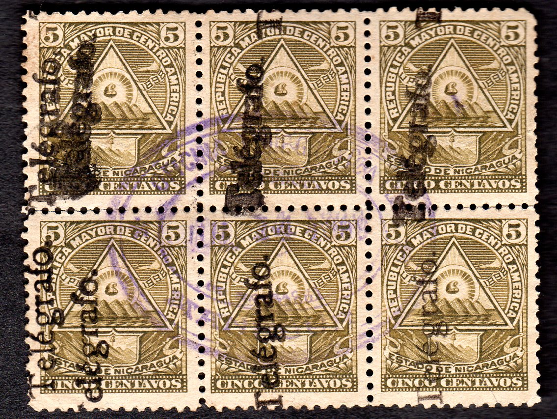
This block of 5c stamps (at 400dpi) shows *double overprint on two stamps. The two overprints can be one reading up and the other reading down.
This suggests that each stamp was individually hand-stamped. Image courtesy of Alan Slater.
| RH # | Hisc. | Type. | Description | Mint | Used |
|---|---|---|---|---|---|
| RH59 | H59 | 15, 14 | 5c brown-olive (reading down) | 10.00 | 3.75 |
| RH59a | H59a | reading up | 10.00 | 3.75 | |
| *RH59b | - | overprint double (up or down) | 50.00 | - | |
| *RH59c | - | 15, 14A | overprint 14A (up or down) | 20.00 | 7.50 |
| RH60 | H60 | 15, 14 | 10c violet-blue (reading down) | 10.00 | 3.75 |
| RH60a | H60a | reading up | 10.00 | 3.75 | |
| RH60b | H60b | violet, reading down | 15.00 | 5.00 | |
| RH60c | H60c | violet, reading up | 15.00 | 5.00 | |
| *RH60d | - | overprint double in black (up or down) | 50.00 | - | |
| *RH60e | - | overprint double in violet (up or down) | 50.00 | - | |
| *RH60f | - | 15, 14A | overprint 14A in black (up or down) | 20.00 | 7.50 |
| RH61 | H61 | 15, 14 | 15c pale blue (reading down) | 10.00 | 3.75 |
| RH61a | H61a | reading up | 10.00 | 3.75 | |
| *RH61b | - | overprint double (up or down) | 50.00 | - | |
| RH62 | H62 | 15, 14 | 20c blue (reading down) | 20.00 | 3.75 |
| RH62a | H62a | reading up | 20.00 | 3.75 | |
| *RH62b | - | overprint double (up or down) | 60.00 | - | |
| RH63 | H63 | 15, 14 | 50c yellow (reading down) | 30.00 | 10.00 |
| RH63a | H63a | reading up | 30.00 | 10.00 | |
| *RH63b | - | overprint double (up or down) | 80.00 | - | |
| RH64 | H64 | 15, 14 | 1p ultramarine (reading down) | 7.50 | 10.00 |
| RH64a | H64a | reading up | 7.50 | 10.00 | |
| *RH64b | - | overprint double (up or down) | 50.00 | - | |
| RH65 | H65 | 15, 14 | 2p olive-brown (reading down) | 5.00 | 10.00 |
| RH65a | H65a | reading up | 5.00 | 10.00 | |
| *RH65b | - | overprint double (up or down) | 50.00 | - | |
| RH66 | H66 | 15, 14 | 5p orange (reading down) | 15.00 | 20.00 |
| RH66a | H66a | reading up | 15.00 | 20.00 | |
| *RH66b | - | overprint double (up or down) | 50.00 | - |
*These have been added due to the examples shown and information supplied.
Hiscocks added the following note:
| Note. All varieties of Nos. 59-66 are said to exist with comma in place of stop after 'Telégrafo.' |
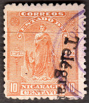
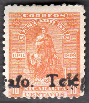
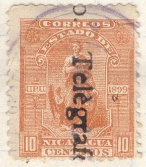
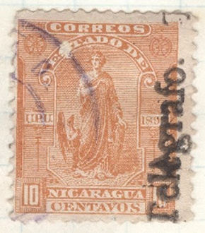
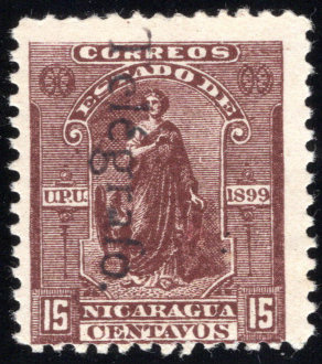
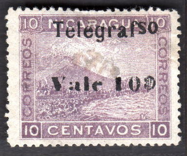
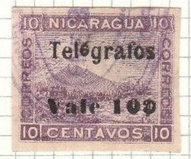
1899 Postage stamps of 1899 (SG 129 etc.) overprinted in black or violet (default black) with type 14 or 14A as before.
White wove paper. No watermark. Perf. 12.
 |
 |
 |
 |
 |
| 5c (RH67) - courtesy of Courtney Hess. | Type 16. 5c with violet overprints, the left one ending with a comma ',' (RH67d and RH67c) - down |
RH67c - up, courtesy of Courtney Hess. | 5c (*RH67e) - Overprint 14A down | 5c (*RH67e, Overprint 14A, up) courtesy of Rolf Lamprecht. |
 |
 |
 |
 |
| 10c (RH68) Courtesy of Alan Slater. |
10c (RH68b) Courtesy of Alan Slater. |
RH68c - Overprint 14A down, courtesy of Courtney Hess. |
RH68c - Overprint 14A up, courtesy of Courtney Hess. |
 |
 |
 |
| Type 16. 15c with type 14 overprint. (RH69) courtesy of Steve Moreland. |
Type 16. 15c overprint reading upwards (RH69a). Courtesy of Alan Slater. |
*RH69c - horizontally, courtesy of Courtney Hess. |
There are a lot of permutations, 2 types of overprint that can be black or violet, reading up or down and sometimes ending with a comma.
| RH # | Hisc. | Type. | Description | Mint | Used |
|---|---|---|---|---|---|
| RH67 | H67 | 16, 14 | 5c blue (reading down) | 2.50 | 5.00 |
| RH67a | H67a | double overprint | 15.00 | - | |
| RH67b | H67b | reading up | 2.50 | 5.00 | |
| RH67c | H67c | overprint in violet (up or down) | 2.50 | 5.00 | |
| *RH67d | - | overprint ending with comma (up or down, in violet) | 5.00 | 6.00 | |
| *RH67e | - | 16, 14A | Overprint 14A in violet (up or down) | 5.00 | 6.00 |
| RH68 | H68 | 16, 14 | 10c orange (reading down) | 15.00 | 10.00 |
| RH68a | H68a | reading up | 15.00 | 10.00 | |
| RH68b | H68b | reading horizontally | 20.00 | 20.00 | |
| *RH68c | - | 16, 14A | Overprint 14A in black (up or down) | 15.00 | 10.00 |
| RH69 | H69 | 16, 14 | 15c red-brown (reading down) | 2.50 | 2.50 |
| RH69a | H69a | reading up | 2.50 | 2.50 | |
| *RH69b | - | ending with comma. | 5.00 | 6.00 | |
| *RH69c | - | reading horizontally | 4.00 | 4.00 | |
| RH69d | - | 16, 14A | Overprint 14A in violet (up or down) | 5.00 | 6.00 |
*These have been added due to the examples shown and information supplied.
Hiscocks added the following note:
| Note. All varieties of Nos. 67-69 are reported with a comma in place of stop after 'Telégrafo.' |
Proofs are known of this overprint on other denominations.
 |
 |
 |
 |
 |
 |
| Horizontal in black on 1c. | Horizontal in black on 4c. | Horizontal in black on 20c. | Downwards in black on 20c. | Upwards in black on 50c. | Downwards in blue on 50c. |
| Images courtesy of Courtney Hess. | |||||
 |
 |
 |
 |
 |
| Downwards in black on 1P. | Downwards, doubled in slate on 1P. | Downwards doubled on 1P dated 1898. | Downwards, doubled in slate on 2P. | Downwards in black on 5P. |
| Images courtesy of Courtney Hess. | ||||
The 1p, apparently used in 1898 deserves comment. Remember these are Seebeck "issues". They probably never went near Nicaragua let alone a Telegraph Office.
This was probably done with one of his old handstamps that he used to supply CTOs to the philatelic market.
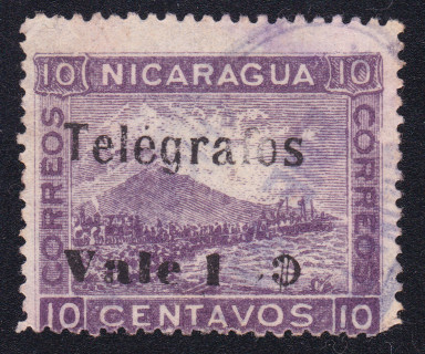
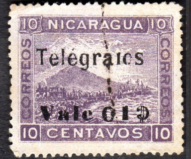
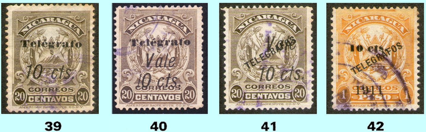
1900 Postage stamps of 1900 (SG 140 etc.) overprinted in black or violet with type 14 or 14A as before.
White wove paper. No watermark. Perf. 12.
 |
 |
 |
 |
| 10c Type 14 reading up (RH72a) Image courtesy of Alan Slater. |
10c double ovpt., reading down (*RH72b) Image courtesy of Rolf Lamprecht. |
10c double ovpt., reading up (*RH72c) Image courtesy of Alan Slater. |
10c reading horizontally (*RH72d) Image courtesy of Courtney Hess. |
 |
 |
 |
 |
| 10c Type 14A ovpt., reading down (*RH72f) Image courtesy of Alan Slater. |
20c Type 14 ovpt., reading down (RH74) Image courtesy of Rolf Lamprecht. |
20c Type 14A ovpt., reading down (*RH74d) Image courtesy of Alan Slater. |
Types 14 and 14A ovpts., reading down (*RH74e) Image courtesy of Nik Oquist. |
| RH # | Hisc. | Type. | Description | Mint | Used |
|---|---|---|---|---|---|
| RH70 | H70 | 17, 14 | 4c olive (reading down) | - | - |
| RH70a | H70a | reading up | - | - | |
| RH71 | H71 | 17, 14 | 5c blue (V) (reading down) | - | - |
| RH71a | H71a | reading up | - | - | |
| RH72 | H72 | 17, 14 | 10c violet (V) (reading down) | 10.00 | 5.00 |
| RH72a | H72a | reading up | 10.00 | 5.00 | |
| *RH72b | - | double overprint (reading down) | 20.00 | 10.00 | |
| *RH72c | - | double overprint (reading up) | 20.00 | 10.00 | |
| *RH72d | - | horizontal overprint | - | - | |
| *RH72e | - | horizontal inverted | - | - | |
| *RH72f | - | 17,14A | 14A, reading up or down | - | - |
| RH73 | H73 | 17, 14 | 15c pale blue (reading down) | - | - |
| RH73a | H73a | reading up | - | - | |
| RH74 | H74 | 17, 14 | 20c brown (V) (reading down) | 15.00 | 10.00 |
| RH74a | H74a | reading up | 15.00 | 10.00 | |
| *RH74b | - | double overprint (reading down) | 30.00 | 20.00 | |
| *RH74c | - | double reading up | 30.00 | 20.00 | |
| *RH74d | - | 17,14A | 14A, reading up or down | - | - |
| *RH74e | - | 17,14A | 14 + 14A, overprints (reading down) | - | - |
| RH75 | H75 | 17, 14 | 50c carmine (reading down) | - | - |
| RH75a | H75a | reading up | - | - | |
| RH76 | H76 | 17, 14 | 5p black (reading down) | - | - |
| RH76a | H76a | reading up | - | - |
*These have been added due to the examples shown and information supplied.
The examples shown imply the existence of a lot more possibilities/permutations.
Hiscocks added the following note:
| Note. Overprints on Nos. 59-76 vary from incomplete due to under-inking to heavily smudged due to over-inking. |
My note: Expert opinion (including John Stroub) considers all but the 10c and 20c of these as "dubious".
any examples of them offered, should be treated with suspicion.
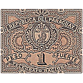
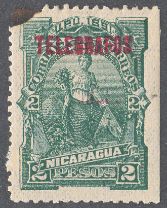
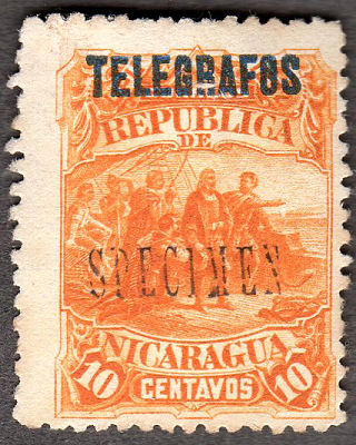
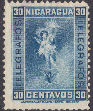
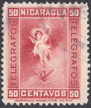
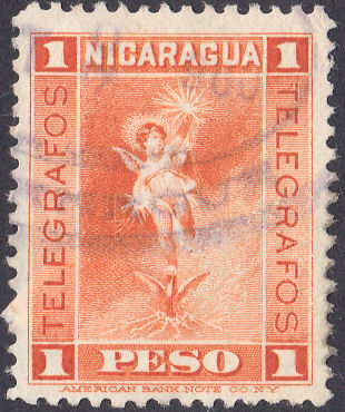
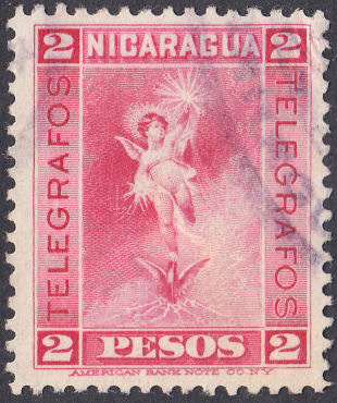
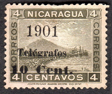
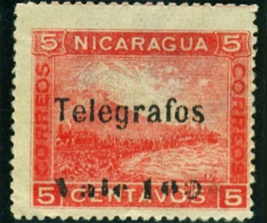
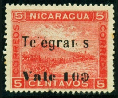
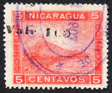
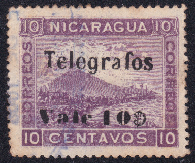
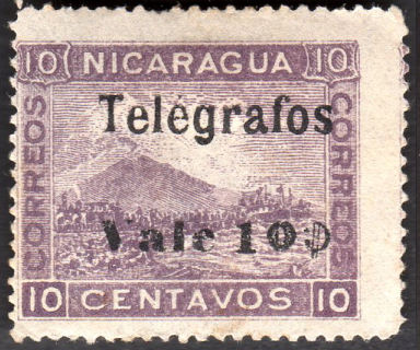
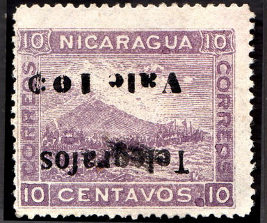
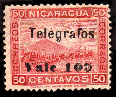
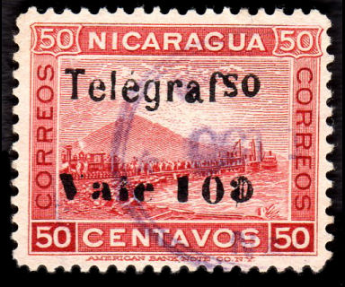
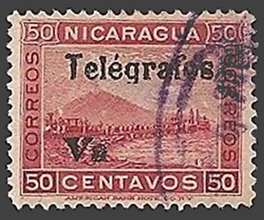
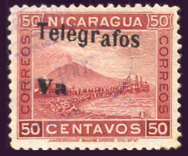
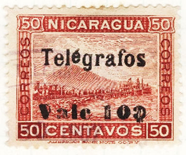
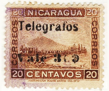
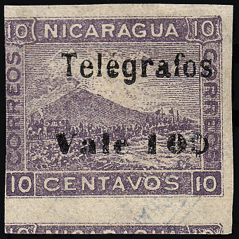
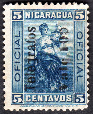
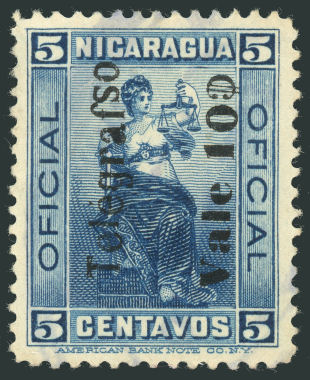
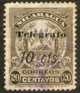
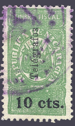
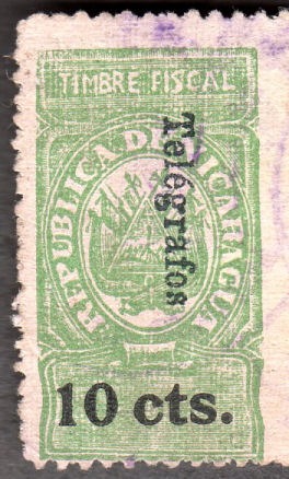
1900 Telegraph stamps. Printed by the American Bank Note Co.
White wove paper. No watermark. Perf. 12.
 |
 |
 |
 |
| 10c - RH77 | 15c - RH78 | 20c - RH79 | 30c - RH80 |
| Hiscocks Type 18 | |||
 |
 |
 |
 |
| 50c - RH81 | 1p - RH82 | 2p - RH83 | 3p - RH84 |
| Hiscocks Type 18 | |||
| RH # | Hisc. | Type. | Description | Mint | Used |
|---|---|---|---|---|---|
| RH77 | H77 | 18 | 10c reddish violet (shades) | 7.50 | 1.80 |
| RH78 | H78 | 18 | 15c grey-blue (shades) | 5.00 | 2.50 |
| RH79 | H79 | 18 | 20c yellow-brown (shades) | 7.50 | 2.50 |
| RH80 | H80 | 18 | 30c steel blue (shades) | 7.50 | 2.50 |
| RH81 | H81 | 18 | 50c crimson | 15.00 | 15.00 |
| RH82 | H82 | 18 | 1p yellow-orange to orange | 15.00 | 15.00 |
| RH83 | H83 | 18 | 2p rose | 15.00 | 15.00 |
| RH84 | H84 | 18 | 3p deep blue-green | 15.00 | 15.00 |
Hiscocks added the following 2 notes:
| Note 1. Many mint copies of the above issue have a thin black line extending horizontally partway across in (apparently) print and also, usually, in pencil. The significance of these lines is not known but they may indicate remainders. Prices reduced by a third. |
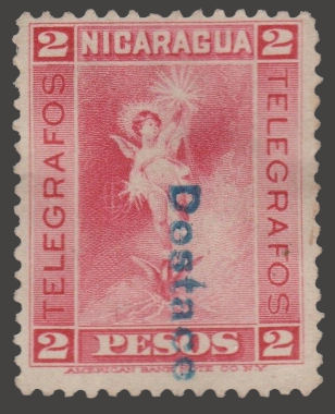
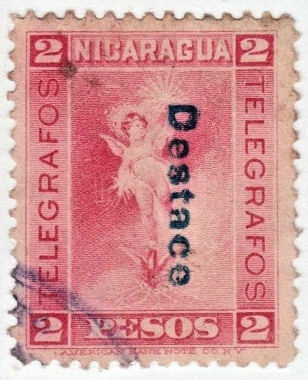
| Note 2. Copies of the above stamps are found overprinted 'DESTACE' in thick blue typeface or printed black italic capitals. These are provisional revenue stamps issued in 1902 to indicate payment of a tax on the butchering of live-stock carcases. |
My note: I was told that Note 2 above is not correct. it was the "OFICIAL" stamps
A selection is shown below courtesy of treasurings-jewelry, (click images for listing).
The overprint though, does also exist on the telegraph stamps as shown below :
 |
 |
 |
 |
| The overprint on these two (scanned together) are slightly different sizes The left is about 15.16 x 2.37 mm, the right is about 15.45 x 2.67 mm |
Overprint in black italic capitals. | Overprint reading downwards. | Overprint reading downwards in black. |
| Images courtesy of Harry Patsalos | Image from RL | Images courtesy of treasurings-jewelry, (click images for listing). | |
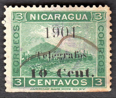
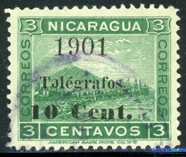
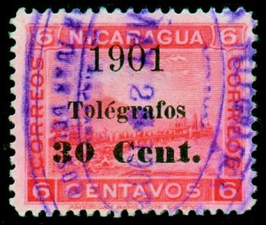
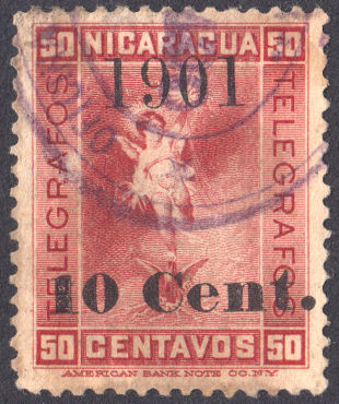
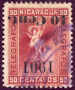
1901 Postage stamps of 1900 (SG 140 etc.) surcharged in black with type 19 below.
White wove paper. No watermark. Perf. 12.
 |
 |
 |
| RH85 courtesy of Alan Slater. | RH85c courtesy of Nik Oquist. inverted first 'e'. |
RH86 courtesy of Alan Slater. |
 |
 |
 |
 |
| RH87 | RH87a - inverted overprint, from RL. | RH87c - inverted first 'e' in 'Telégrafos'. | RH87d - 'o' for first 'e' in 'Telégrafos'. Courtesy of Courtney Hess. |
John Barefoot illustrates a similar type with "1901 / Telégrafos" on a 3c but without the surcharge, his number 84. RH87a above shows that the surcharge is an integral part of this overprint.
Steve Hiscocks listed H70 and H71 which are now considered to be dubious. They are also low values, 4c and 5c, which may no longer have had a telegraphic use.
I would welcome scans of any examples like the above but without a surcharged value.
| RH # | Hisc. | Type. | Description | Mint | Used |
|---|---|---|---|---|---|
| RH85 | H85 | 19 | 10c on 3c green | 5.00 | 3.75 |
| RH85a | H85a | surcharge inverted | 20.00 | 12.50 | |
| RH85b | H85b | surcharge double | 20.00 | 12.50 | |
| RH85c | H85c | first 'e' in ''Telégrafos' inverted | 15.00 | 10.00 | |
| *RH85d | - | '10 Cent.' missing | - | - | |
| *RH85e | - | '10 Cent.' missing and first 'e' in ''Telégrafos' inverted. | - | - | |
| RH86 | H86 | 19 | 10c on 4c olive | 7.50 | 2.50 |
| RH86a | H86a | surcharge inverted | 25.00 | 15.00 | |
| RH86b | H86b | surcharge double | 25.00 | 15.00 | |
| RH86c | H86c | first 'e' in 'Telégrafos' inverted | 20.00 | 12.50 | |
| RH87 | H87 | 19 | 30c on 6c rose | 5.00 | 2.00 |
| RH87a | H87a | surcharge inverted | 20.00 | 12.50 | |
| RH87b | H87b | surcharge double | 20.00 | 12.50 | |
| RH87c | H87c | first 'e' in 'Telégrafos' inverted | 15.00 | 10.00 | |
| RH87d | - | 'o' for first 'e' in 'Telégrafos' | - | - |
* I have added these due to information received.
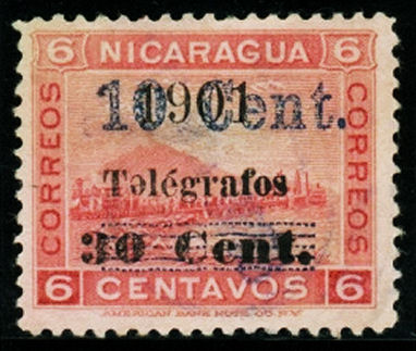
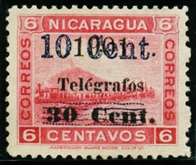
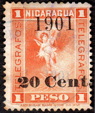
1901 No. 87 additionally surcharged with type 21 or similar.
 |
 |
 |
 |
| RH88a wide gap, inverted first 'e' in 'Telégrafos'. Courtesy of Courtney Hess |
RH88c wide gap, raised stop after "Cent". Type 20 - x, courtesy of Courtney Hess |
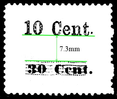
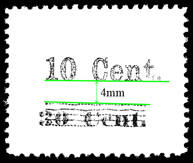
Hiscocks Type 20 comes in two different types. He illustrates one with a large gap, about 7.3mm between the parts, referred to as type "x". The other, type "y", has only a 4mm gap, |
|
Hiscocks added the following note:
| Note. It is not clear whether the errors of first surcharges, inverted and double (Nos. 85(a) and 85(b) etc.) exist further overprint as type 20 and 21. |
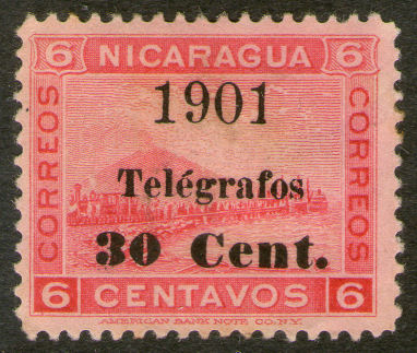
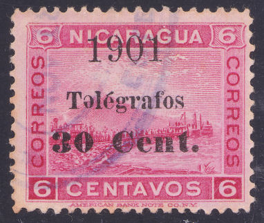
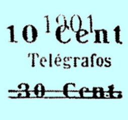
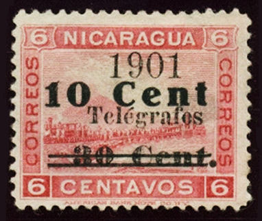
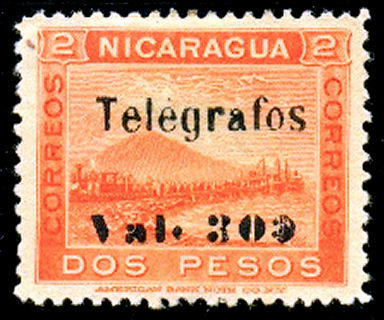
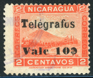
1901 Telegraph stamps of 1900 (Nos. 78, 81 and 82) overprinted as below.
| Type 22 from Hiscocks book, page 209. |
Type 23 (RH90) courtesy of Courtney Hess. |
Type 23 (RH91) |
Type 23 (RH91b) from RL |
Type 23 (RH93) courtesy of Alan Slater. |
| RH # | Hisc. | Type. | Description | Mint | Used |
|---|---|---|---|---|---|
| RH90 | H90 | 22 | 10c on 15c grey-blue | 50.00 | 40.00 |
| RH91 | H91 | 23 | 10c on 50c crimson | 3.75 | 2.00 |
| RH91a | H91a | missing '10' | 10.00 | 7.50 | |
| RH91b | - | inverted overprint | - | - | |
| RH92 | H92 | 23 | 10c on 1p (error) orange (shades) | 75.00 | 75.00 |
| RH92a | H92a | '0' missing from '10' | 100.00 | 100.00 | |
| RH93 | H93 | 23 | 20c on 1p orange (shades) | 20.00 | 3.75 |
| RH93a | H93a | missing '1901' (i.e. as 22) | 50.00 | 50.00 | |
| RH93b | H93b | value missing | 40.00 | 40.00 |
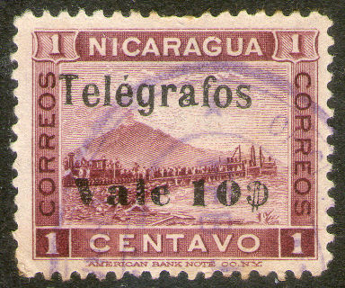
1902 Postage stamps of October 1900 (SG 137 — as for Nos. 70-76 and 85-89 above) overprinted 'Telégrafo'
as type 14 and further surcharged in violet as type 24 below.
 |
 |
 |
| Type 14 Taken from Hiscocks, page 206. | Type 24 Taken from Hiscocks, page 209. | Image courtesy of Courtney Hess. |
The postage stamps described consisted of two denominations, a 15c on 2c vermilion and a 30c on 1c plum.
Varieties existed. Both could have a double surcharge, the 15c could have a blue surcharge and the 30c could have an inverted surcharge.
The Scott catalogue says "Counterfeits of No. 163 [the 30c] exist in slightly smaller type".
Steve Hiscocks described H94 as having type 14 overprint in addition to Type 24 (for 30c). The example shown, which is on a 5c stamp, is type 33 overprint of 1907 (badly shifted). See RH115.
To me it looks like a counterfeit 1902 overprint was applied (right way up plus inverted) to an RH115. The illustration at least gives an idea of RH94.
Be careful what you spend a lot of money on though.
| RH # | Hisc. | Type. | Description | Mint | Used |
|---|---|---|---|---|---|
| RH94 | H94 | (24) | 30c on 1c lilac-brown | 75.00 | 75.00 |
Hiscocks added the following note:
| Note. I have not seen a copy of this stamp and am not clear whether the 14 overprint is in black or violet or whether it is horizontal as I would expect or vertical. |
My note: There are doubts about the existence of this stamp, but there may also be a 15c on 2c version.
Can anyone supply a scan ?
1902 Official postage stamps of 1900 (SG O148-150) overprinted and surcharged as below.
Type 25 1c (RH95) on the left is one of mine.
On the right is RH96 with the smaller '1902' courtesy of Alan Slater.
Type 26 is taken from Hiscocks, page 209.
 |
 |
 |
| RH97 | RH98 | RH99 (small '1902') courtesy of Alan Slater. |
| RH # | Hisc. | Type. | Description | Mint | Used |
|---|---|---|---|---|---|
| RH95 | H95 | 25, 26 | 10c on 1c lilac-brown | 7.50 | 2.00 |
| RH95a | H95a | surcharge double | 20.00 | 15.00 | |
| RH96 | H96 | 25, 26 | 10c on 1c lilac-brown (smaller '1902') | 15.00 | 5.00 |
| RH96a | H96a | surcharge double | 40.00 | 25.00 | |
| RH97 | H97 | 25, 26 | 10c on 2c brownish orange | 12.50 | 2.00 |
| RH98 | H98 | 25, 26 | 10c on 4c brownish olive | 5.00 | 2.00 |
| RH99 | H99 | 25, 26 | 10c on 4c brownish olive (smaller '1902') | 15.00 | 7.50 |
Hiscocks added the following note:
| Note. I have not seen the smaller '1902' type (Nos. 96 and 99). The normal '1902' in Nos. 95, 97 and 98 measures 9.2 x 2.2mm. |
My note: I am not sure if Hiscocks note had a typo, but the ones illustrated above have a
'1902' measuring about 9.2mm x 3.2mm with the small being 2.7mm high.
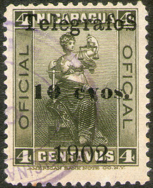
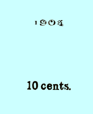
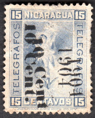
1904 - I have reversed the order of these as shown by Hiscocks
This was done because it seems unlikely that Type 29 would be created after Type 28 was available.
Clearly dated examples would be welcome.
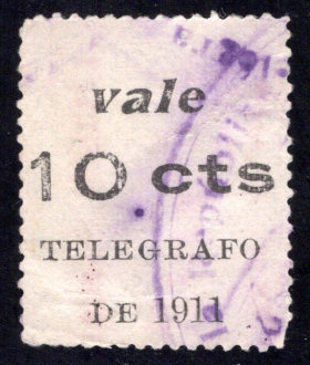
1904 Telegraph stamp of 1900 (No. 78) surcharged as below in black.
| Type 29 revised. | RH100 Courtesy of Alan Slater. |
RH100 Courtesy of Courtney Hess. |
RH100a Courtesy of Clayton Rubec. |
RH100a Courtesy of Courtney Hess. |
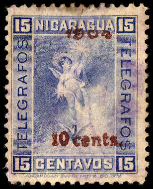

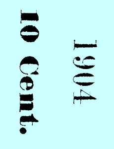
Type 29 is a bit variable in detail, particularly the "10 cents". Clear overprints are hard to find.
| RH # | Hisc. | Type. | Description | Mint | Used |
|---|---|---|---|---|---|
| RH100 | H101 | 29 | 10c on 15c grey-blue | 30.00 | 15.00 |
| RH100a | H101a | surcharge in red | 100.00 | 25.00 |
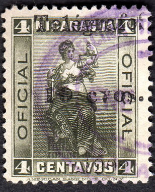
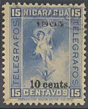
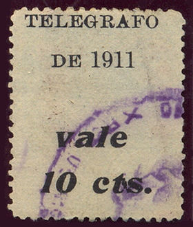
1904 Telegraph stamp of 1900 (No. 78) surcharged as below in black.
| Type 28 | Type 28 (RH101) | *RH101a Courtesy of Alan Slater. |
| RH # | Hisc. | Type. | Description | Mint | Used |
|---|---|---|---|---|---|
| RH101 | H100 | 28 | 10c on 15c grey-blue | 25.00 | 2.50 |
| *RH101a | - | surcharge double | - | - |
*RH101a was added because of the example illustrated.
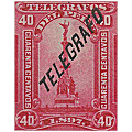
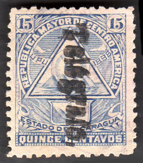
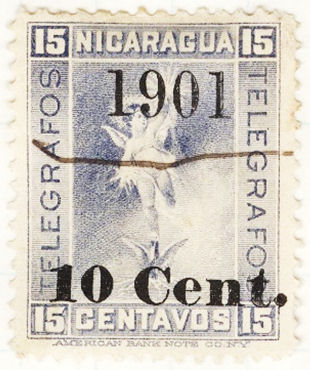
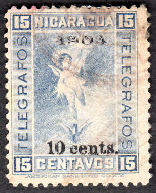
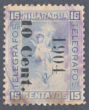
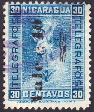
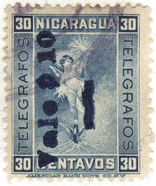
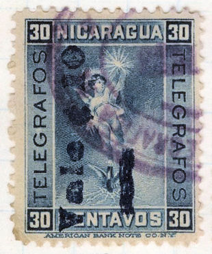
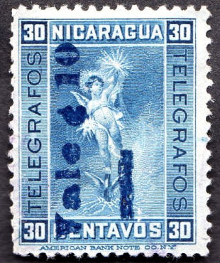
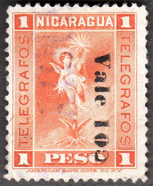
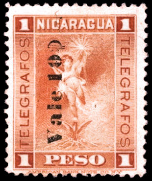
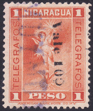
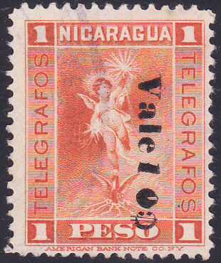
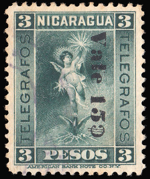
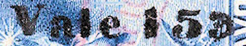
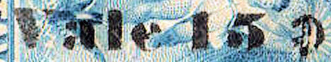
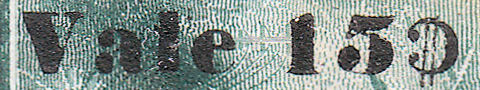
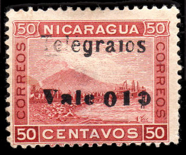
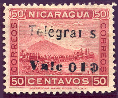
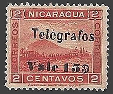
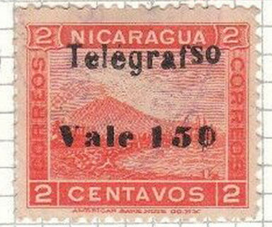
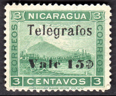
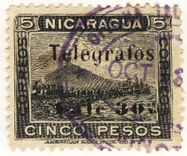
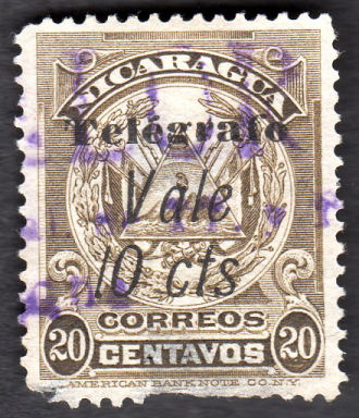
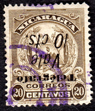
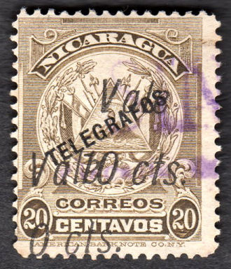
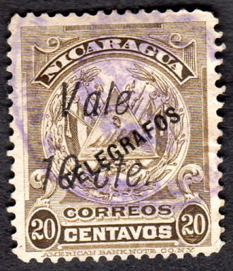
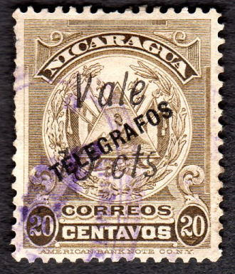
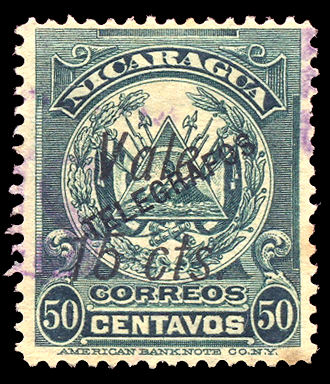
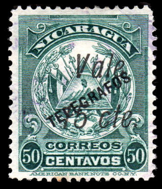
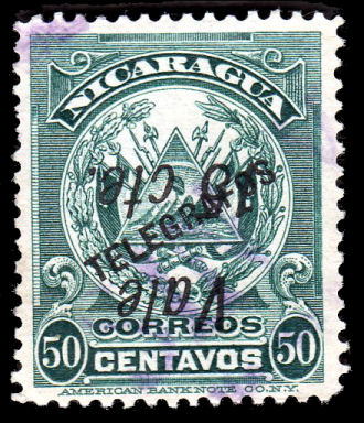
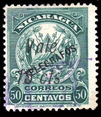
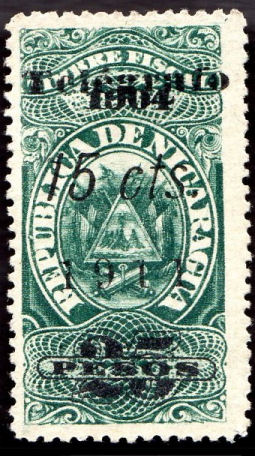
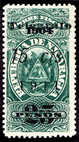
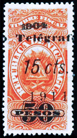
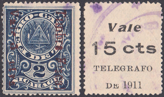
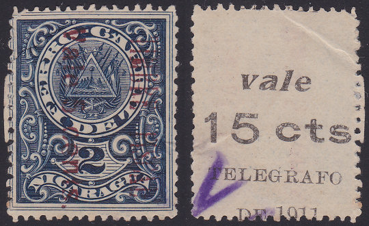
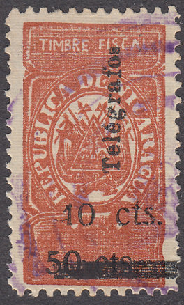
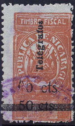
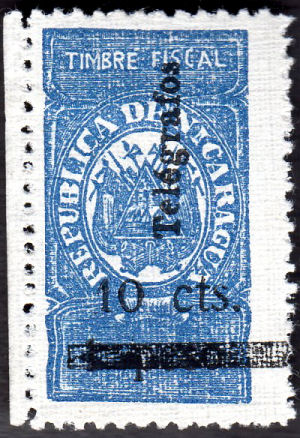
1905 Telegraph stamp of 1900 (Nos. 80-84) surcharged as below in black except where stated otherwise.
Hiscocks' original illustration for this section was as shown below. For a long time I have been unhappy with the illustrations of Type 30 and Type 31. Specifically, there are two differences between Types 30 and 31.
The Cent symbol reads upwards in Type 30 and downwards in Type 31. There is bar in Type 30 and 3 wavy lines in Type 31. How do we allocate stamps with only one difference ?
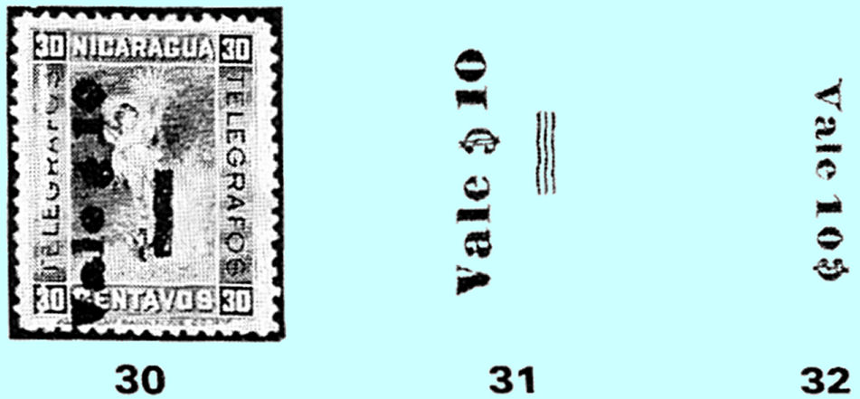
Ignoring for the moment that the overprints can be different colours and read upwards or downwards, look at these:
 |
 |
 |
 |
 |
The reader is invited to assume that 3 wavy lines get filled in to become blobby bars. Certainly the middle red one looks like there are 3 wavy lines, but the other bars look like only two thicker lines under there.
The 3 wavy lines are under the Cent symbol, the 2-lined blob is lower down. I have yet to see a stamp that looks like the Type 31 above as shown. If you can show me one, then please do !
I am going to add three types to allow accurate descriptions, whilst still accommodating the original types (that may not actually exist), with the understanding that they can be filled to a varying extent.
 |
 |
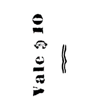 |
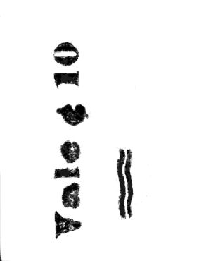
Types 30 and 31 normally read upwards, while Type 32 normally reads downwards.
I think the black ink came first and that the blue ink caused clogging of the wavy lines. The position of the wavy lines is a bit variable.
The blue ink used for Type 30 may not be colour-fast. I have seen a used example in which the ink appears to have run! Be careful if soaking off (which is generally not a good idea anyway).
|
 |
 |
 |
 |
 |
| RH102 | RH102e ? - this looks transitional. Courtesy of Courtney Hess. |
RH102a courtesy of Alan Slater. | RH102b | RH102c courtesy of Alan Slater. | RH102d courtesy of Alan Slater. |
|
|
|
|
| RH103 courtesy of Courtney Hess. | RH105 courtesy of Alan Slater. | RH105a courtesy of Alan Slater. | RH106a |
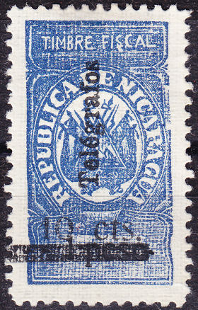
Type 32 : Hiscocks listed no varieties for stamps with the Type 32 overprint, however, of course, there are varieties.
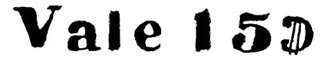
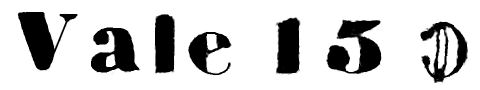
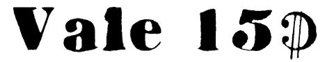
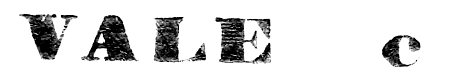
Firstly, though it is normally downwards, it is known reading upwards. There is some variation in spacing between "VALE" and the value and there are variations in the size and font of the value.
I have shown a few below, but would welcome scans of more examples.
 |
 |
 |
 |
 |
| RH104 courtesy of Alan Slater. | RH107 courtesy of Alan Slater. | RH107a courtesy of Courtney Hess. | RH107b Oval '0' in '10'. | RH107b sloping '1' close to 'Vale'. |
 |
 |
 |
 |
 |
| RH108 courtesy of Alan Slater. | RH109 courtesy of Alan Slater. | RH110 from RL. | RH110a courtesy of Alan Slater. | RH111 15c on 3p |
Clayton Rubec has pointed out that the spacing on the overprints are not all the same on either the 10c or 15c.
* These have been added due to the examples illustrated above.
There appears to be some variability of the positioning of the bars below the values.
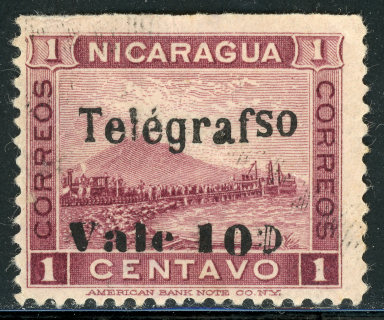
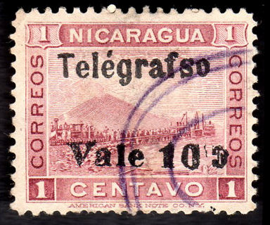
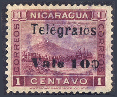
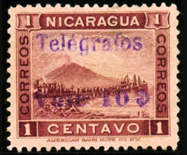
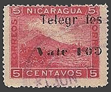
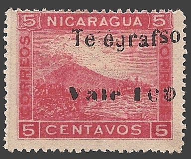
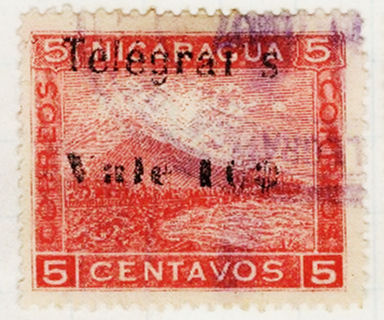
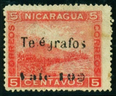
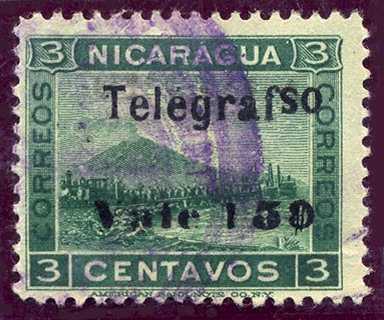
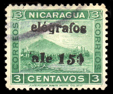
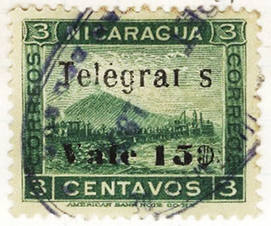
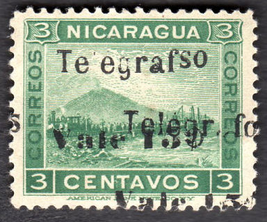
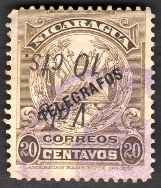
1907 Postage stamps of 1900 (SG 137 etc.) and 1902 (SG 184-6) surcharged with Type 33 as below in black.
The 1900 stamps were printed by, and had the imprint of, the 'American Bank Note Co. NY.' these were Perf. 12.
In 1902 stamps (5c and 10c values) were printed by H. Braunlich, N.Y. and were poorer quality (litho) and without imprint. These are Perf. 14 x 14¼.
The quality of the type-setting and printing of the overprints was very poor. I have listed some varieties, but the number of permutations of errors is open-ended.
Keep in mind that a slightly different font or spacing does no necessarily imply a forgery. These were produced by typesetting and Type bits and spacers were often re-used and mixed.
More varieties can be seen at www.paperheritage.co.uk/articles/Nic-1907Tele
 |
 |
 |
 |
| 10c on 1c RH113 | RH113a 'Telégrafso' | RH113a possibly fake, with 'so' lower, é accent larger | RH113b 'Telégraios' (deformed 'a', broken 'f ') |
| One of mine. | Courtesy of Nik Oquist. | Courtesy of Alan Slater. | From RL. |
 |
 |
 |
 |
| 10c on 1c RH113A - Violet overprint. | 10c on 2c RH114 | RH114a 'Telégrafso' | RH114b surcharge inverted, but possibly fake, the accent on é and last 's' look wrong. |
| Courtesy of Courtney Hess. | Courtesy of Alan Slater. | From RL. | |
 |
 |
| RH114c surcharge doubled | RH114e 'é' small and raised + 'l' weak. |
| Courtesy of Courtney Hess. | |
 |
 |
 |
 |
| 10c on 5c RH115 | RH115a 'Telégrafso' | RH115c '10' omitted | *RH115d 'a' omitted. |
| Courtesy of Alan Slater. | Courtesy of Benjamin Singer. | ||
 |
 |
 |
| *RH115e 'Te égrafso' | *RH115f damaged "f" + 'o' omitted. | *RH115h 'é' small and raised + 'l' weak. |
| Courtesy of Benjamin Singer. | Courtesy of Courtney Hess. | |
 |
 |
 |
| *RH115i small '0' in '10'. | *RH115j 'l', 'f' and 'o' broken. | *RH115k 'Telegrafos' shifted up to next stamp. |
| Courtesy of Courtney Hess. | Courtesy of Miguel Torres. | |
With RH115k, "Telegrafos" would normally be seen below the "Vale 10ɔ", so this must be from the bottom row of the sheet. The bottom of "Telegrafos" can just be seen at the top.
 |
 |
 |
| 10c on 10c RH116 | RH116a 'Telégrafso' | RH116b+e/f imperf + small raised 'é' |
| One of mine. | Courtesy of Alan Slater. | Courtesy of Courtney Hess. |
 |
 |
 |
 |
| RH116c '0' omitted | RH116d '01' for '10' and broken 'f' | RH116e small, raised 'é' in 'Telégrafos' plus broken ' l ' and 'g' |
RH116f small, raised 'é' in 'Telégrafos' plus dropped '0' in '10' |
| One of mine | Courtesy of Alan Slater. | Image courtesy of Benjamin Singer. | Courtesy of Courtney Hess. |
 |
 |
 |
 |
| *RH116g '0 ¢' omitted sfos | *RH116h 'le 10¢' omitted, 'afos' low. | *RH116i small zero in '10' | *RH116j small zero in '10' and surcharge inverted |
| Courtesy of Alan Slater. | |||
 |
 |
 |
 |
| 10c on 50c RH117 | RH117a 'Telégrafso' | RH117b 'le 10¢' omitted | RH117c 'le 10¢' omitted, 'afos' low |
| Courtesy of Alan Slater. | Image courtesy of Benjamin Singer. | Courtesy of Courtney Hess. | |
 |
 |
 |
| *RH117d '01' for '10' and 'Telégraios' | *RH117e '01' for '10' and 'Telégrai s' | *RH117f 'é' small and raised |
| Courtesy of Alan Slater. | From RL. | Courtesy of Courtney Hess. |
 |
 |
| 15c on 2c RH118 | 15c on 2c RH118a 'Telégrafso' |
| Image courtesy of Benjamin Singer. | Courtesy of Courtney Hess. |
 |
 |
 |
 |
| 15c on 3c RH119 | RH119a 'Telégrafso'. | RH119b 'T' and 'V' omitted | RH119c 'f' broken, 'o' omitted |
| Courtesy of Alan Slater. | Image courtesy of Rolf Lamprecht. | Courtesy of Alan Slater. | Courtesy of Courtney Hess. |
 |
 |
 |
 |
| *RH119d surcharge double, one telegrafso | 15c on 5c RH120 | *RH120a surcharge inverted | *RH120b 'T' and 'V' omitted |
| Courtesy of Alan Slater. | |||
 |
 |
 |
 |
| 15c on 10c *RH120A | 30c on 20c *RH121A | 30c on 2P *RH121B | 30c on 5P *RH121C |
| Courtesy of Courtney Hess. | |||
 |
 |
 |
| *RH114d Bold 'T' | *RH115g Bold 'T' | *RH117h Bold 'T' |
| As Nik points out, the 'T' is pretty consistent on these. I suspect that it occurs on other stamps of this series also. - Images courtesy of Nik Oquist. | ||
 |
 |
| *RH118b Bold 'T' | *RH119e Bold 'T' |
| Anyone have any others? - Images courtesy of Nik Oquist. | |
* I have added these to accommodate examples shown above.
However, given the poor quality of these overprints, I'm not sure that it is worthwhile adding every permutation of defects.
The example of RH116e has a missing 'l' in 'Telégrafos', whilst the example of RH119c also has a
'Telégrafos' overprint with the 'a' nearly missing and a 'Telégrafso' overprint with missing ' l '.
It is likely that the same 10c plate was used in overprinting all the values that had a 10c overprint and thus the same errors exist for all of them.
The same of course applies with the 15c overprint.
Hiscocks added the following note:
| Note. Nos. 115, 116 and 120 are on the lithographed 1902 issue (by H. Braunlich of New York). Perf. 14, in which "Am. Bank Note Co" has been omitted from the design. |
My note: There is another group of stamps very similar to the above that should be mentioned :
 |
 |
 |
 |
 |
 |
 |
 |
 |
These are characterised by (unusually) having good quality overprints, as well as not appearing in catalogues.
In fact they give every appearance of being the products of Linotype rather than the conventional Typesetting available in Nicaragua at the time.
Whilst Linotype was readily available in the U.S.A. from 1892, it does not appear to have been used to overprint Nicaraguan Telegraph stamps until about 1908.
I cannot claim to be an expert in such matters, but I would be failing in my duty to inform, if I did not raise doubts about these.
Perhaps the American Bank Note Co. produced them to tender for a contract to produce them, which was turned down in favour of domestic production.
The 10c on 15c though appears to be cancelled. The 15c on 10c (on a H. Braunlich Co. Printing) is not the sort of thing that would win a contract.
Some of the stamps shown above may also belong with these. Perhaps they were used to sell a Linotype machine? - These images come courtesy of Courtney Hess.
1907 Official postage stamps of 1900 (SG O148 etc.) with the same surcharge as H113-121 reading vertically down (usually) in black. They will likely have the same varieties.
 |
 |
 |
 |
| 10c on 1c RH122 | *RH122b Reading upwards | 10c on 2c RH123 | RH123a 'Telégrafso'. |
| Courtesy of Alan Slater. | One of mine | Courtesy of Alan Slater. | |
 |
 |
 |
 |
| 10c on 5c RH124 | RH124b surcharge in carmine. | RH124c Reading upwards. | RH124a/c 'Telégrafso', upwards. |
| Type 33a examples, courtesy of Alan Slater. | Courtesy of Nik Oquist. | ||
Type 33A
| RH # | Hisc. | Type. | Description | Mint | Used |
|---|---|---|---|---|---|
| RH122 | H122 | 33A | 10c on 1c lilac-brown | 10.00 | 10.00 |
| RH122a | H122a | error — 'Telégrafso' (i.e. 'os' inverted) | 25.00 | 20.00 | |
| *RH122b | - | surcharge reading upwards | - | - | |
| RH123 | H123 | 33A | 10c on 2c bright orange | 2.50 | 1.25 |
| RH123a | H123a | error — 'Telégrafso' (i.e. 'os' inverted) | 7.50 | 5.00 | |
| RH123b | - | surcharge reading upwards | - | - | |
| RH124 | H124 | 33A | 10c on 5c dark blue | 3.75 | 2.50 |
| RH124a | H124a | error — 'Telégrafso' (i.e. 'os' inverted) | 10.00 | 7.50 | |
| RH124b | H124b | surcharge in carmine | 2.50 | 1.25 | |
| *RH124c | - | surcharge reading upwards | - | - |
* I have added RH122b and RH124c due to the examples above.
Late 1907 Postage stamps of 1905 and 1907 (SG 206-7 and 239). Surcharged as above.
White wove paper. No watermark. Perf. 12 (American Bank Note Co.) or Perf. 14 (Waterlow & Sons Ltd.)
 |
 |
 |
 |
 |
| 10c on 1c RH125 - The date normally given for these is 1908. This is dated 1907. RL has another dated 1 Sept 1907. |
RH125a 'Telégrafso' | *RH125ab 'Telégrafso', split '1' in '10' (this is also known on the postal version) |
RH125b surcharge reading upwards | *RH125c raised second 'é' in 'Telégrafos' (reading downwards) |
| One of mine. | Courtesy of Alan Slater. | Courtesy of Nik Oquist. | Courtesy of Alan Slater. | Courtesy of Nik Oquist. |
 |
 |
 |
 |
 |
| *RH125d Bold 'T' | *RH125e surcharge reading upwards (ABN) | 10c on 2c RH126 | 15c on 1c RH128 | 15c on 2c RH129 |
| Courtesy of Nik Oquist. | Courtesy of Benjamin Singer. | Courtesy of Alan Slater. | ||
| RH # | Hisc. | Type. | Description | Mint | Used |
|---|---|---|---|---|---|
| RH125 | H125 | 34 | 10c on 1c green (SG 239, 1907 W) | 2.50 | 1.25 |
| RH125a | H125a | error — 'Telégrafso' (i.e. 'os' inverted) | 7.50 | 5.00 | |
| *RH125ab | - | error — split base of '1' in '10' | - | - | |
| RH125b | H125b | surcharge reading upwards | 10.00 | 7.50 | |
| *RH125c | - | raised second 'é' in 'Telégrafos' | - | - | |
| *RH125d | - | bold 'T' | - | - | |
| *RH125e | - | surcharge reading upwards (1905 ABN) | 35.00 | 35.00 | |
| RH126 | H126 | 34 | 10c on 2c rose (SG 207, 1905 ABN) | 2.50 | 1.25 |
| RH127 | H127 | 34 | 15c on 1c green (SG 206, 1905 ABN) | 30.00 | 30.00 |
| RH128 | H128 | 34 | 15c on 1c green (SG 239, 1907 W) | 30.00 | 30.00 |
| RH129 | H129 | 34 | 15c on 2c rose (SG 207, 1905 ABN) | 2.50 | 1.25 |
* I have added RH125ab, RH125c, RH125d and RH125e due to the examples shown above.
Hiscocks added the following note:
| Note. The stamps of 1905 were recess printed by the American Bank Note Co. while those of 1907 were re-engraved and printed by Waterlow & Sons, London. There are many minor differences but in both cases the printer's name appears in the bottom margin. |
1908 Fiscal stamps of 1899 (Forbin No. 1) surcharged as above in black.
White wove paper, sheets of 20. No watermark. Perf. 13
 |
 |
 |
 |
 |
 |
| 10c on 1c RH130 Upwards. | 10c on 1c RH131 Downwards. | 15c on 1c RH132 Upwards. | 15c on 1c RH133 Downwards in red. | 15c on 10c *RH133A Upwards. | 15c on 10c *RH133B Downwards. |
| Courtesy of Alan Slater. | A couple of mine. | Courtesy of Courtney Hess. | |||
Type 35
| RH # | Hisc. | Type. | Description | Mint | Used |
|---|---|---|---|---|---|
| RH130 | H130 | 35 | 10c on 1c blue (reading up) | 2.50 | 2.00 |
| RH131 | H131 | 35 | 10c on 1c blue (reading down) | 10.00 | 2.50 |
| RH132 | H132 | 35 | 15c on 1c blue (reading up) | 2.50 | 2.00 |
| RH133 | H133 | 35 | 15c on 1c blue (reading down in red) | 25.00 | 5.00 |
| *RH133A | - | (35) | 15c on 10c green (reading up) | - | - |
| *RH133B | - | (35) | 15c on 10c green (reading down in red) | - | - |
* These have been added due to the examples shown. Status unknown, these are the only examples that I have seen.
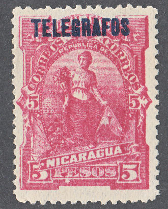
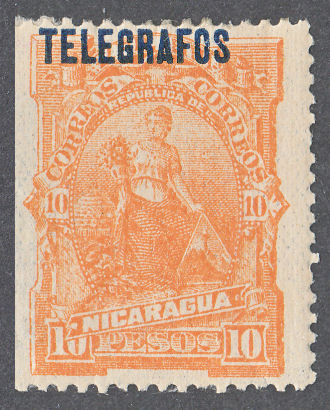
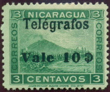
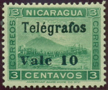
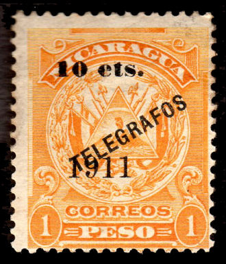
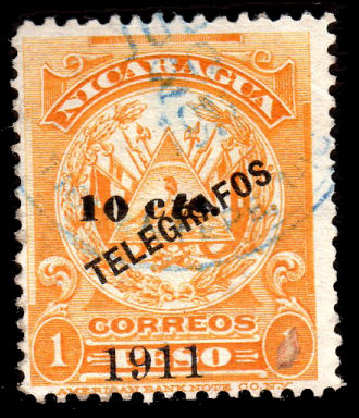
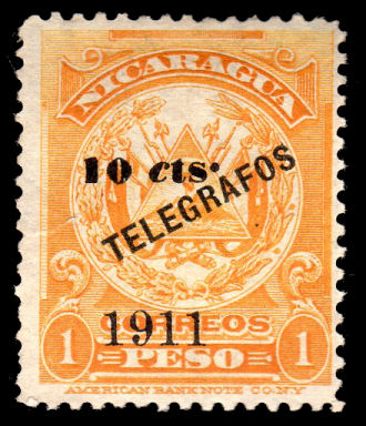
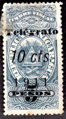
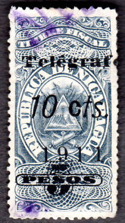
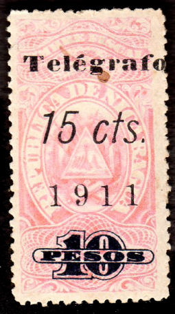
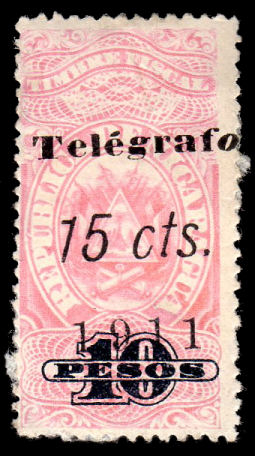
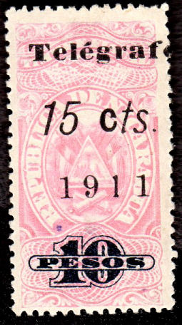
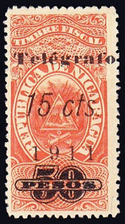
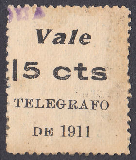
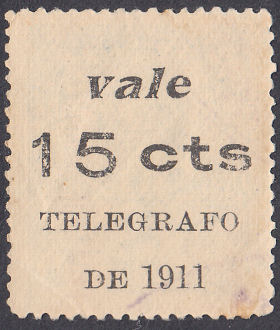
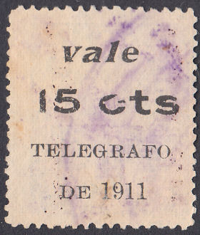
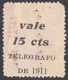
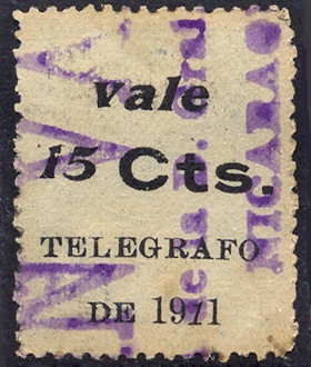
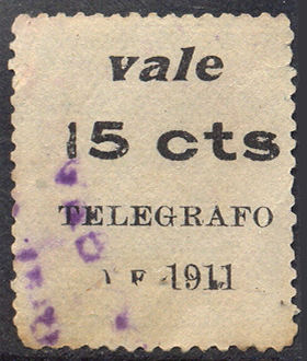
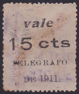
1910-1911 Postage stamps of 1909 (SG 284 — similar to those of 1905 (SG 206 etc.) but with altered colours of 1909) overprinted as below in black.
White wove paper. No watermark. Perf. 12 (American Bank Note Co.) or Perf. 14 (Waterlow & Sons Ltd.)
Types as indicated in Hiscocks' book page 212.
Varieties and other examples:
 |
 |
 |
 |
| 10c RH135 | 10c on 15c RH136a 'VAEE' | 10c on 15c RH136b added postal surcharge - (See Scott 255) |
10c on 15c Scott 255 for comparison. |
| Courtesy of Alan Slater. | Images c ourtesy of Miguel Torres. | ||
 |
 |
 |
 |
 |
| 10c on 15c RH136A (Waterlow perf.14) | 10c on 15c RH136B MOCKUP (A.B.N. Co.) I have seen only a poor image. |
10c on 20c RH137 | 10c on 20c *RH138b no stop after 'cts' | *RH138c inverted |
| Courtesy of Nik Oquist. | Can anyone supply a genuine image? | One of mine. | Courtesy of Alan Slater. | |
 |
 |
 |
 |
| 10c on 20c RH139a surcharge double | RH139c 'cte' | RH139d Vale / 10 cts' inverted | *RH139e no stop after 'cts' |
| Courtesy of Alan Slater. | |||
 |
 |
 |
 |
 |
| 10c on 1p RH140a 'ets' | RH140c italic 'ts' in 'cts' | *RH140e italic 'c' and high stop in 'cts.' | 15c RH141 | 10c on 15c RH142A MOCKUP (A.B.N. Co.) I have seen only a poor image. |
| Courtesy of Alan Slater. | Can anyone supply a genuine image? | |||
 |
 |
 |
 |
 |
| 10c on 50c RH142 | 10c on 50c RH142a 'cte' | RH142b 'Vale / 10 cts' inverted | *RH142d no stop after 'cts' | 1p RH142e - No, no such postal. |
| Courtesy of Rolf Lamprecht. | Courtesy of Alan Slater. | Courtesy of Miguel Torres. | ||
 |
| 1p RH143 |
| Courtesy of Alan Slater. |
The original list of Steve Hiscocks had only stamps of the American Bank Note Company in this section.
However RH136A indicates that, like the H125-H129 series, it appears that some Waterlow stamps were also overprinted
More recently I have been shown a poor image, probably from an old eBay lot, of Type 36a on the 1909 ABN version of 15c.
The distance between the 2 parts was the same, but slightly shifted in alignment. Anyone have one?
I would like to hear about these or any more similar examples not on this list.
* I have added these due to the examples shown above.
† I have added these due to poor images seen. Type 37 is also known ONLY so far as specimens on the 20c and 50c.
I have provided Mock-up images of some for now, but would welcome genuine images.
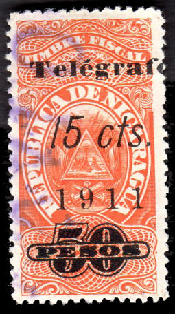
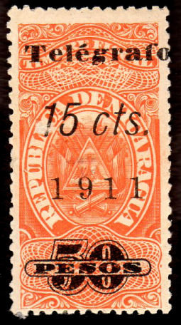
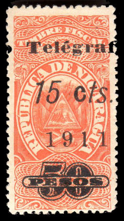
1911 Fiscal stamps of 1908 (Forbin 20-29) surcharged as below in black.
White wove paper, sheets of 20. No watermark. Perf. 14
 |
 |
 |
 |
 |
 |
| 10c on 50c RH144 | 10c on 50c RH144a italic 'o' | 10c on 50c RH144c non-italic 'c' | 10c on 50c *RH144d no serif on '1' of '10' |
10c on 5p *RH145b italic 'g' | 10c on 5p RH145c non-italic 'c' |
| Courtesy of Alan Slater. | From RL | Courtesy of Alan Slater. | From RL | Courtesy of Alan Slater. | |
 |
 |
 |
 |
 |
| 15c on 10p RH146 | *RH146c italic 'g' and 'o' | RH146d non-italic 'c' | 15c on 25p RH147 | *RH147c italic 'g' and 'o' |
| Courtesy of Alan Slater. | Courtesy of Niki Oquist. | |||
 |
 |
 |
 |
| RH148 | RH148a italic 'o' | *RH148b italic 'g' | RH148d non-italic 'c' in 'cts' |
| Courtesy of Clayton Rubec. | Courtesy of Alan Slater. | ||
Type 43
* I added RH144d, RH145b, RH146c, RH147c and RH148b due to the examples shown above. Since it seems likely that
the same 10c overprint plates were used for both values, and the same 15c overprints were used for all values,
I have added the respective varieties for other values. Note that I have rearranged the orders of these to be a bit more logical
1911 As above but also overprinted '1904' i.e. on Forbin Nos. 13, 18 and 19 of 1904. Perf. 14½.
 |
 |
 |
 |
 |
| *RH149Eb italic 'g' | *RH149Fb italic 'g' | 15c on 25p RH150 | RH150a italic 'o' | *RH150E |
| Courtesy of Courtney Hess. | Courtesy of Alan Slater. | Courtesy of Clayton Rubec. | ||
| RH # | Hisc. | Type. | Description | Mint | Used |
|---|---|---|---|---|---|
| RH149 | H149 | 43 | 10c on 50c yellow-green | 100.00 | 5.00 |
| RH149a | H149a | italic 'o' in 'Telégrafo' | 150.00 | 25.00 | |
| RH149b | - | italic 'g' in 'Telégrafo' | 150.00 | 25.00 | |
| RH149c | H149b | non-italic 'c' in 'cts' | 150.00 | 25.00 | |
| RH149d | - | missing serif on '10' | 150.00 | 25.00 | |
| *RH149E | - | 43 | 10c on 5p blue | - | - |
| RH149Ea | - | italic 'o' in 'Telégrafo' | - | - | |
| RH149Eb | - | italic 'g' in 'Telégrafo' | - | - | |
| RH149Ec | - | italic 'g' and 'o' in 'Telégrafo' | - | - | |
| RH149Ed | - | non-italic 'c' in 'cts' | - | - | |
| *RH149F | - | 43 | 15c on 10p pink | - | - |
| RH149Fa | - | italic 'o' in 'Telégrafo' | - | - | |
| RH149Fb | - | italic 'g' in 'Telégrafo' | - | - | |
| RH149Fc | - | italic 'g' and 'o' in 'Telégrafo' | - | - | |
| RH149Fd | - | non-italic 'c' in 'cts' | - | - | |
| RH150 | H150 | 43 | 15c on 25p green | 5.00 | 5.00 |
| RH150a | H150a | italic 'o' in 'Telégrafo' | 25.00 | 25.00 | |
| RH150b | - | italic 'g' in 'Telégrafo' | 25.00 | 25.00 | |
| RH150c | H150b | non-italic 'c' in 'cts' | 25.00 | 25.00 | |
| RH150d | - | missing serif on '10' | 150.00 | 25.00 | |
| *RH150E | - | 43 | 15c on 50p vermilion | - | - |
| RH150Ea | - | italic 'o' in 'Telégrafo' | - | - | |
| RH150Eb | - | italic 'g' in 'Telégrafo' | - | - | |
| RH150Ec | - | italic 'g' and 'o' in 'Telégrafo' | - | - | |
| RH150Ed | - | non-italic 'c' in 'cts' | - | - |
* I have added RH149E, RH149F and RH150E due to images shown. It is possible that more of the 1904 set exists with the 1911 surcharge shown above.
I would very much like to hear from anyone that finds any..
As for the previous series, I have added the expected varieties.
Railway Ticket Stamps.
More interesting illustrations can be found here on stampboards.com
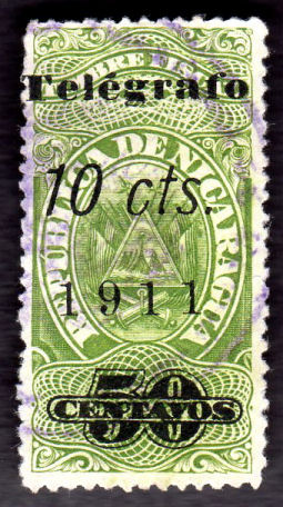
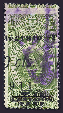
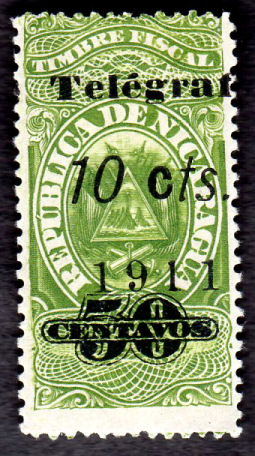
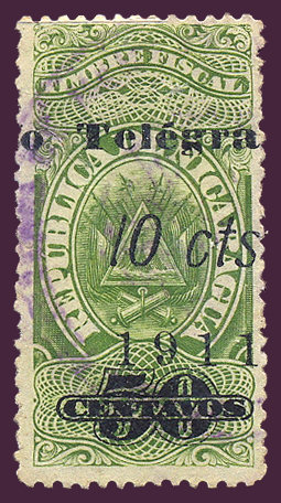
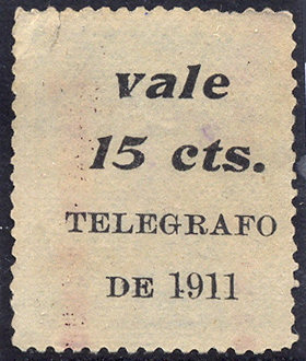
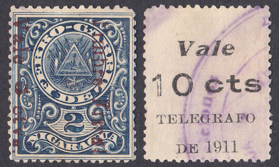
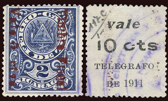
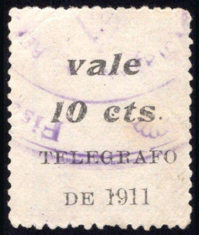
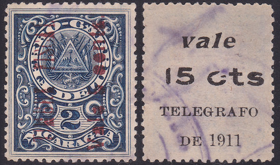
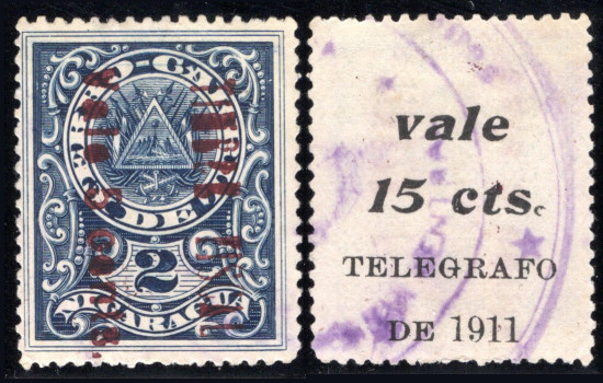
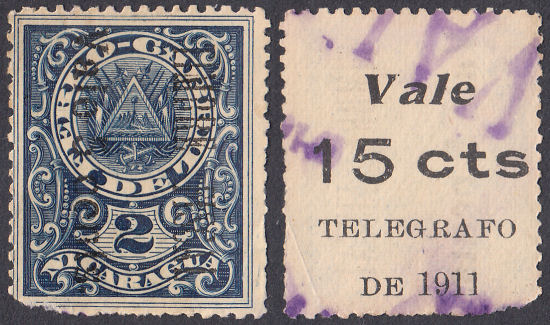
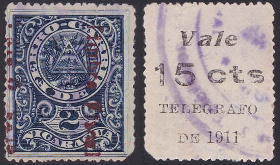
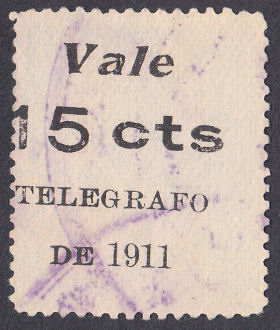
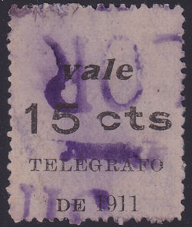
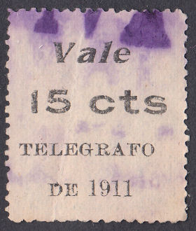
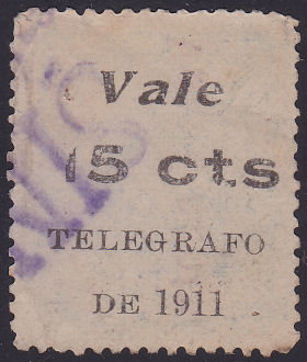
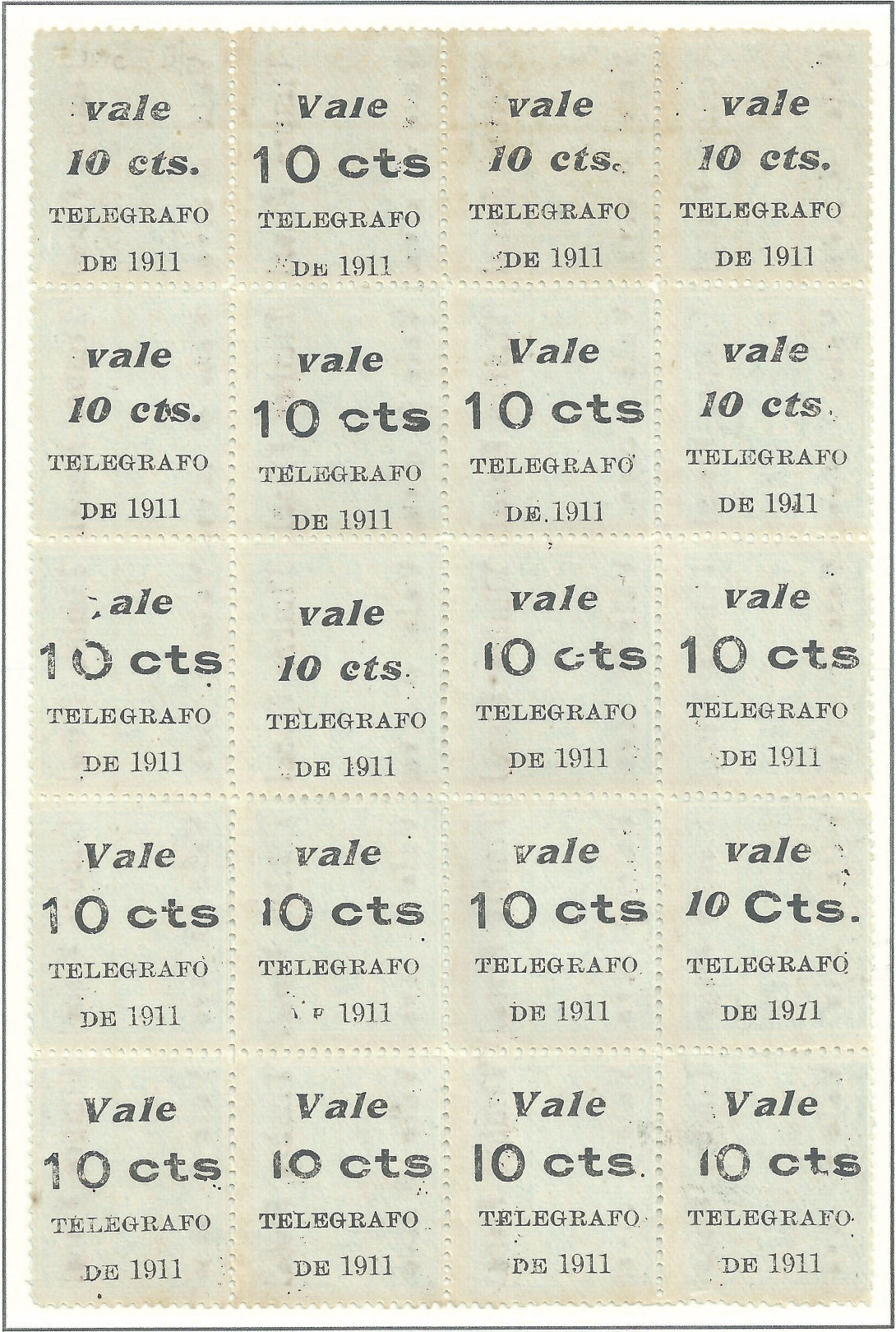
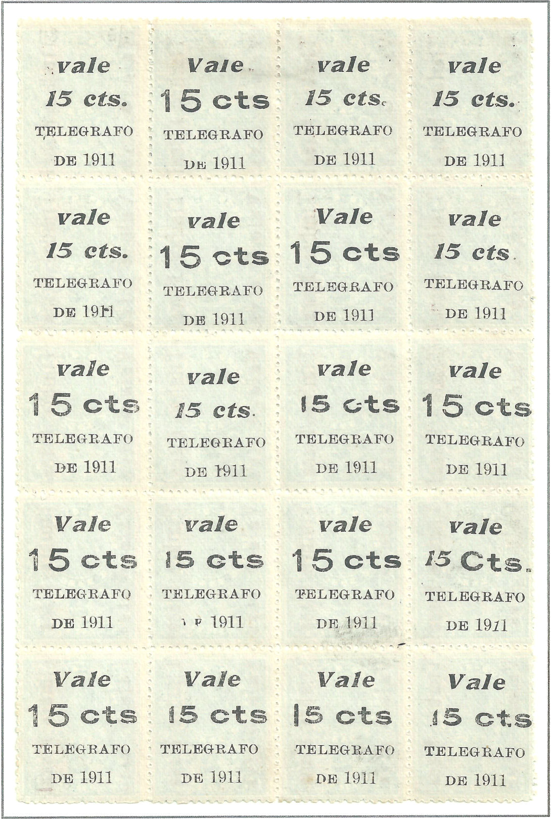
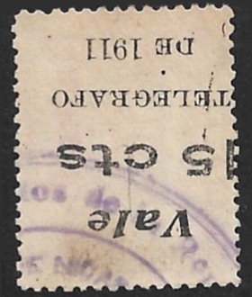
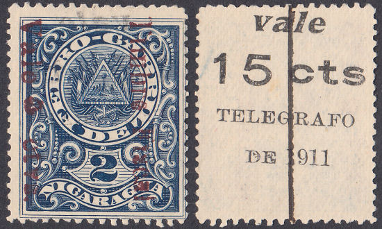
First Telegraph Provisionals (August 1911).
1911 Railway stamps surcharged for revenue purposes (around 1903) in very dark red or in black (Forbin Nos. 7 and 8) and further surcharged
as below (45) in black on the reverse of the stamp. There are many varieties of type 45 and I will illustrate the ones I can.
Printed on panes of 20 (5 rows of 4), probably from original sheets of 12x10) printed by Waterlow in 1890. Un-gummed. Wove paper. No watermark. Perf. 14.
The digits 1 and 2 on these are not a value in cents, but are the class of the tickets, first class or second class.
 |
 |
 |
 |
 |
 |
| Type 44a, 5c in red or black. | Type 44, 5c on a second class stamp. Usually reading down, but can be up. Usually dark red, but can be bright red. |
Type 44, 10c on a first class stamp. Usually reading down, but can be up. |
Type 44A, 10c only known on the 1912 Telegraph series (rare) | ||
 |
 |
 |
 |
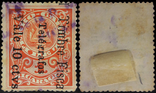
| Type 45 is printed on the back of the ticket. It can be either way up (about a third inverted), 10c or 15c in a range of fonts, often mixed, but always in black. For types with a 'B' at the bottom, see under Bluefields RH33. |
|||
 |
 |
 |
 |
 |
 |
 |
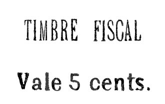 |
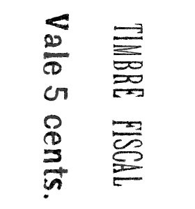
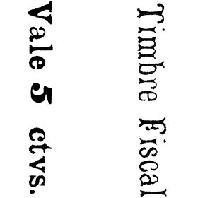
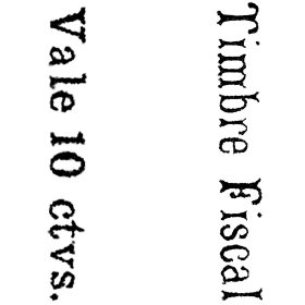
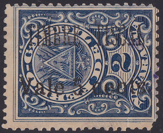
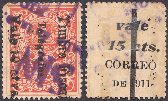
| Timbre Fiscal Vale 5 ctvs. Forbin 7 as used to define Hiscocks Type 44 (as on RH151 and RH152) |
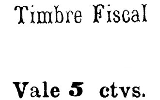
Forbin 7a with 'ctvs.' inverted. This is on 5% of the Type 44, 5c stamps. (as on RH151a and RH152c) |
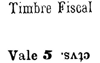
TIMBRE FISCAL Vale 5 cents. Type 44a in red (Forbin unlisted) (as on RH152a) |
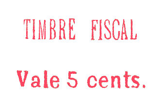
TIMBRE FISCAL Vale 5 cents. Type 44a in black (Forbin unlisted) (as on RH152b) |
I have no scans of RH153 so I do not know what style it is or if there was more than one type of it.
Can anyone supply a scan of it ?
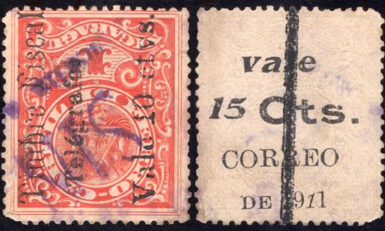
 |
 |
| RH151 - showing front and type 45 on the back | RH151 - with type 45 variant courtesy of Thomas Keesling. Small 'v' and '1', broken 'c'. |
Variants seen of the 10c overprint, with positions as viewed from the back.
|
|
 |
 |
 |
| My only example, Large 'V', large '10' Positions 13 and 17 are like this. 7 is similar with a distorted 's'. |
Thomas Keesling example Small 'v' and '1', broken 'c'. This is position 11. |
Small 'v' and '10', italic 'cts'. courtesy of Moreland Revenue Stamps. Positions 8 and 10 are like this. 1, 3, 4, 5 are similar with a larger stop. |
Small 'v', large '10', normal 'cts'. courtesy of Moreland Revenue Stamps. This is position 12. |
Centring is variable This is more extreme than usual. Image courtesy of Rolf Lamprecht. |
For the 15c value, the 10c plate was altered, changing '0' to '5' so that the pattern of variations are largely the same. Again, positions as viewed from the back.
For similar items with 'B' below 'DE 1911' see under Bluefields.
 |
 |
 |
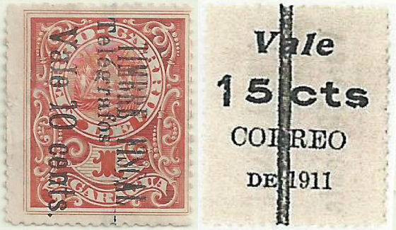
| RH152 - about 34% of these have Type 45 inverted, relative to the front. 'l' in 'Vale' cut short and 'DE' shorn off, position 2. |
*RH152a - showing front and back. Large '15', small 'v', positions 9, 12 and 15 are like this, 6 is similar but with damage to the 'c' of 'cts'. |
*RH152a - reading upwards. Though most read downwards, clearly some read upwards. This is the only one I have seen, so I do not know the proportions. The proportions may be different for different types. Position 11. |
 |
 |
 |
| *RH152a - showing front and back. Small '15', small 'v', broken period. Position 3. Courtesy of Steve Moreland |
*RH152b - showing front and back. large 'V' and '15' exist at positions 2, 7, 13 and 17. | *RH152c (inverted 'ctvs.' - showing front and back. Position 17. |
Variants, just showing backs, seen of the 15c overprint, with positions as viewed from the back.
 |
 |
 |
 |
 |
| Commonest - Large 'V', large '15'. Positions 7, 13 and 17 are like this. |
Small 'v', large '15' with part of 'c' missing. Position 6. |
Large 'V', medium '15' Position 18. |
Position 20. Similar to last but top of '1' in '15' is more sloping. |
Large 'V', mixed '15' Position 19. |
 |
 |
|
 |
 |
| Small 'v', large '15' Positions 9,12,and 15. 6 is similar with damage to 'c'. |
Small 'v', medium '15', broken 'c'. Position 11. |
Small 'v', italic '15 cts' with a clear stop '.' at the end. Positions 1, 4 and 5. |
As last but a very feint stop. Positions 3, 8 and 10. From RL. |
Small italic '15', large 'C' and italic '1' in '1911'. Position 16. From RL. |
|
 |
 |
| Large 'V' and '15' but shorn off 'l' in 'Vale' and 'DE'. Position 2. |
small 'v' and '15', with damaged '1' and 'DE' mostly missing. Position 14. |
small 'v' and large '15', flattened bottom to 's'. Position 15. |
A further complication is that the fiscal overprint also has varieties.
For example, the last stamp in the pane of 20 (as viewed from the front, 17 from the back) has 'ctvs.' inverted (Forbin 7a).
Neal West illustrates these sheets of 10c and 15c on his eighth pdf file (see above).
I am not sure what is going on with the 10c position 9, perhaps a one-off variety ?
Anyone have another example of it ?
Talking about "one-off varieties", Harry Patsalos sent me these images
with much of the "Vale 5" missing from the fiscal overprint :
The distinctive "15" gives this as ostensibly position 15.
I have two from that position, neither having the flaw. However this has the back overprint inverted relative to the front, so it would be effectively position 2.
For that position I have two normal and another two inverted. None of those have the flaw either. The flaw is clearly not constant, though there may be other similar ones.
Cancels found on these.
These are generally one of two types that are generally hard to make out due to size and being smudged and blurry.
These are found on most (if not all) individual stamps, as well as complete sheets. It may be that most examples on the market are cancelled remainders.
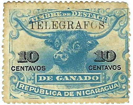
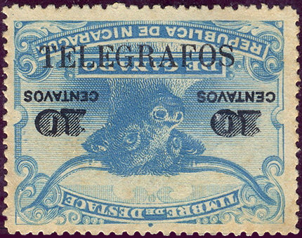
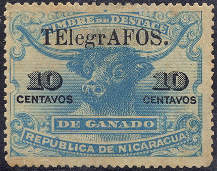
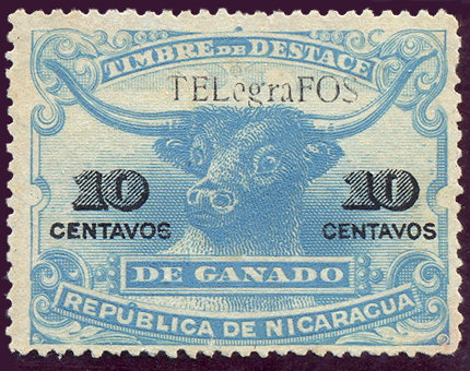
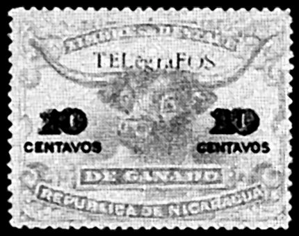
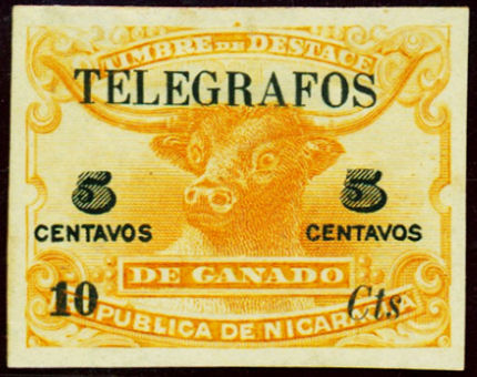
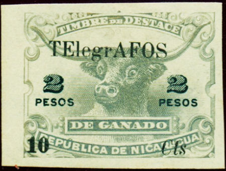
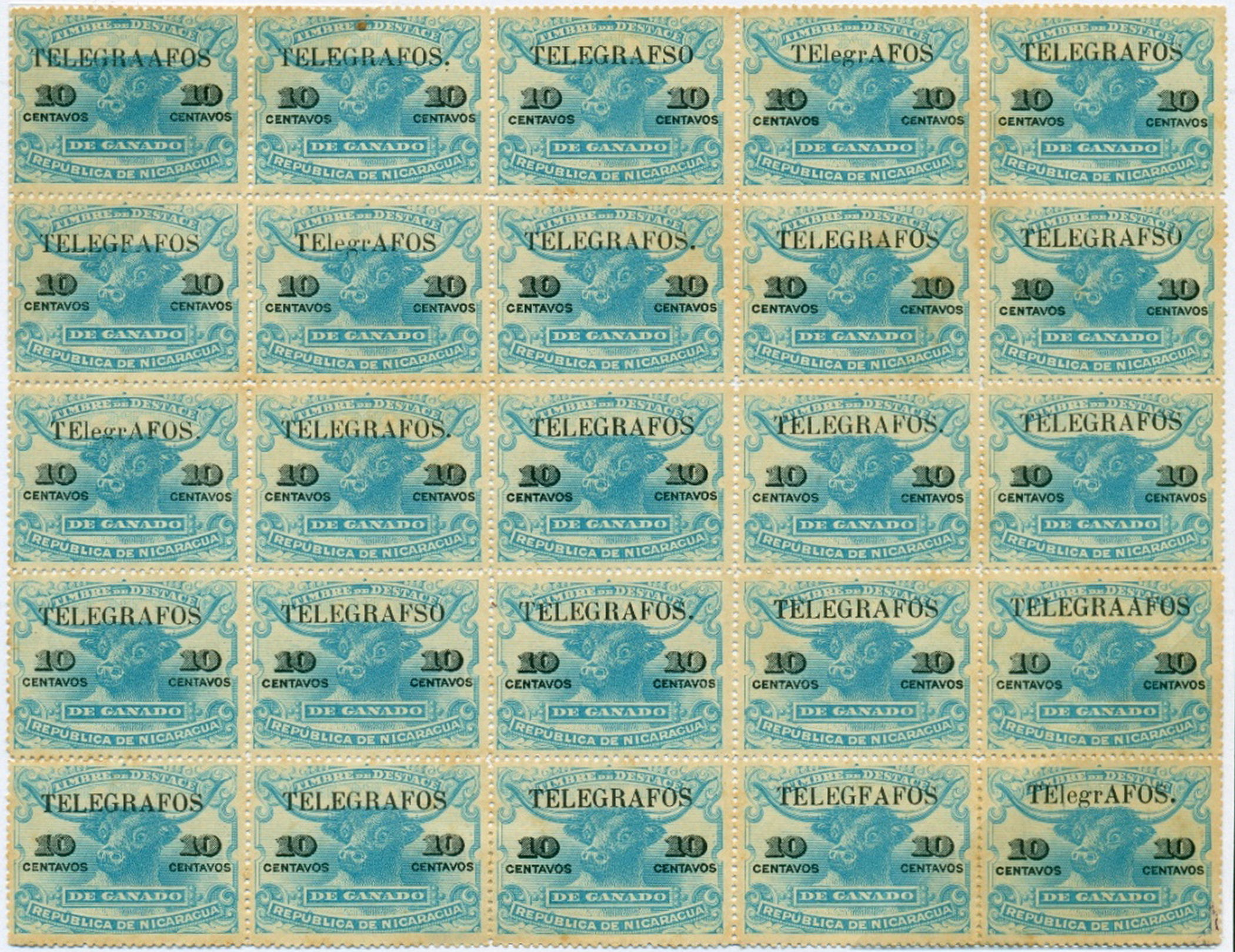
1911 'Destace de Ganado' (Butchery of Livestock) revenue stamps (Forbin 1, 3 and one unlisted) in colours stated but all with original values in black,
overprinted 'TELEGRAFOS' in black as indicated and, in most cases, further surcharged in black.
White wove paper. No watermark. Perf. 11½, 14 or imperf.
 |
 |
 |
 |
| H154 'Normal' - variant 1 (20.5 x 2.2mm) courtesy of Dick Keiser |
H154 'Normal' - variant 2 (23.5 x 2.7mm), inverted from RL. This has large letters and is missing the '.' at the end. I am not convinced that it is a genuine overprint. |
H154 'Normal' - variant 3 (23.7 x 2.8mm) + '.' from RL. |
H154 'Normal' - variant 3 (23.5 x 2.7mm) + '.', inverted courtesy of Dick Keiser |
 |
 |
 |
| H154a - 'TELEGRAFSO' from RL. |
H154b - 'TELEGFAFOS' from RL. |
H154d - 'TELEGRAAFOS' from RL. |
 |
 |
 |
| H154f - 'TElegrAFOS' from RL. |
*H154e (or H154g) - 'TELegraFOS' - (14.86 x 2.03mm) from RL. |
Hiscocks illustration of *H154g. - (14.86 x 2.07mm) the sizes on this and last ignore the tail of the 'g'. |
 |
 |
 |
| Types 47 taken from Hiscocks, page 214 | H155. Courtesy of Courtney Hess. | H157a. Courtesy of Courtney Hess. |
| RH # | Hisc. | Type. | Description | Mint | Used |
|---|---|---|---|---|---|
| RH154 | H154 | 46 | 10c pale blue (Perf.14) | 15.00 | 10.00 |
| RH154a | H154a | error 'TELEGRAFSO' | 30.00 | 20.00 | |
| RH154b | H154b | error 'TELEGFAFOS' | 30.00 | 20.00 | |
| RH154c | H154c | error 'TELegrAFOS' | 30.00 | 20.00 | |
| RH154d | H154d | error 'TELEGRAAFOS' | 30.00 | 20.00 | |
| - | *H154e | error 'TELegraFOS' | 20.00 | 15.00 | |
| RH154f | H154f | error 'TElegrAFOS' | 30.00 | 20.00 | |
| - | *H154g | error 'TELegraFOS' (in smaller type — 46A) | 30.00 | 20.00 | |
| ƒRH155 | - | 46, 47 | 10c on 5c pale orange (Perf.11½) | - | - |
| RH155a | H155 | 46, 47 | imperf | 125.00 | 125.00 |
| RH156 | H156 | 46, 47 | 10c on 50c yellow-green (Perf.11½) | 75.00 | 75.00 |
| RH157 | H157 | 46, 47 | 10c on 2p grey (imperf.) | 125.00 | 125.00 |
| RH157c | H157a | error 'TElegrAFOS' | 150.00 | 150.00 | |
| RH157h | H157b | '19 cts' for '10 cts' | 250.00 | 250.00 | |
| ƒRH157J | - | 46 | 20c carmine (Perf.11½) | - | - |
| ƒRH157K | - | 46 | 1p yellow-brown (Perf.11½) | - | - |
Hiscocks added the following note:
| Note. It is not clear whether No. 154(g), which I have, is the same as No. 154(e) which I have not seen. Letters on No. 154(g) are 1¾mm (46A) as compared with 2¾mm for all others I have seen. |
My note: Hiscocks implied that these were all Perf.14, but Forbin implies all Perf. 12.
The images of 154 and 154g above appear to be about Perf.14, but the images of 20c, 50c and 1p that I have seen are about 11½.
More information is needed.
ƒRH157J and RH157K have been added since they are known overprinted "CABO" and presumably exist/existed without it.
Each of the types having type 46 overprint exist/existed with the same varieties given for RH154. Use the same suffix letter for them.
The basic Ganado stamp was printed in sheets of 5 x 5. Clayton Rubec has shown me a sheet of H154, but there is a complication
that Hiscocks did not address. Some have a stop on the end, others do not. Also *there is no H154e or H154g on it so I presume they are bogus overprints.
Having said that, there may have been more than one setting used for these overprints, see note below RH4di under CABO below.
Here is a diagram of the varieties in the sheet, I have added 'o' where there is an extra stop on the end :
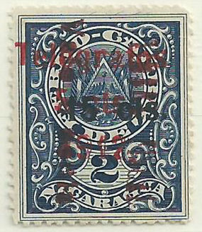
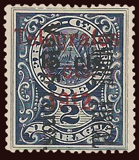
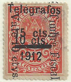
1912 As for Nos. 144-148 above but surcharged as indicated in black.
(These are chronologically out of sequence, they should be further down, but for the time being at least, I will leave them here to preserve Hiscocks numbering sequence.)
 |
 |
 |
 |
 |
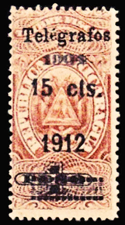 |
| Hiscocks Type 48 is made of 2 parts that vary in relative position. In RH159A the "1912" is also lower relative to the "Telégrafos" |
RH158 courtesy of Courtney Hess | RH158a courtesy of Alan Slater | RH159 courtesy of Alan Slater | RH159Ab courtesy of Courtney Hess | |
RH159A is on a fiscal stamp that had been given a 1904 overprint. It is possible that the 50c also exists like that. Anyone have one ?
| RH # | Hisc. | Type. | Description | Mint | Used |
|---|---|---|---|---|---|
| RH158 | H158 | 43, 48 | 15c on 50c dark green | 5.00 | 3.75 |
| RH158a | - | no accent on second 'e' | - | - | |
| RH159 | H159 | 43, 48 | 15c on 1p brown | 5.00 | 3.75 |
| RH159a | - | no accent on second 'e' | - | - | |
| RH159A | - | (43), 48 | 15c on 1p brown with "1904" | - | - |
| RH159Aa | - | no accent on second 'e' | - | - | |
| RH159Ab | - | small 'é' | - | - |
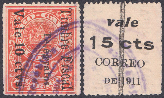
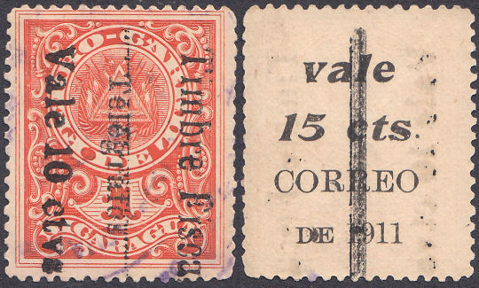
Second Telegraph Provisionals (Late 1911).
Late 1911 Fiscal stamps of 1903 (Types 44/44a as above) that had 'Correos' overprints on the back, were overprinted
'Telégrafos' as below (Type 49) on the front and a bar on the back to delete Correos usage and 15c (the value reverts to 10c).
Below are images of the constant varieties in positions 11, 12, 18 and 20 derived from the Exhibit of Neal West.
 |
 |
| Type 49 - Position 11, broken bottom of "g" in "Telégrafos". | Type 49 - Position 12, broken bottom of "r" in "Telégrafos". |
 |
 |
| Type 49 - Position 18, smaller, raised "f" in "Telégrafos". | Type 49 - Position 20, broken bottom of first "e" in "Telégrafos". |
The bar runs from the top row to the bottom row of the pane of 20, but is a little short leaving spaces at the ends.
As in the 1911 issue, there are two types of fiscal overprint and many types of the overprint on the back.
In addition, stocks were running out and, even what would otherwise have been printers waste, was utilized.
With 3 overprints, there are many permutations of errors and varieties. There are also multiple types of the 'CORREO' overprint.
 |
 |
 |
| Type 49 - Usually reading down. | RH160 variant front and back. '15' different fonts. |
RH160 variant front and back. Small '15 cts' italic. Stamps 1-6. The short bar indicates that this is from the top row of a pane of 20. |
 |
 |
 |
| RH160 variant front and back. large stop on end of italic 'cts'. |
RH160a variant front and back. Inverted like some of RH152. Large 'C', italic '1' in '1911' - courtesy of Moreland Revenue Stamps |
RH160c front and back. Neal B. West states that these are very rare. Image courtesy of Daniel Butel. |
 |
| RH160d front and back courtesy of Neal B. West. These are very rare. |
| RH # | Hisc. | Type. | Description | Mint | Used |
|---|---|---|---|---|---|
| RH160 | H160 | 44, 49 | 10c on 15c on '1' red | 2.00 | 1.25 |
| RH160a | H160a | 'Telégrafos' (49) reading up | 10.00 | 2.50 | |
| RH160b | H160b | 'Telégrafos' (49) double | 25.00 | 20.00 | |
| RH160c | - | no bar on the back | - | - | |
| RH160d | - | 44a, 49 | 44a fiscal type | - | - |
Third Telegraph Provisionals (Early 1912).
Early 1912 Fiscal stamps of 1903 (Types 44/44a as above) surcharged with Type 50a and Type 50b on the blues, or Type 50c and Type 50d on the reds.
On the blues (2nd. class), the 5c overprint is usually dark red on dark red Type 44a fiscal overprint, or bright red on black Type 44a fiscal overprint.
Usually the back is blank, but they are known with Correos types (no bar).
Types 50a and 50c were applied before it was realized that what they really needed were 15c stamps, so they were overprinted 15c before issuing.
Again, printers waste was used, there are examples with the fiscal overprint on the back or Type 50a skewed.
 |
 |
 |
 |
| Type 44, in red-brown. (ctvs. inverted) | Type 50a | Type 50b This is intended to cover the '5 cts.' |
RH161a courtesy of Neal West. |
 |
|
|
 |
| Type 44a, in red. | Type 50a | Type 50b This is intended to cover the '5 cts.' |
RH162 courtesy of Neal West. |
|
|
|
 |
| Type 44a, in black. | Type 50a | Type 50b This is intended to cover the '5 cts.' |
RH162b courtesy of Neal West. |
|
 |
 |
 |
| Type 44 | Type 50c | Type 50d The bar is intended to cover the '10 cts.' |
RH163 courtesy of Neal West. |
| RH # | Hisc. | Type. | Description | Mint | Used |
|---|---|---|---|---|---|
| RH161 | H161 | 44, 50a, 50b | 15c on 5c (dark red) on '2' dark blue | 5.00 | 2.50 |
| RH161a | - | 44, 50a, 50b | 'ctvs.' inverted | - | - |
| RH162 | - | 44a, 50a, 50b | 15c on 5c (bright red) on '2' dark blue. Type 44a in red. | - | - |
| RH162a | H161a | 44a, 50a, 50b | surcharge (50a) double | 250.00 | 250.00 |
| RH162b | - | 44a, 50a, 50b | Type 44a in black | - | - |
| RH163 | H162 | 44, 50c, 50d | 15c on 10c on '1' red | 7.50 | 2.50 |
| RH163a | H164? | 44, 50c, 50d | with 'Vale/15cts/Correo de/1911' on reverse (no bar, many types, but all rare on this) | - | - |
Hiscocks added the following note:
| Note. I have not seen Nos. 160-164. Descriptions in earlier listings are very confused and my. interpretations of them may be in error. |
My note: I have tried to correct the types in this list on the basis of examples seen.
Hiscocks listed all of 160-165 as having both 49 and 50 overprints. No such exists.
H163, H164, H165 and H165a have been removed in their original form.
1912 Fiscal stamps of 1912 (Forbin 31-34) overprinted 'Telégrafos' (49) and surcharged in black as required.
Wove paper. No watermark. Perf. 11½ (not 12½ as stated by Forbin).
Some of these are on slightly tinted paper, but it is not always apparent.
 |
 |
 |
 |
| Type 51 as used on 10c | RH166 reading upwards | *RH166a reading downwards | 10c *RH166b square stop after 'cts' |
| Usually reading upwards, but can be downwards. |
From RL. | Courtesy of Alan Slater. | |
 |
 |
 |
 |
 |
| Type 51 on other values | 10c on 25c RH167 | 10c on 25c RH167a small '0' in '10' | 10c on 50c RH168 | 10c on 50c RH168b |
| Cannot read downwards unless the whole thing is inverted. |
One of mine. | Courtesy of Alan Slater. | One of mine. | From RL |
| RH # | Hisc. | Type. | Description | Mint | Used |
|---|---|---|---|---|---|
| RH166 | H166 | 51 | 10c yellow-green | 3.75 | 2.50 |
| *RH166a | - | reading downwards | - | - | |
| *RH166b | - | square stop after 'cts' | - | - | |
| RH167 | H167 | 51 | 10c on 25c carmine / green | 2.50 | 1.50 |
| RH167a | H167a | small '0' in '10' | 7.50 | 5.00 | |
| RH168 | H168 | 51 | 10c on 50c brown-red / blue | 2.50 | 0.30 |
| RH168a | H168a | small '0' in '10' | 7.50 | 5.00 | |
| *RH168b | - | malformed '1' in '10' | 7.50 | 5.00 | |
| RH169 | H169 | 51 | 10c on 1p dark blue | 2.50 | 1.50 |
| RH169a | H169a | small '0' in '10' | 7.50 | 5.00 | |
| *RH169b | - | malformed '1' in '10' | 7.50 | 5.00 |
* I have added these due to the examples shown above.
1912 As above but overprinted 'Telégrafos' and '1912' in black.
The "Telégrafos" overprint is similar to Type 48 on H158/H159, but larger.
Hiscocks Type 52. The 15c violet was produced from Forbin 30, a 5c stamp, and modifies by the addition of the '1'.
RH170 normal and with dropped '1', with (RH171 and RH172) courtesy of Benjamin Singer.
*The RH170 with '1' of '15' is significantly misplaced is courtesy of Alan Slater, Alan says this is not constant.
However this pair suggests that it is not just a 'one-off', so I will list it as *RH170a. This image courtesy of Paul & Les Bottomley.
| RH # | Hisc. | Type. | Description | Mint | Used |
|---|---|---|---|---|---|
| RH170 | H170 | 52 | 15c violet | 5.00 | 5.00 |
| *RH170a | - | Misplaced '1' in '15' | 7.00 | 7.00 | |
| RH171 | H171 | 52 | 15c on 10c yellow-green | 5.00 | 5.00 |
| RH172 | H172 | 52 | 15c on 50c brown-red / blue | 5.00 | 5.00 |
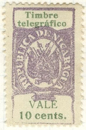
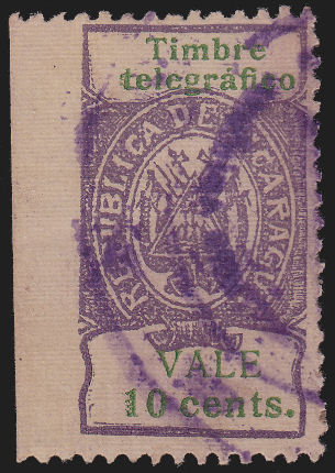
1912 As above but overprinted 'TIMBRE TELEGRAFICO' horizontally in black.
These were in sheets having 4 rows of 5 stamps, perforated between. Thus 6 out of 20 are perforated all around.
That does not seem to be true for some of the similar stamps above.
 |
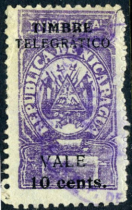 |
| Hiscocks type 53 (RH173) Courtesy of Paul & Les Bottomley. |
Hiscocks RH173a From Wikimedia Commons* |
* The description says "One per sheet of 20".
| RH # | Hisc. | Type. | Description | Mint | Used |
|---|---|---|---|---|---|
| RH173 | H173 | (53) | 10c violet / blue | 2.50 | 2.50 |
| RH173a | H173a | error 'TELEGRATICO' | 15.00 | 15.00 |
Hiscocks added the following note:
| Note. Illustrations for Nos. 173-176 have not, unfortunately, become available before going to press. Illustration numbers 53, 54 and 55 have been allocated for a future edition. |
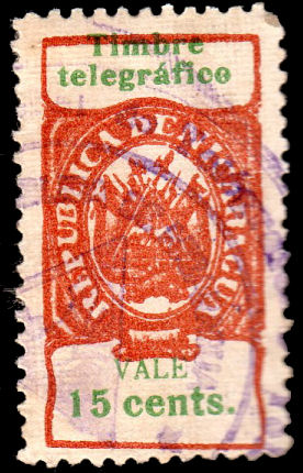
1912 Similar to above but inscribed 'Timbre Telegrafico'.
 |
 |
 |
| 10c RH174 | 10c RH174 | 15c RH175 courtesy Alan Slater. |
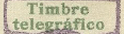
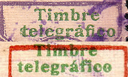
* For evidence of this, see RH180c below.
1912 As above but overprinted 'Tbre Telegráfico'.
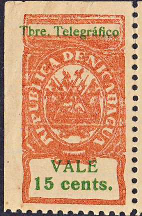 |
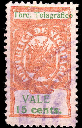 |
| 15c RH176. | RH176a 'Telagráfico' courtesy Alan Slater. |
Hiscocks type 55
| RH # | Hisc. | Type. | Description | Mint | Used |
|---|---|---|---|---|---|
| RH176 | H176 | (55) | 15c yellow-brown and green | 2.50 | 2.00 |
| RH176a | H176a | error 'Telagráfico' | 15.00 | 15.00 |
1913 As above but values in 'cts Córdoba'.
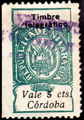 |
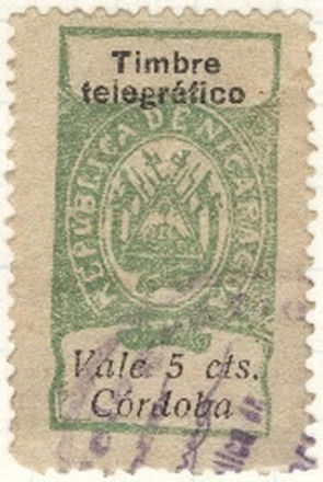 |
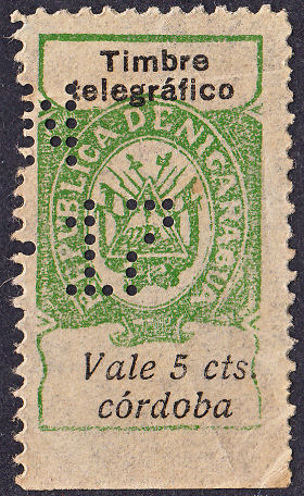 |
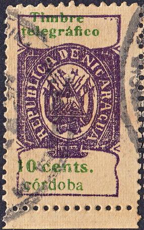 |
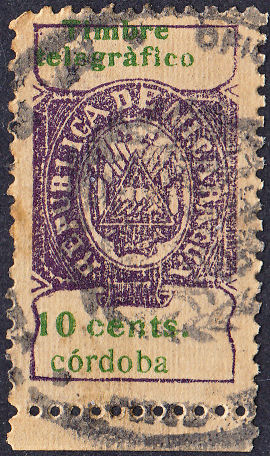 |
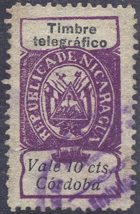 |
 |
 |
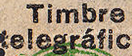 |
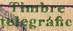 |
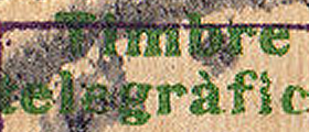 |
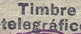 |
| RH177 courtesy Alan Slater | *RH177a (italic '5' and large 'C' in 'córdoba') |
*RH177b (italic '5' and small 'c' in 'córdoba') |
RH178 | *RH178a ('à' in 'telegràfico') | RH179 from RL |
1919 No. 176 surcharged as indicated in black.
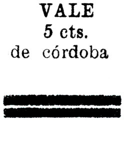 |
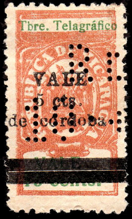 |
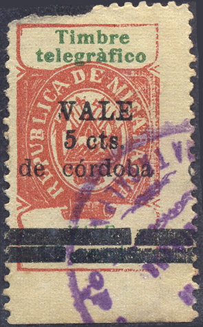 |
| Type 57 | *RH180a courtesy of Alan Slater | *RH180c from RL |
| RH # | Hisc. | Type. | Description | Mint | Used |
|---|---|---|---|---|---|
| RH180 | H180 | 57 | 5c on 15c yellow-brown and green | 50.00 | 40.00 |
| *RH180a | - | error 'Telagráfico' | - | - | |
| *RH180b | - | on RH175 instead | - | - | |
| *RH180c | - | as RH180b but with à for á | - | - |
* I have added these due to the examples shown above.
1921 Official postage stamps of 1913 (SG O361-O364) surcharged as below in carmine.
White wove paper. No watermark. Perf. 14.
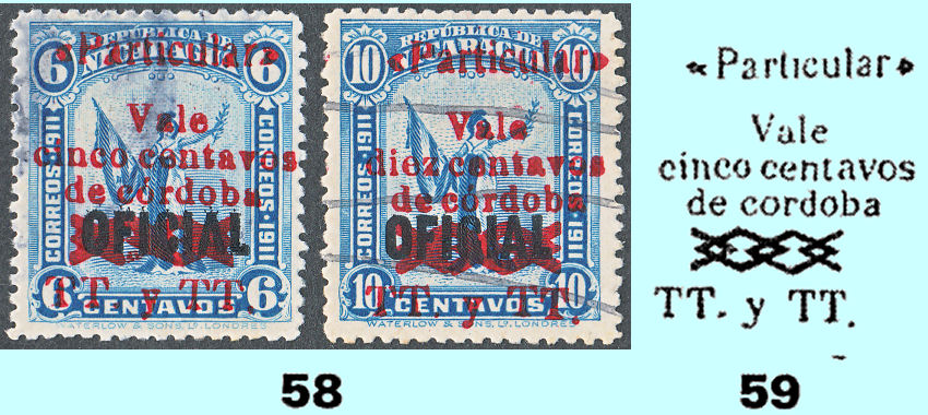
RH181 and RH184 as in Hiscocks' book, page 216.
Varieties and other examples:
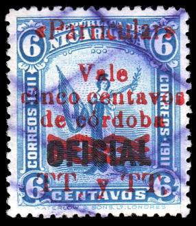 |
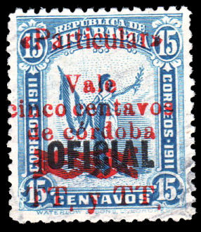 |
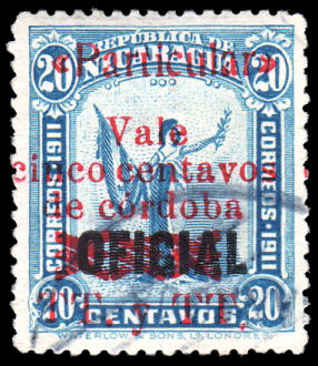 |
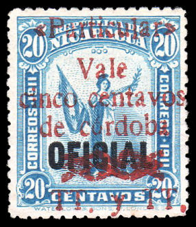 |
| 5c on 6c *RH181a 'Parricular' | 5c on 15c RH182 | *RH183a 'Parricular' | 5c on 20c *RH183b larger surcharge |
| Courtesy of Alan Slater. | |||
| RH # | Hisc. | Type. | Description | Mint | Used |
|---|---|---|---|---|---|
| RH181 | H181 | 58, 59 | 5c on 6c blue | 20.00 | 2.50 |
| *RH181a | - | error 'Parricular' for 'Particular' | - | - | |
| ƒRH181b | - | double overprint | - | - | |
| RH182 | H182 | 58, 59 | 5c on 15c blue | 10.00 | 2.50 |
| *RH182a | - | error 'Parricular' for 'Particular' | - | - | |
| ƒRH182b | - | double overprint | - | - | |
| RH183 | H183 | 58, 59 | 5c on 20c blue | 10.00 | 2.50 |
| *RH183a | - | error 'Parricular' for 'Particular' | - | - | |
| *RH183b | - | larger surcharge | - | - | |
| RH184 | H184 | 58, 59 | 10c on 10c blue | 10.00 | 2.50 |
| *RH184a | - | error 'Parricular' for 'Particular' | - | - |
* I have added these due to the examples shown above.
ƒ I have added RH181b and RH182b due to information received.
1921-1934? New design engraved by the American Bank Note Co. (Values in black).
White wove paper. No watermark. Perf. 12. (21½x31 mm)
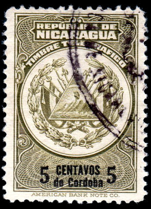 |
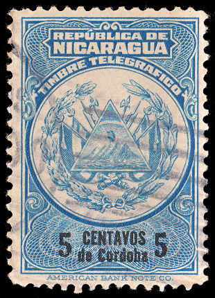 |
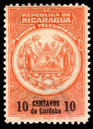 |
| 5c RH185 | 5c RH186 | 10c RH187 |
| Courtesy of Alan Slater. | One of mine. | Courtesy of Alan Slater. |
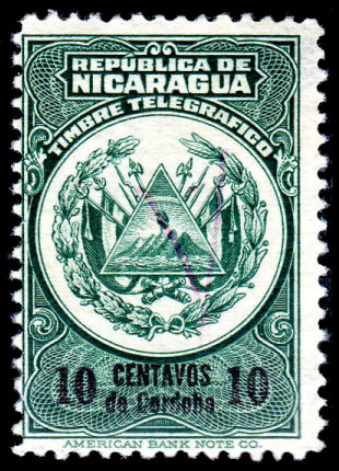 |
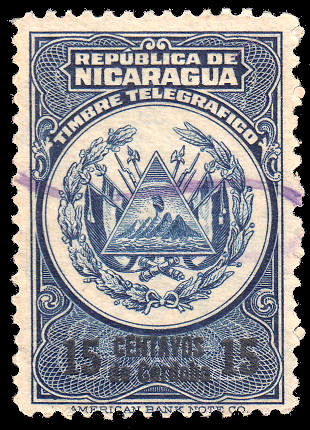 |
| 10c RH188 | 15c RH189 |
| Courtesy of Alan Slater. | One of mine. |
Hiscocks Type 60
| RH # | Hisc. | Type. | Small-size Description | Mint | Used |
|---|---|---|---|---|---|
| RH185 | H185 | 60 | 5c olive and black | 3.75 | 2.50 |
| RH186 | H186 | 60 | 5c blue and black | 3.75 | 2.50 |
| RH187 | H187 | 60 | 10c orange and black | 5.00 | 3.75 |
| RH188 | H188 | 60 | 10c dark green and black | 5.00 | 3.75 |
| RH189 | H190 | 60 | 15c dark blue and black | 5.00 | 3.75 |
These are in the correct chronological sequence for each value, but actual dates are currently unknown.
1925? Type 60N This is very similar to Type 60 but the design is physically larger. Perf.12, (22x32 mm)
The frame is about 4% taller and 1% wider. I suspect that it is the result of a change from a flatbed to rotary press for printing.
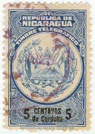 |
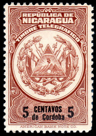 |
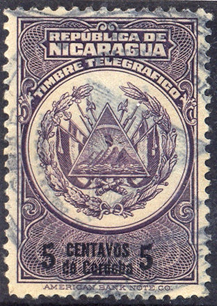 |
| Type 60N 5c RH190 dated 1925 | Type 60N 5c RH190A | Type 60N 5c RH190B |
| Courtesy of Clayton Rubec. | Courtesy of Alan Slater. | From RL. |
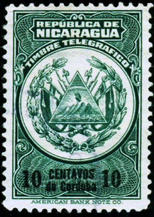 |
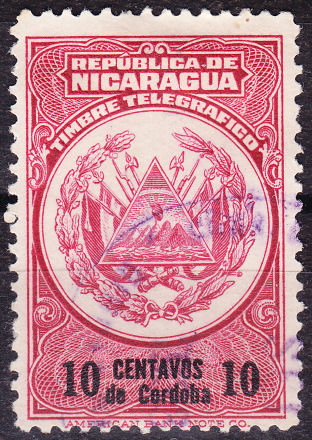 |
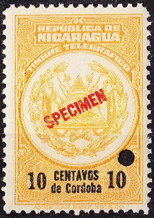 |
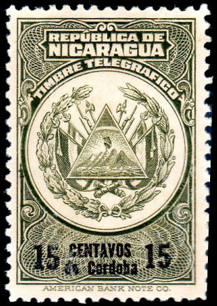 |
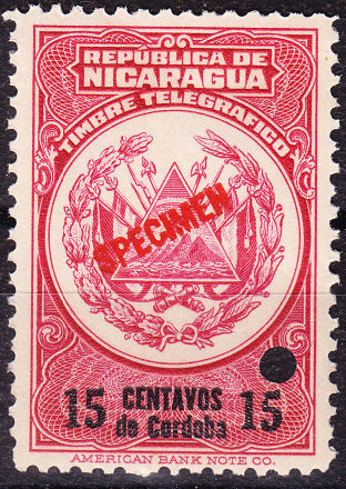 |
| Type 60N 10c RH191 | Type 60N 10c RH191A | Type 60N 15c RH191B (specimen) | Type 60N 15c RH192 | Type 60N 15c RH193 (specimen) |
| Courtesy of Courtney Hess. | Courtesy of Clayton Rubec. | Courtesy of Courtney Hess. | Courtesy of Alan Slater. | Courtesy of Clayton Rubec. |
It bothers me that I have only seen RH191B and RH193 as specimens. I would really like to see evidence that they were actually issued.
Anyone have non-specimen examples ?
| RH # | Hisc. | Type. | Large Description | Mint | Used |
|---|---|---|---|---|---|
| *RH190 | - | 60N | 5c light blue and black | 5.00 | 3.00 |
| *RH190A | - | 60N | 5c red-brown and black | 5.00 | 3.00 |
| *RH190B | - | 60N | 5c violet and black | 5.00 | 3.00 |
| *RH191 | - | 60N | 10c dark green and black | 15.00 | 5.00 |
| ƒRH191A | H189 | 60N | 10c carmine and black | 15.00 | 5.00 |
| *RH191B | - | 60N | 10c yellow and black | 15.00 | 5.00 |
| *RH192 | - | 60N | 15c olive and black | 20.00 | 10.00 |
| RH193 | H191 | 60N | 15c carmine and black | 20.00 | 10.00 |
* I have added these due to the examples shown above.
ƒ This was previously listed as the small format. I have moved it and re-numbered due to RH212a.
These may not currently be in the correct chronological sequence for each value. The first 5c was blue and the first 10c was dark green, but the rest is uncertain.
The changes of colour are almost certainly due to limits on the validity of each, possibly two years. I have put them in what I think is the correct order.
Used examples with the year clearly visible would be very useful in establishing a sequence. I may then need to renumber (again).
1923 Postage stamp of 1914 (SG 399) overprinted 'TT' as indicated in red (Timbre Telegráfico, see type 64/5).
White wove paper. No watermark. Perf. 12.
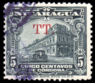
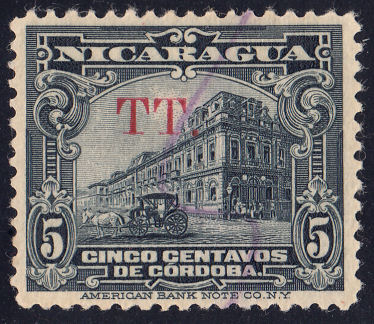
Type 61 As Hiscocks book, page 217. There seems to be some variation of the overprint.
The left stamp courtesy of Alan Slater. On the right is one of mine.
| RH # | Hisc. | Type. | Description | Mint | Used |
|---|---|---|---|---|---|
| RH194 | H192 | 61 | 5c deep bluish grey | 7.50 | 1.50 |
1923? As RH186, above but overprinted 'R. de T.' ("Reconstrucción de Telégrafos") as indicated in black.
This was for use as a Telegraph Tax Stamp.
 |
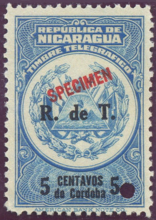 |
| Type 62A | RH195 Specimen |
| My attempt at rendering | from RL |
Type 62A
| RH # | Hisc. | Type. | Description | Mint | Used |
|---|---|---|---|---|---|
| *RH195 | - | 60N, 62A | 5c blue (RH186) | 15.00 | 15.00 |
* Added due to Specimen shown and subsequent postal overprints, but I have not seen it used telegraphically.
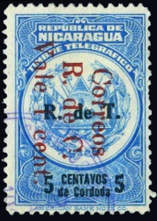
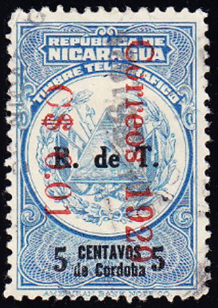
A couple of examples of RH195 overprinted for Postal use, courtesy of Courtney Hess.
1924 As RH185, RH186 and RH190, above but overprinted 'R. de C.' ("Reconstrucción de Communicaciones") as indicated in black.
 |
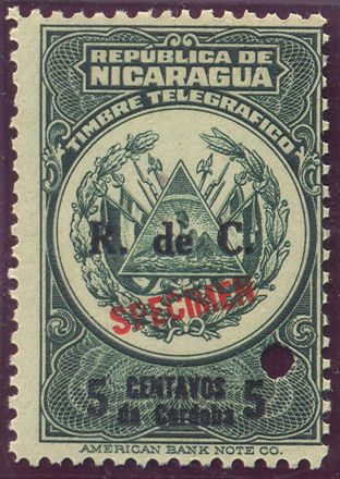 |
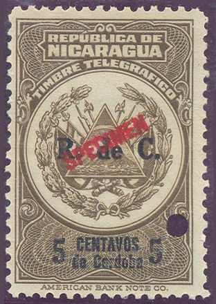 |
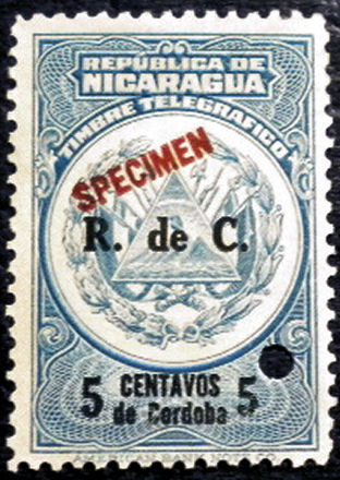 |
 |
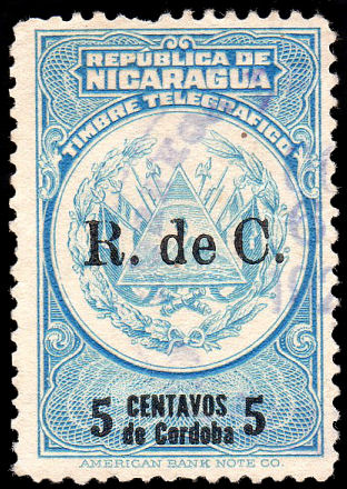 |
| Type 62 | 5c RH196 specimen | 5c *RH197 specimen | 5c *RH197A specimen | Type 62B | 5c *RH198 |
| My attempt at rendering | From RL. |
Courtesy of Courtney Hess. | My attempt at rendering | Courtesy of Alan Slater. | |
I have only seen Type 62 on Specimens so far, so it may have been replaced by Type 62B for the issued stamps.
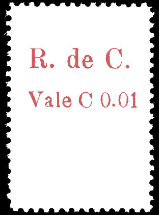 |
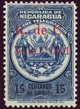 |
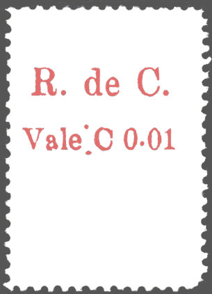 |
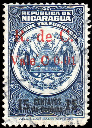 |
| Type 62Ba | 1c on 15c *RH199 | Type 62Bb | 1c on 15c *RH199a |
| My attempt at rendering | From RL. | My attempt at rendering | Courtesy of Alan Slater. |
| RH # | Hisc. | Type. | Description | Mint | Used |
|---|---|---|---|---|---|
| RH196 | H193 | 60N, 62 | 5c dark green (B) | 5.00 | 2.50 |
| *RH197 | - | 60N, 62 | olive-brown (RH185, B) | 10.00 | 5.00 |
| *RH197A | - | 60N, 62 | light blue (B) | 10.00 | 5.00 |
| *RH198 | - | 60N, 62B | light blue (B) | 10.00 | 5.00 |
| *RH199 | - | 60, 62Ba | 1c on 15c dark blue (R) | 10.00 | 5.00 |
| *RH199a | - | 60, 62Bb | overprint 62Bb | 10.00 | 5.00 |
* I have added these due to the examples seen or shown.
Hiscocks added the following note:
| Note. This was an obligatory tax stamp to finance the rebuilding of the main Post Office in Managua which burned down April, 1921 and was replaced in 1930. |
1927 (large format) As above but overprinted as indicated.
 |
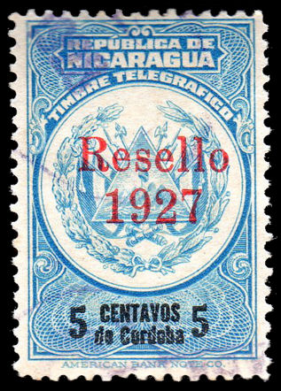 |
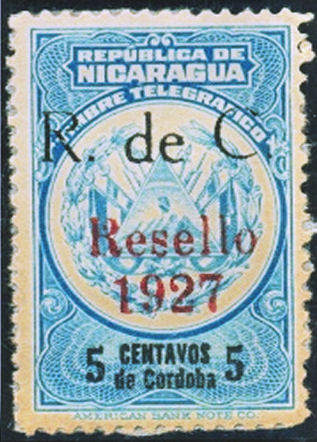 |
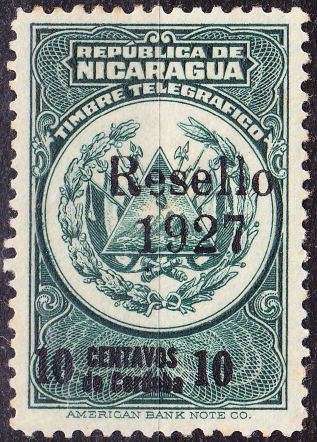 |
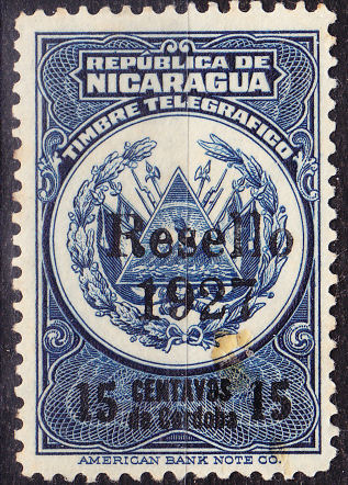 |
| Type 62C | 5c *RH200 | 5c *RH200a | 5c *RH201 | 5c *RH202 |
| My attempt at rendering | Courtesy of Alan Slater. | Courtesy of Courtney Hess. | Courtesy of Clayton Rubec. | Courtesy of Clayton Rubec. |
The type of "R. de C." overprint on RH200a appears to be otherwise unknown, but the Resello overprint has be lowered to make way for it.
| RH # | Hisc. | Type. | Description | Mint | Used |
|---|---|---|---|---|---|
| *RH200 | - | 60N, 62C | 5c blue (R) | 10.00 | 5.00 |
| *RH200a | - | 60N, 62C | together with "R. de C." | - | - |
| *RH201 | - | 60N, 62C | 10c dark green and black (B) | 15.00 | 7.50 |
| *RH202 | - | 60N, 62C | 15c dark blue and black (B) | 15.00 | 7.50 |
* I have added these due to the examples shown.
1928 As above but overprinted as indicated.
 |
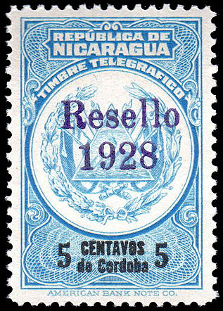 |
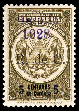 |
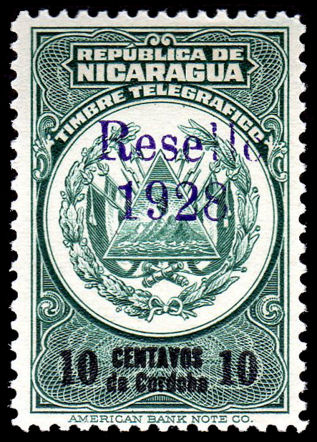 |
| Type 62D | 5c *H203 | 5c (on RH200) *H204 | 10c *H205 |
| My attempt at rendering | Courtesy of Alan Slater. | ||
| RH # | Hisc. | Type. | Description | Mint | Used |
|---|---|---|---|---|---|
| *RH203 | - | 60N, 62D | 5c blue (V) | 10.00 | 5.00 |
| *RH204 | - | 60, 62A, 62D | 5c olive-brown (RH200, V) | 10.00 | 5.00 |
| *RH205 | - | 60N, 62D | 10c green (V) | 10.00 | 5.00 |
* I have added these due to the examples shown.
1930 - RH188 surcharged as indicated in black.
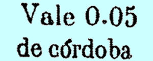 |
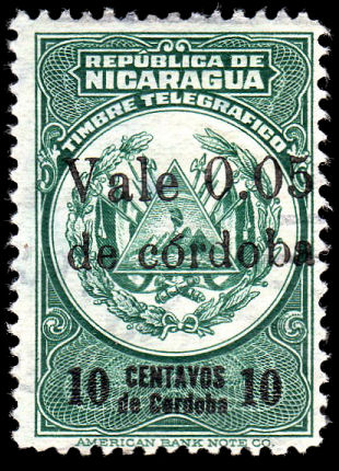 |
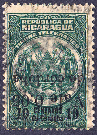 |
| Type 63 | 10c H206 | 10c *H206a (inverted surcharge) |
| From Hiscocks book | Courtesy of Alan Slater. | One of mine. |
| RH # | Hisc. | Type. | Description | Mint | Used |
|---|---|---|---|---|---|
| RH206 | H194 | 63,60 | 0.05C on 10c dark green and black | 5.00 | 2.50 |
| *RH206a | - | inverted surcharge | 50.00 | 25.00 |
* I have added this due to the example shown.
1934 Postage stamps of 1929 (SG 620 and 622), but without the control marks, overprinted "Timbre Telegráfico" in carmine.
White wove paper. No watermark. Perf. 12.
 |
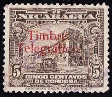 |
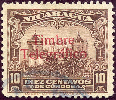 |
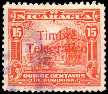 |
| Type 65 | Type 64 - RH207 courtesy of Courtney Hess. | Type 64 - RH208 from RL. | Type 64 - *RH209 courtesy of Alan Slater. |
Types 64 and 65 from Hiscocks book, page 218.
| RH # | Hisc. | Type. | Description | Mint | Used |
|---|---|---|---|---|---|
| RH207 | H195 | (64), 65 | 5c brownish grey | 15.00 | 2.00 |
| RH207a | - | (64), 65 | "R. de C." added below overprint | - | - |
| RH208 | H196 | (64), 65 | 10c brown-red | 15.00 | 3.75 |
| *RH209 | - | (64), 65 | 15c orange (R) | 20.00 | 5.00 |
* I have added this due to the example shown above.
1935 As type 60N (RH191-3) above but additionally overprinted as indicated in vermilion or blue.
 |
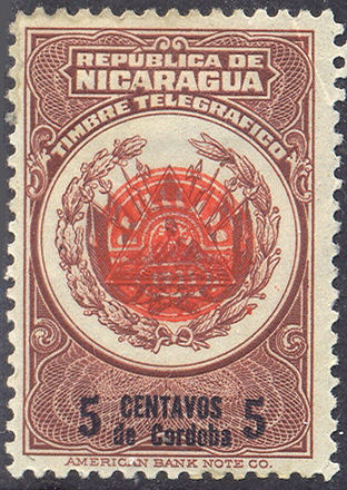 |
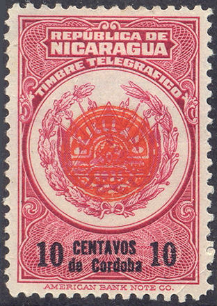 |
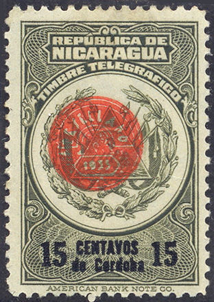 |
| Type 66 | 5c RH210 | 10c RH211 | 15c RH212 |
| From Hiscocks book, page 218 | Courtesy of Rolf Lamprecht. | ||
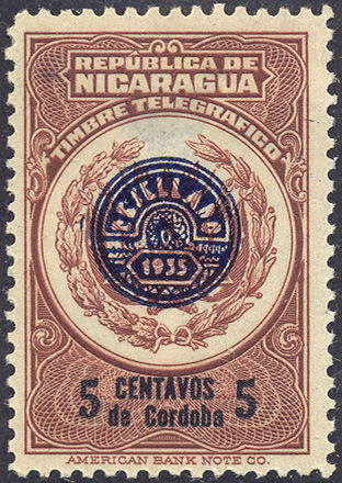 |
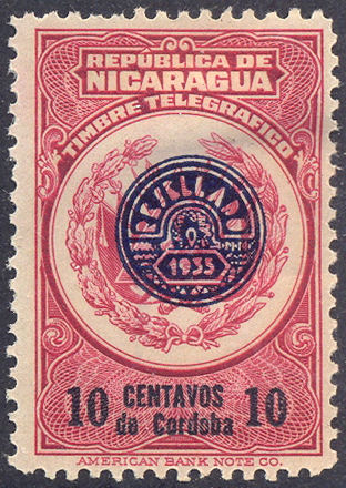 |
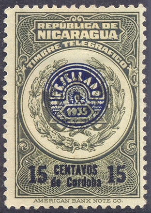 |
| 5c RH210a | 10c RH211a | 15c RH212a |
| Courtesy of Rolf Lamprecht. | ||
| RH # | Hisc. | Type. | Description | Mint | Used |
|---|---|---|---|---|---|
| RH210 | H197 | 60N, 66 | 5c red-brown and black (vermilion) | 5.00 | 7.50 |
| RH210a | H197a | overprint in blue | 10.00 | 15.00 | |
| RH211 | H198 | 60N, 66 | 10c carmine and black (vermilion) | 5.00 | 7.50 |
| RH211a | H198a | overprint in blue | 10.00 | 15.00 | |
| RH212 | H199 | 60N, 66 | 15c olive green and black (vermilion) | 5.00 | 7.50 |
| RH212a | H199a | overprint in blue | 10.00 | 15.00 |
Hiscocks added the following note:
| Note. Presumably the 'RESELLADO' overprints were analogous to the various 'RESELLO' overprints applied to postage stamps between 1927 and 1936 as a security measure to prevent the reuse of cleaned stamps. |
1935 ? As type 60 above but additionally overprinted 'COMUNICACIONES RECONSTRUCTIÓN' and 5 centavos de Cordoba.
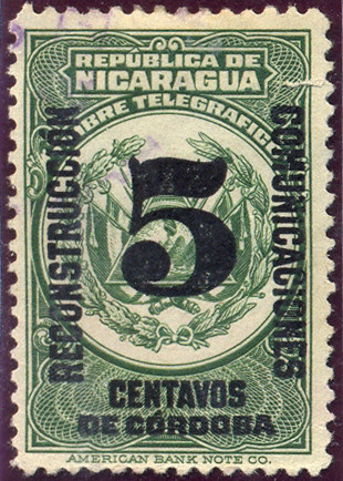
Type 66A - RH213 - from RL
1936 As above but additionally overprinted with various 1936 overprints in red as indicated.
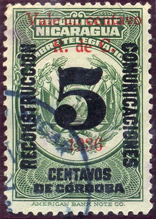
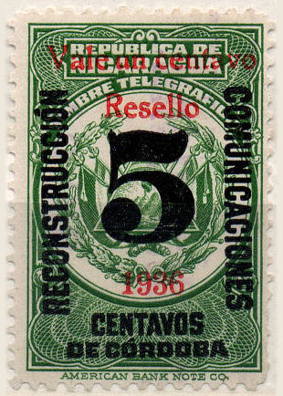
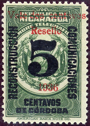
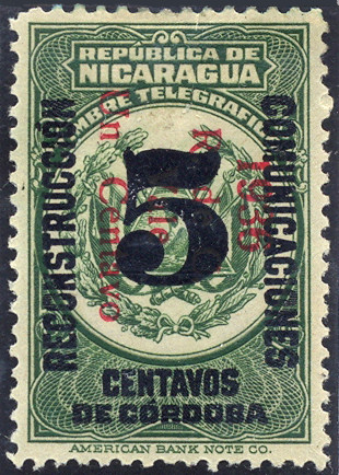
| RH # | Hisc. | Type. | Description | Mint | Used |
|---|---|---|---|---|---|
| *RH213 | - | 60, 66A | 5c green | 2.00 | 2.00 |
| *RH214 | - | 60, 66B | 1c on 5c green (red) | 2.00 | 2.00 |
| *RH215 | - | 60, 66C | 1c on 5c green (red) | 2.00 | 2.00 |
| *RH216 | - | 60, 66C | 2c on 5c green (red) | 2.00 | 2.00 |
| *RH217 | - | 60, 66D | 1c on 5c green (red) | 2.00 | 2.00 |
| sRH217a | - | 'Cenavo' | 10.00 | 10.00 | |
| sRH217b | - | 'Centavos' | 10.00 | 10.00 |
* My note: Judging by the items above, 'Resello' overprints were also applied to telegraph stamps.
s The Scott catalogue lists these (RA53) as they were required on mail also.
1939+ ? Revenue stamps (TIMBRE FISCAL) overprinted with Type 60A in red, 'Timbre Telégrafico / VALE / Diez Centavos / de Córdoba' in four lines.
Old value in black. White wove paper. No watermark. Perf. 12.
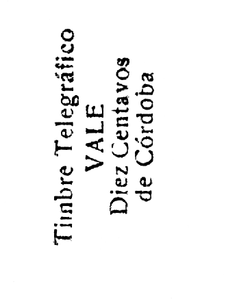 |
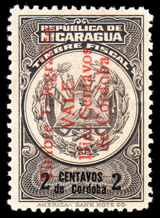 |
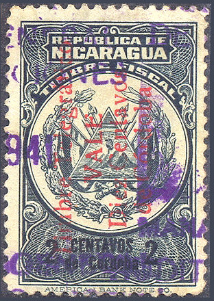 |
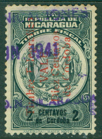 |
| Type 60A | 10c on 2c *RH218 | 10c on 2c RH219 | 10c on 2c RH220 |
| Courtesy of Alan Slater. | From RL. | Courtesy of Courtney Hess. |
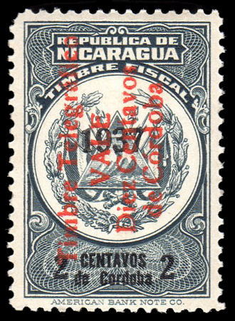 |
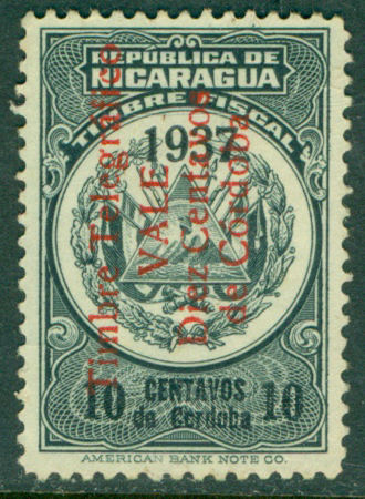 |
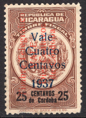 |
| 10c on 2c *RH221 1937 overprint | 10c on 2c *RH222 1937 overprint | 10c on 4c on 25c *RH223 1937 overprint |
| Courtesy of Alan Slater. | Courtesy of Courtney Hess. | Courtesy of Stephen Roche of Latin American Philatelics. |
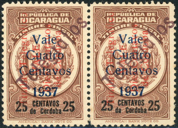 |
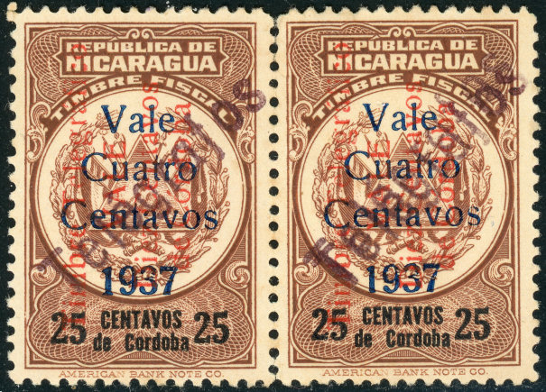 |
| 10c on 4c on 25c plus hand-stamp *RH223a (x3) and *RH223b with 1937 overprint and additional "Telegrafos" handstamps. Courtesy of Nik Oquist. | |
The hand-stamp appears to be in something like a purple-brown, which does not show up well against the brown stamp.
Perhaps it was added to clarify the red overprint which also did not show up well !
If that is the case, then it should only be found on these red-brown stanps. It has to be said that it looks a bit dubious. Stephen Roche says :
"Many fonts were developed from the 1960's onwards and the one used on this stamp does not look to me like a font that even existed in the 1930's.
The rounding of the letters lack of serifs and the tallness of the lettering make it appear to be more modern 1970's+."
| RH # | Hisc. | Type. | Description | Mint | Used |
|---|---|---|---|---|---|
| *RH218 | - | 60A | 10c on 2c brown | 15.00 | 10.00 |
| RH219 | H191A | 60A | 10c on 2c slate | 15.00 | 10.00 |
| *RH220 | - | 60A | 10c on 2c green | 15.00 | 10.00 |
| *RH221 | - | 60A | 10c on 2c slate with '1937' overprint | 15.00 | 10.00 |
| *RH222 | - | 60A | 10c on 2c green with '1937' overprint | 15.00 | 10.00 |
| *RH223 | - | 60A | 10c on 4c on 25c brown with '1937' overprint | - | - |
| *RH223a | - | 60A | with "Telegrafos" handstamp | - | - |
| *RH223b | - | 60A | with handstamp inverted | - | - |
| *RH223c | - | 60A | with handstamp doubled | - | - |
* I have added these due to the examples shown above.
Hiscocks added the following note:
| Note. This stamp has not been catalogued previously and its date is not known. The same fiscal stamp was overprinted as a postal tax stamp in 1921 and the design is virtually identical with that of the telegraph stamps of 1921-34 (Nos. 185-191) so it seems probable that it dates from this period. |
My Note: This is the larger format, the example shown is cancelled in 1941.
1938 Overprinted Resello 1938 in red.
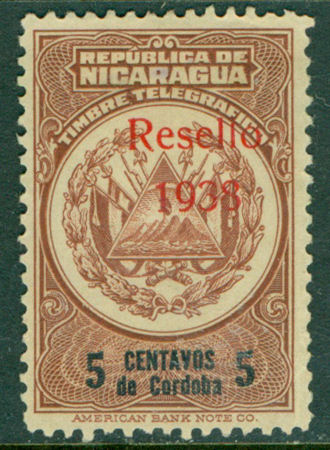 |
| 5c *RH224 Resello 1938 overprint |
| Courtesy of Courtney Hess. |
| RH # | Hisc. | Type. | Description | Mint | Used |
|---|---|---|---|---|---|
| *RH224 | - | 66E | 5c brown | - | - |
* I have added this due to the example shown above.
1949 Law of 13 October 1949. Perf.12
imprint of, the 'American Bank Note Co. NY.'
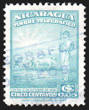
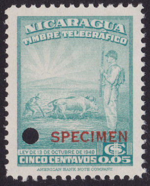
Type 66F. - used and specimen.
| RH # | Hisc. | Type. | Description | Mint | Used |
|---|---|---|---|---|---|
| *RH225 | - | 66F | 5c turquoise | 12.00 | 6.00 |
* I have added this due to the example shown above.
However, according to Clayton Rubec, this was actually a “Semana” pension revenue stamp issued in 1951.
Semana de Communicaciones (week of Communications)
The purpose of these was to raise money for the Post & Telecommunications staff pension fund.
These were obligatory on all letters, telegrams and telephone services within Nicaragua for just the second week of November from 1954 to 1970.
Each use of the service during that week was supposed to have these stamps added equal in value to the value of the service used.
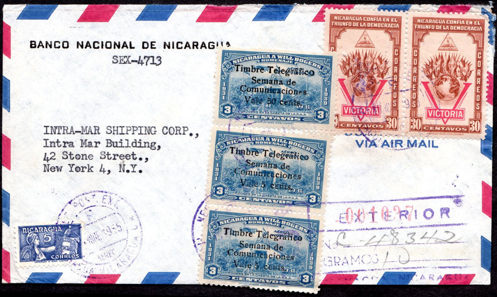
Here is an example of correct usage with a 1955 air mail cover to the USA, courtesy of Alan Slater.
The 5c stamp at the bottom left is listed by Scott as a social welfare tax stamp that they date as 1956!
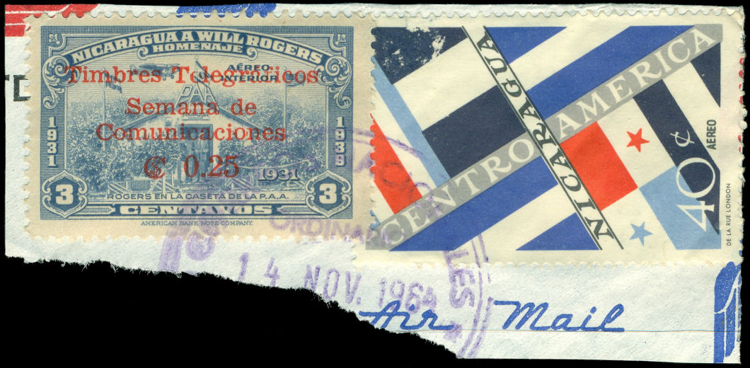
A piece of 1964 showing a later type, courtesy of Nik Oquist.
Despite Hiscocks General Note (below H205 below), he allocated no space for them in his numbering system
(this is one of the reasons for introducing the 'RH' numbers).
The following Semana stamps originally started at H200. I will start them at RH300 to avoid constant re-numbering as other issues are found.
1954 Airmail postage stamp of 1939 (SG 1031) surcharged as shown in black or red.
White wove paper. No watermark. Perf. 12.
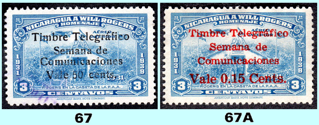
Numbering from Hiscocks book, page 218, illustrations of RH304 and RH302 courtesy of Allan Slater/
Varieties and other examples:
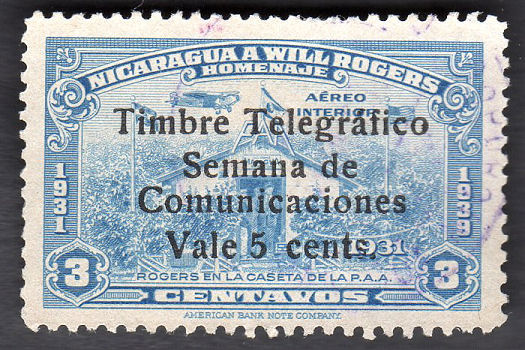 |
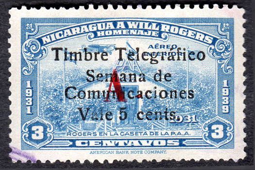 |
| 5c on 3c RH300 | 5c on 3c with letter 'A' in red *RH300a |
| Courtesy of Alan Slater. | |
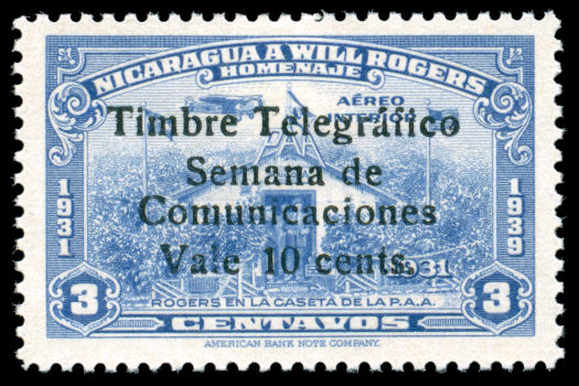 |
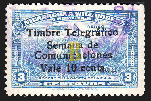 |
| 10c on 3c RH301 | 10c on 3c with letter 'B' in yellow *RH201a |
| Courtesy of Nik Oquist. | Courtesy of Alan Slater. |
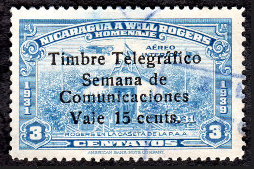 |
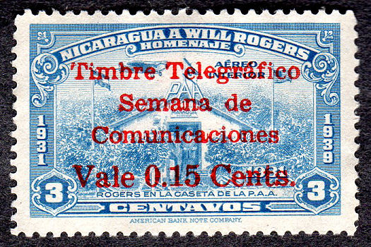 |
| 15c on 3c in black *RH302 | 15c on 3c in red RH302a |
| Courtesy of Alan Slater. | |
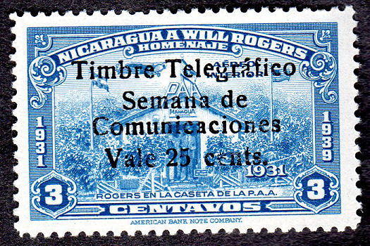 |
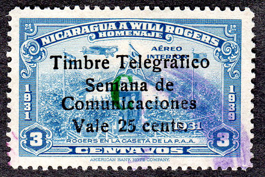 |
| 25c on 3c RH303 | 25c on 3c with letter 'C' in green *RH303a |
| Courtesy of Alan Slater. | |
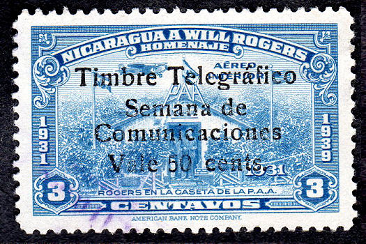 |
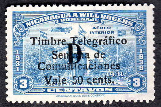 |
| 50c on 3c in red RH304 | 50c on 3c with letter 'D' in black *RH304a |
| Courtesy of Alan Slater. | |
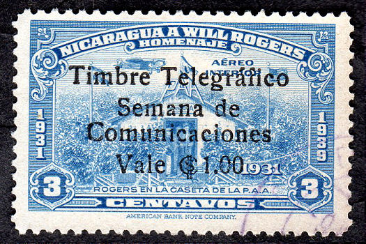 |
| 1p on 3c in black RH305 |
| Courtesy of Alan Slater. |
| RH # | Hisc. | Type. | 1954 Description | Mint | Used |
|---|---|---|---|---|---|
| RH300 | H200 | 67 | 5c on 3c dull blue (Black, 300,000) | 1.50 | 1.50 |
| *RH300a | - | Nov.1962 overprinted 'A' in Red | - | - | |
| RH301 | H201 | 67 | 10c on 3c dull blue (Black, 250,000) | 1.25 | 1.25 |
| *RH301a | - | Nov.1962 overprinted 'B' in Yellow | - | - | |
| *RH302 | - | 67 | 15c on 3c dull blue (Black, 150,000) | 1.50 | 1.50 |
| RH302a | H202 | 67A | Nov.1959 15c on 3c dull blue (Red, 150,000) | 1.50 | 1.50 |
| RH303 | H203 | 67 | 25c on 3c dull blue (Black, 100,000) | 2.50 | 2.50 |
| *RH303a | - | Nov.1962 overprinted 'C' in Green | - | - | |
| RH304 | H204 | 67 | 50c on 3c dull blue (Black, 100,000) | 2.50 | 2.50 |
| *RH304a | - | Nov.1962 overprinted 'D' in Black | - | - | |
| RH305 | H205 | 67 | 1p on 3c dull blue (Black, 100,000) | 5.00 | 5.00 |
* I have added these to accommodate the examples above.
Alan Slater has provided information on the quantities printed which I have added.
Hiscocks added the following 2 notes and general note:
| Note 1. Previous lists imply that Nos. 200-205 are all of type 67 in black but my copy of No. 202 is as indicated, (67A). |
| Note 2. My copy of No. 200 bears a further overprinted capital 'A', 5¾mm high, in red while my No. 203 bears a capital 'G' in green in the same type. The significance of these is not known but they are definitely overprints and both stamps bear the usual purple cancellations. |
| General Note. No confirmation that the use of telegraph stamps ceased after 1956 has been forthcoming and there may also exist so far unlisted issues between 1935 and 1956. |
Nov. 1964 Airmail postage stamp of 1939 (SG 1031) surcharged similar to above in red, but without 'Vale' or 'cents.'
Change to "telegraficos" instead of "telegrafico". White wove paper. No watermark. Perf. 12.
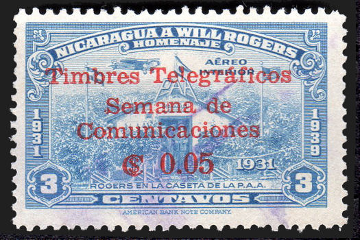 |
| Type 67C (5c on 3c RH306) |
| Courtesy of Alan Slater. |
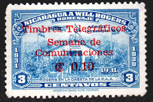 |
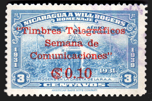 |
| 10c on 3c RH307 | Type 67D, larger value, quotes added (10c on 3c RH313) |
| Courtesy of Alan Slater. | |
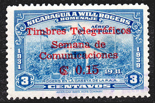 |
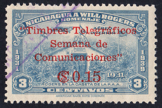 |
| 15c on 3c RH308 | 15c on 3c RH314 (larger value, quotes added) |
| Courtesy of Alan Slater. | One of mine. |
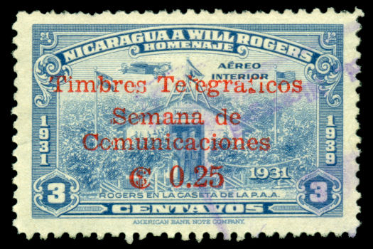 |
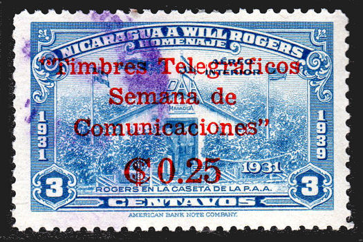 |
| 25c on 3c RH309 | 25c on 3c RH315 (larger value, quotes added) |
| Courtesy of Nik Oquist. | Courtesy of Alan Slater. |
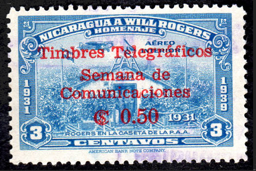 |
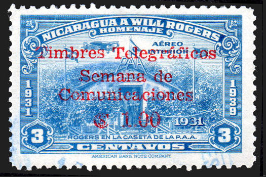 |
| 50c on 3c RH310 | 1p on 3c RH311 |
| Courtesy of Alan Slater. | |
| RH # | Hisc. | Type. | 1964 Description | Mint | Used |
|---|---|---|---|---|---|
| *RH306 | - | 67C | 5c on 3c dull blue | 1.50 | 1.50 |
| *RH307 | - | 67C | 10c on 3c dull blue | 1.50 | 1.50 |
| *RH308 | - | 67C | 15c on 3c dull blue | 1.50 | 1.50 |
| *RH309 | - | 67C | 25c on 3c dull blue | 2.50 | 2.50 |
| *RH310 | - | 67C | 50c on 3c dull blue | 2.50 | 2.50 |
| *RH311 | - | 67C | 1p on 3c dull blue | 4.00 | 4.00 |
Nov. 1965 Larger value, quotation marks added.
| RH # | Hisc. | Type. | 1965 Description | Mint | Used |
|---|---|---|---|---|---|
| ƒRH312 | - | 67D | 5c on 3c dull blue | 1.50 | 1.50 |
| *RH313 | - | 67D | 10c on 3c dull blue | 1.50 | 1.50 |
| *RH314 | - | 67D | 15c on 3c dull blue | 1.50 | 1.50 |
| *RH315 | - | 67D | 25c on 3c dull blue | 2.50 | 2.50 |
| ƒRH316 | - | 67D | 50c on 3c dull blue | 2.50 | 2.50 |
| ƒRH317 | - | 67D | 1p on 3c dull blue | 4.00 | 4.00 |
* I have added these to accommodate the examples above, and information received.
There may yet be more of type 67D to add.
ƒ I have not seen these, but it seems likely they exist so I have added numbering for them.
1966 Airmail postage stamp of 1961 (Scott C452) surcharged as shown in red
White wove paper. No watermark. Printed by Joh. Enschedé en Zonen, Holland.
Perforations are 11¾(short edge) x 11(long edge).
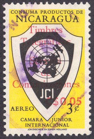 |
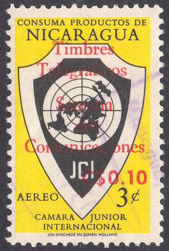 |
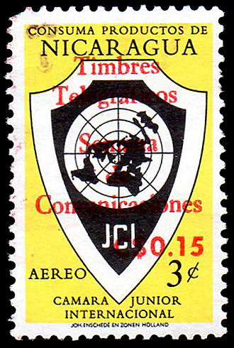 |
| Type 67E (5c on 3c RH318) | Type 67E (10c on 3c RH319) | 15c on 3c RH320, courtesy of Alan Slater |
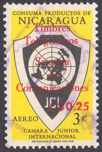 |
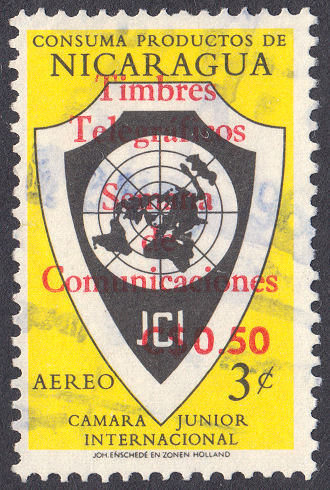 |
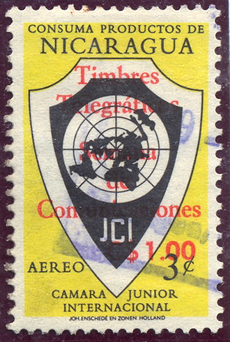 |
| Type 67E (25c on 3c RH321) | Type 67E (50c on 3c RH322) | Type 67E ($1 on 3c RH323) - from RL |
| RH # | Hisc. | Type. | 1966 Description | Mint | Used |
|---|---|---|---|---|---|
| *RH318 | - | 67E | 5c on 3c yellow and black (100,000) | 1.20 | 1.20 |
| *RH319 | - | 67E | 10c on 3c yellow and black (75,000) | 1.50 | 1.50 |
| *RH320 | - | 67E | 15c on 3c yellow and black (75,000) | 1.50 | 1.50 |
| *RH321 | - | 67E | 25c on 3c yellow and black (60,000) | 2.50 | 2.50 |
| *RH322 | - | 67E | 50c on 3c yellow and black (50,000) | 2.00 | 3.00 |
| *RH323 | - | 67E | 1p on 3c yellow and black (50,000) | 4.00 | 4.00 |
* I have added these to accommodate examples observed.
I have given the quantities authorized, as shown at: http://sajurin.enriquebolanos.org/vega/docs/G-1966-09-26.pdf
and also at: legislacion.asamblea.gob.ni.
It should be noted that both of these refer to the use of a black overprint, whereas I have only seen red.
Possibly that was a mistake, or possibly there are/were some in black, but a change was made to red due to lack of contrast.
I would be interested to hear from anyone that has any of these with a black overprint.
1968 Airmail postage stamp of 1961 (Scott C451) surcharged as shown in red
White wove paper. No watermark. Printed by Joh. Enschedé en Zonen, Holland.
Perforations are 11¾(short edge) x 11(long edge).
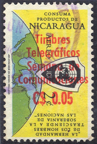 |
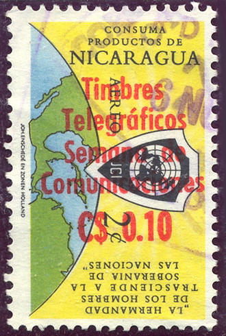 |
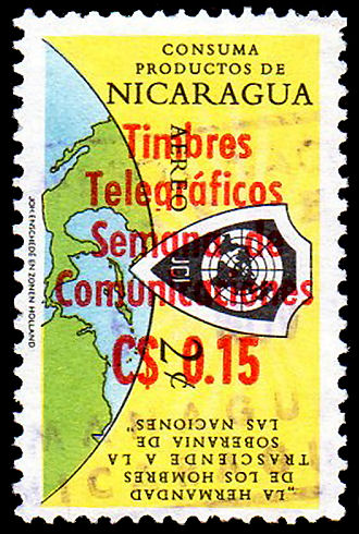 |
| Type 67F (5c on 2c RH324) - from RL | Type 67F (10c on 2c RH325) - from RL | 15c on 2c RH326, courtesy of Alan Slater |
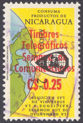 |
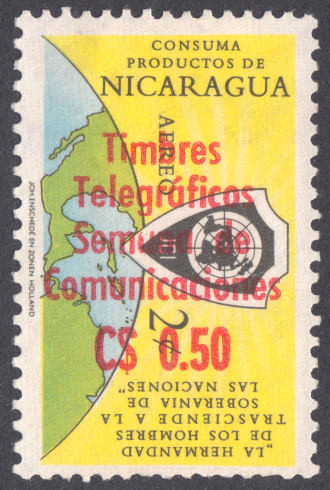 |
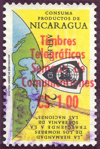 |
| Type 67F (25c on 2c RH327) | Type 67F (50c on 2c RH328) | Type 67F ($1 on 2c RH329) - from RL |
| RH # | Hisc. | Type. | 1968 Description | Mint | Used |
|---|---|---|---|---|---|
| *RH324 | - | 67F | 5c on 2c yellow, black, blue and green (70,000) | 1.20 | 1.20 |
| *RH325 | - | 67F | 10c on 2c yellow, black, blue and green (55,000) | 1.50 | 1.50 |
| *RH326 | - | 67F | 15c on 2c yellow, black, blue and green (55,000) | 1.50 | 1.50 |
| *RH327 | - | 67F | 25c on 2c yellow, black, blue and green (35,000) | 2.00 | 2.00 |
| *RH328 | - | 67F | 50c on 2c yellow, black, blue and green (20,000) | 4.00 | 4.00 |
| *RH329 | - | 67F | 1p on 2c yellow, black, blue and green (25,000) | 3.00 | 3.00 |
* I have added these to accommodate the examples above.
I have given the quantities authorized, as shown at: http://sajurin.enriquebolanos.org/vega/docs/G-1968-09-20.pdf
Department of Zelaya
This was basically the East of the country, which had currency based on silver.
It comprised Bluefields and Cabo Gracias à Dios and it appears that initially there were plans for stamps used by both.
I do not know of a telegraphic link between East coast and West coast at this time within Nicaragua,
but it is possible that they were linked via Honduras.
BLUEFIELDS
The eastern part of the country had a very different history from the west, and was mostly under the control of
pirates and European powers until 1894 when José Santos Zelaya, President of Nicaragua,
took control by military force. In 1903 Bluefields was made capital of the Department of Zelaya.
Due to their past history, Bluefields and Cabo Gracias à Dios had a currency based on silver until 1912.
Because of this it's money was worth about double the money in the rest of the country (using paper money).
To prevent them buying their stamps elsewhere at effectively half price,
the local stamps were overprinted to ensure that the full price was paid for them.
This ended late in 1912 when the gold 'cordoba' was adopted throughout the country.
I have it on good authority that:
"[These overprints] are all rubber handstamps until 1908, when the overprints started to be printed.
There are quite a few forgeries and some stamps were overprinted in the Managua post office to fulfil dealers' orders.
Unfortunately, all the records were lost in the fire after the earthquake in 1931.
Hence, the only safe way of collecting these - and the postage stamps - to ensure that they are genuine, is to only collect used stamps.
Quality control was never a strongpoint in Nicaraguan stamp production circles!"
The Scott Catalogue, referring to the postage stamps, states "Dangerous counterfeits exist of most of the Bluefields overprints."
They list postage stamps with Bluefield overprints from 1904. They also illustrate the 2 types used to fulfil dealers orders.
One type is similar to types 68/69, but without the ornament at the bottom, with a stop after 'Dpto' i.e 'Dpto.' and relative spacing
between 'B' and words about midway between that of 68/69 and type 70. The other type is similar to that but with 'Dto.' rather than 'Dpto'.
This recent article by Linns.com is also well worth reading.
What is perhaps the earliest is of uncertain status. "unauthorized" perhaps, or maybe just plain rare.
Examples were in the Byerley Collection, sold by Harmer in 2020. I have not illustrated them since the images are poor and I don't want copyright problems.
However I show below an approximation to the overprint and the stamp types that it was on.
1903 ?
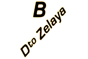 |
|
|
|
|
| Unauthorized ? overprint | 10c - RH77 | 15c - RH78 | 30c - RH80 | 20c on 1p - RH93. Courtesy of Alan Slater. |
| Courtesy of Clayton Rubec | Hiscocks Type 18 | Hiscocks Type 23 | ||
It should be mentioned that of the 4 examples, the first and last were clearly used with telegraphic cancels.
Anyone have examples with this overprint ?
I have taken it upon myself to re-arrange the first part of Bluefields, up to RH16a.
For some time now, it has looked a mess to me. Many of the images I have, do not appear to match Hiscocks' description. Perhaps some descriptions are wrong.
Perhaps multiple handstamps were used, having differences. Some may be from degraded rubber handstamps. Certainly some are likely to be forgeries or bogus.
They were all listed as 1908, and arranged by face value in two groups according to supposed overprint.
I have now put them in the same order and groupings as the un-overprinted stamps were listed in.
I think that is more rational and find it easier to see what is going on, and where errors may lie.
Apologies for the re-numbering, but I think it needed to be done, and the longer it is left, the more problems that will be caused.
This way at least, it may be more easy to distinguish the fakes.
1908? Nicaragua telegraph stamps of the Nos. indicated overprinted with a 'B / Dpto Zelaya' of type 68 or 69.
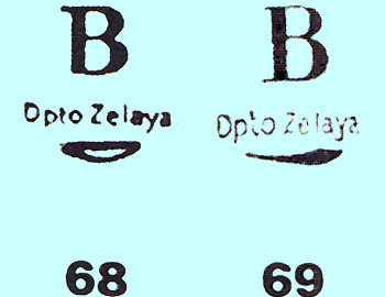 |
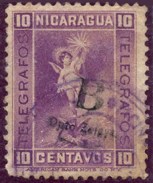 |
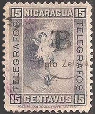 |
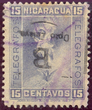 |
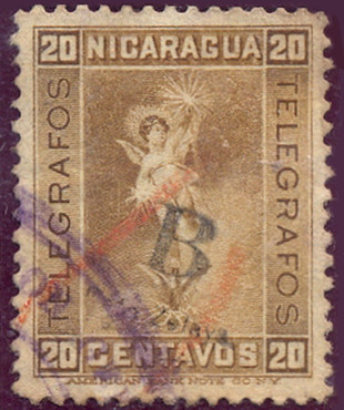 |
| Types 68 and 69 from Hiscocks book. | RH1? - from RL (on RH77) | RH2? - courtesy of Benjamin Singer. (on RH78) | RH2a? - from RL. (on RH78) | RH3? - from RL. (on RH79) |
| RH # | Hisc. | Type. | On 1900 series RH77 - RH84 | Mint | Used |
|---|---|---|---|---|---|
| RH1 | H1 | 68 | 10c reddish violet (shades)(RH77) | 15.00 | 7.50 |
| RH2 | H6 | 68 | 15c grey-blue (RH78) | 25.00 | 3.75 |
| RH2a | - | overprint inverted | - | - | |
| RH3 | H8 | 68 | 20c yellow-brown (RH79) | 10.00 | 7.50 |
|
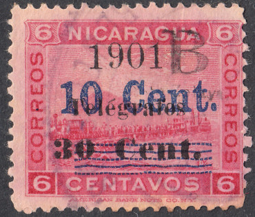 |
| Types 68 and 69 from Hiscocks book. | RH4 (on RH88) |
| RH # | Hisc. | Type. | On 1901 series RH88 - RH89 | Mint | Used |
|---|---|---|---|---|---|
| RH4 | H2 | 68 | 10c on 30c on 6c rose (RH88) | 20.00 | 5.00 |
| RH4a | H2a | heavy line over 30c | 30.00 | 10.00 | |
| RH4b | H2b | first 'e' of Telégrafos inverted | 40.00 | 40.00 |
Nicaragua telegraph stamps of the Nos. indicated overprinted with a 'B / Dpto Zelaya' of type 68 or 69, sideways, reading downwards.
|
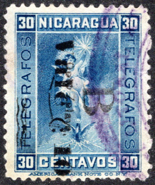 |
 |
 |
| Types 68 and 69 from Hiscocks book. | *RH5b - courtesy of Steve Moreland. (on RH102b down, black) |
*RH5c - B reading upwards. Courtesy of Clayton Rubec |
RH6 - from RL. (on RH104) |
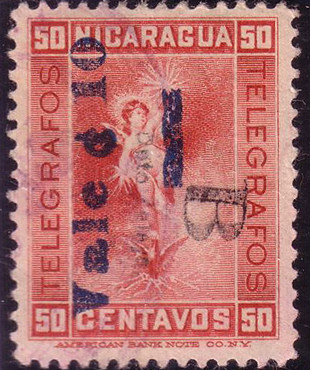 |
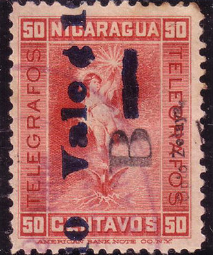 |
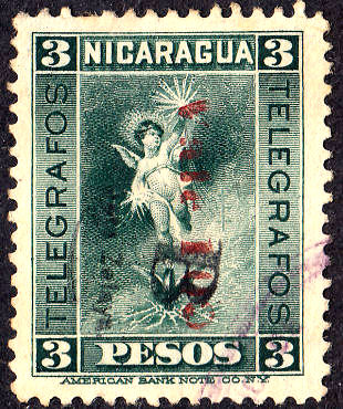 |
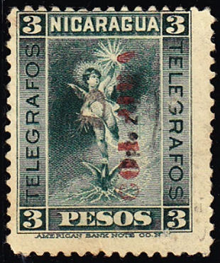 |
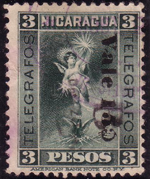 |
| RH7 - from RL. (on RH105) | RH7a - from RL. (on RH105a) | RH10 (on RH109) | RH10a - B upwards Courtesy of Clayton Rubec |
RH11 - from RL. (on RH111) |
These would seem to be all sideways, mostly reading downwards.
| RH # | Hisc. | Type. | On 1905 series RH102 - RH112 | Mint | Used |
|---|---|---|---|---|---|
| RH5 | H3 | 68 | 10c on 30c blue (RH102) | 20.00 | 5.00 |
| RH5a | H3a | surcharge in dark blue | 30.00 | 10.00 | |
| *RH5b | - | surcharge on (RH102b) | 30.00 | 10.00 | |
| *RH5c | - | surcharge on (RH102b), B upwards | 35.00 | 12.00 | |
| RH6 | H11 | 69 | 10c (in carmine) on 30c blue (RH104) | 20.00 | 3.75 |
| RH7 | H12 | 69 | 10c (in blue) on 50c crimson (RH105) | 20.00 | 3.75 |
| RH7a | - | surcharge in blue-black (RH105a), B upwards. | 20.00 | 3.75 | |
| RH8 | H13 | 69 | 10c on 50c crimson (RH106) | 25.00 | 5.00 |
| RH9 | H14 | 69 | 10c on 1p orange (RH107) | 75.00 | 50.00 |
| RH10 | H15 | 69 | 10c (in carmine) on 3p deep blue-green (RH109) | 75.00 | 5.00 |
| *RH10a | H15 | 69 | B reading upwards | 80.00 | 7.00 |
| RH11 | H16 | 69 | 15c on 3p deep blue-green (RH111) | 75.00 | 5.00 |
* These have been added due to the examples illustrated above.
|
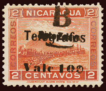 |
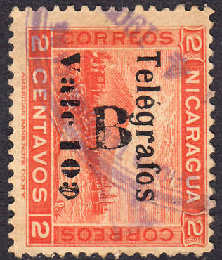 |
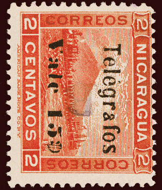 |
| Types 68 and 69 from Hiscocks book. | RH12? - courtesy of Thomas Keesling. (on RH114) |
RH12c? - I presume the bottom of the overprint is too feint to see or perhaps this is a forgery ? (on RH114) |
RH13b? - courtesy of Thomas Keesling. again only the 'B' is apparent. (on RH118) |
| RH # | Hisc. | Type. | On 1907 series RH113-RH121 | Mint | Used |
|---|---|---|---|---|---|
| RH12 | H5 | 68 | 10c on 2c orange (RH114) | 5.00 | 3.75 |
| RH12a | H5a | error — 'Telégrafso' | 15.00 | 15.00 | |
| RH12b | H5b | first surcharge inverted | 25.00 | 25.00 | |
| RH12c | - | 'B' sideways | 5.00 | 3.75 | |
| RH13 | H7 | 68 | 15c on 2c orange (RH118) | 7.50 | 5.00 |
| RH13a | H7a | error — 'Telégrafso' | 15.00 | 15.00 | |
| RH13b | - | 'B' sideways-inverted | 7.50 | 5.60 |
1907 ?
|
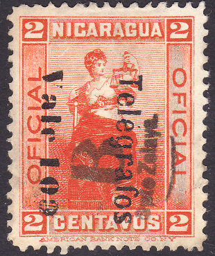 |
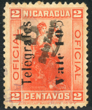 |
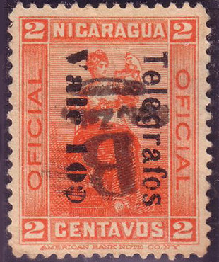 |
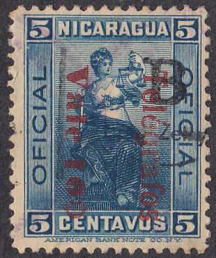 |
| Types 68 and 69 from Hiscocks book. | RH14 (downwards on RH123) | RH14c (upwards on RH123) Courtesy of Nik Oquist. |
from RL. Bogus ? (on RH123) | RH15 (downwards on RH124b) |
For a similar overprint on the RH123, 10c on 2c, see also RH22 below.
| RH # | Hisc. | Type. | On 1907 series RH122-RH124 | Mint | Used |
|---|---|---|---|---|---|
| RH14 | H9 | 69 | 10c on 2c bright orange (RH123) | 3.75 | 2.50 |
| RH14a | H9a | error — 'Telégrafso' | 15.00 | 10.00 | |
| RH14b | - | overprint inverted | 4.00 | 3.00 | |
| RH14c | - | Telégrafos reading upwards (RH123b) | - | - | |
| RH15 | H10 | 69 | 10c (in carmine) on 5c dark blue (RH124b) | 20.00 | 5.00 |
| RH15a | H10a | error — 'Telégrafso' | 40.00 | 30.00 |
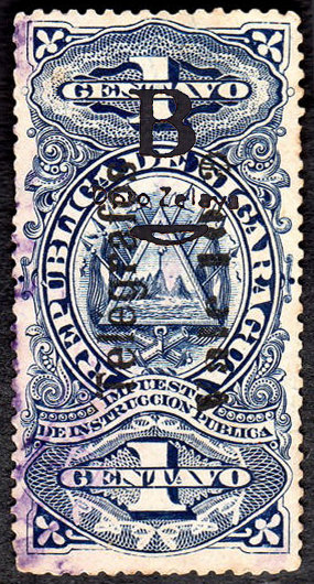
A mockup of RH16 based on description (Type 68 On RH130)
Can anyone provide an actual image?
| RH # | Hisc. | Type. | On 1908 series RH130-RH133 | Mint | Used |
|---|---|---|---|---|---|
| RH16 | H4 | 68 | 10c on 1c blue (RH130) | 50.00 | 40.00 |
| RH16a | H4a | surcharge reading down (?) | - | - |
1908 As H9-16 but overprinted with a 'B', etc. of type 70 in red.
Other details as before.
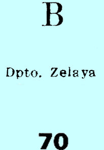 |
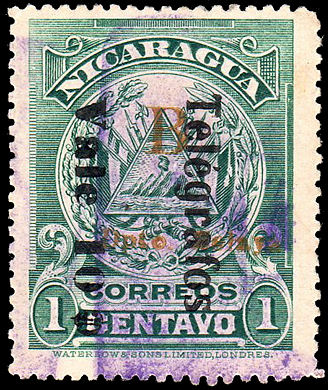 |
 |
| Hiscocks Type 70 | RH17 - courtesy of Alan Slater. | RH17c - courtesy of Nik Oquist. |
| RH # | Hisc. | Type. | Description | Mint | Used |
|---|---|---|---|---|---|
| RH17 | H17 | 70 | 10c on 1c green (RH125, Waterlow) | 3.75 | 3.75 |
| RH17a | H17a | error — 'Telégrafso' | 15.00 | 15.00 | |
| RH17b | H17b | surcharge reading upwards | 10.00 | 10.00 | |
| RH17c | - | surcharge doubled. | - | - |
1910 (August or earlier) Postage stamp of Nicaragua of 1909 (SG284) — similar to Type 34 of Nicaragua — overprinted in
black ('TELEGRAFOS'), carmine (blocks in lower corners) and sage green (inscription).
White wove paper. No watermark. Perf. 12.
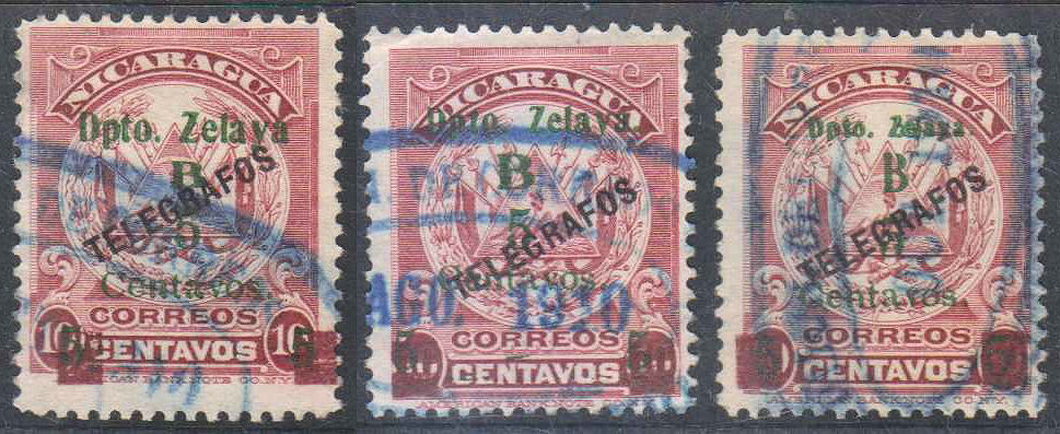 |
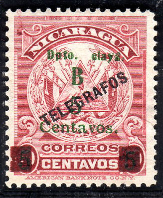 |
||
| Type 71 - 'B' 2mm (H18) | Type 72 - 'B' 2.75mm (H18a) | Type 73 - 'B' 3.3mm (H18c) | Type 73 - 'B' 3.3mm (H18f) |
| Images courtesy of Victor Gugliano (victorgg) on eBay. | Image courtesy of Alan Slater. | ||
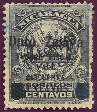
1911 RH110 overprinted with Type 70. Other details as before.
|
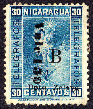 |
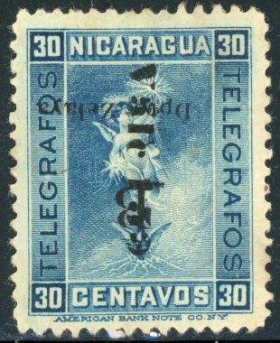 |
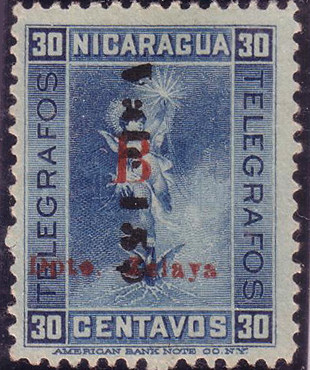 |
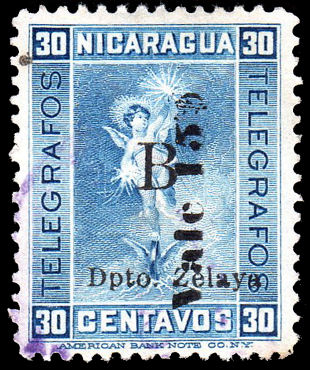 |
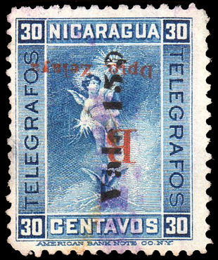 |
| From Hiscocks book, page 220. | RH19 | RH19b - courtesy of Nik Oquist. | RH19c - from RL. | RH19e - courtesy of Alan Slater. | RH19f - courtesy of Alan Slater. |
| RH # | Hisc. | Type. | Description | Mint | Used |
|---|---|---|---|---|---|
| RH19 | H19 | 70 | 15c on 30c blue (RH110) | 3.75 | 2.50 |
| RH19a | H19a | surcharge double (or overprint ?) | - | - | |
| RH19b | H19b | Zelaya overprint inverted | 10.00 | 10.00 | |
| RH19c | H19c | Zelaya overprint in red | 5.00 | 5.00 | |
| RH19d | H19d | Zelaya overprint red and inverted | 10.00 | 10.00 | |
| RH19e | H19e | surcharge reading upwards | 5.00 | 5.00 | |
| RH19f | - | RH19d with surcharge reading upwards | - | - |
1911 Postage stamps of 1909 overprinted as types 37 and 70.
|
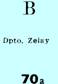 |
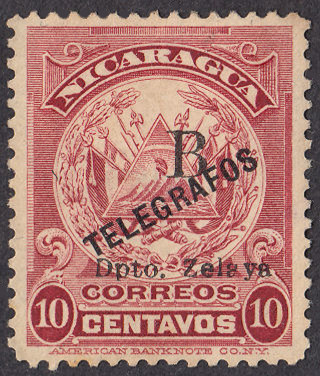 |
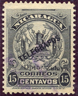 |
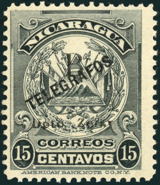 |
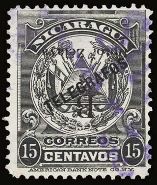 |
| Hiscocks Type 70 | Type 70a | RH20 | RH21 from RL |
RH21b courtesy of Nik Oquist. |
RH21a courtesy of Thomas Keesling. |
Nik Oquist tells me : “Zelay” Omitted “a” – There is a Maxwell listing for this variety of the Postage Stamp.
Since this is likely to apply to all examples of the Type 70 overprint, I will refere to it as a Type 70a.
| RH # | Hisc. | Type. | Description | Mint | Used |
|---|---|---|---|---|---|
| RH20 | H20 | 70 | 10c crimson (RH135) | 10.00 | 3.75 |
| *RH20a | - | Type 70 surcharge inverted | - | - | |
| *RH21 | - | 70 | 15c grey-black (RH141) | - | - |
| *RH21a | - | Type 70 surcharge inverted | - | - | |
| *RH21b | - | 70a | Type 70a surcharge | - | - |
* I have added RH21, RH21a and RH21b because of the examples shown.
I have added RH20a because it likely also exists.
1911 Telegraph stamp of Nicaragua overprinted as below.
Other details as before.
 |
 |
 |
| Taken from page 220 of Hiscocks book. |
RH22 - from RL | RH22b - from RL |
| RH # | Hisc. | Type. | Description | Mint | Used |
|---|---|---|---|---|---|
| RH22 | H21 | 74 | 10c on 2c bright orange (RH123) | 5.00 | 2.50 |
| RH22a | H21a | error — 'Telégrafso' | 25.00 | 15.00 | |
| RH22b | - | overprint reading upwards | - | - |
1912 Telegraph stamp of Nicaragua of Nos. indicated overprinted with type 70 in black.
Other details as before.
RH23 courtesy of Clayton Rubec.
This is like RH17 but with Type 70 as a BLACK overprint.
Can anyone provide an image of the 15c, RH24 ?
| RH # | Hisc. | Type. | Description | Mint | Used |
|---|---|---|---|---|---|
| RH23 | H22 | 70 | 10c on 1c green (RH125, Waterlow) | 25.00 | 25.00 |
| RH23a | H22a | error — 'Telégrafso' | 50.00 | 40.00 | |
| RH23b | H22b | surcharge reading upwards | 40.00 | 30.00 | |
| RH24 | H23 | 70 | 15c on 1c green (RH127 or RH128 ?) | 25.00 | 25.00 |
Hiscocks added the following note:
| Note. It is not clear whether No. 23 is based on No. 127 (American Bank Note Co.) or No. 128 (Waterlow & Sons). Information would be welcome. |
1912 As above but overprinted with type 74 in black.
Other details as before.
| RH # | Hisc. | Type. | Description | Mint | Used |
|---|---|---|---|---|---|
| RH25 | H24 | 74 | 15c grey-black (RH141) | 20.00 | 2.50 |
| RH25a | H24a | error — 'TELEGRAFOS' inverted. | 30.00 | 3.75 |
1912 As above but overprinted with 'B' of type 75 or 76 below in black.
Other details as before.
RH26 - Despite the low price quoted by Steve Hiscocks, these are a lot rarer than the 15c, H32
Images courtesy of Neal West.
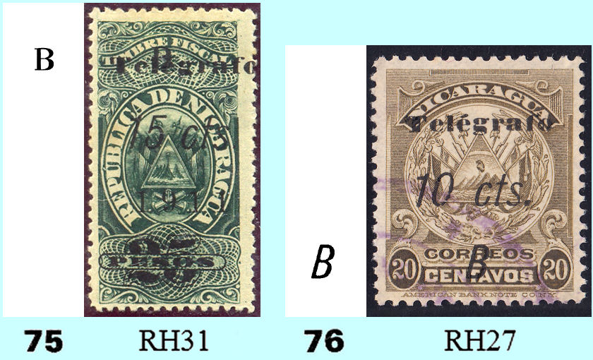
Type 75 as on RH31 from RL with Type 76 as on RH27.
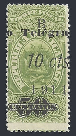 |
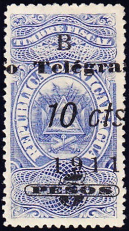 |
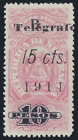 |
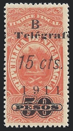 |
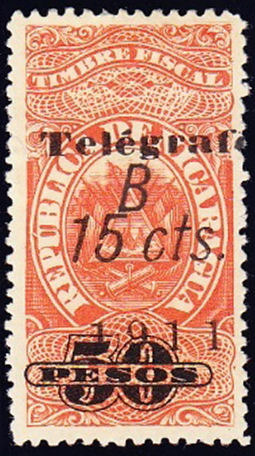 |
| RH28 | RH29 | RH30 | RH32 | RH32d |
| Images courtesy of Clayton Rubec. | ||||
| RH # | Hisc. | Type. | Description | Mint | Used |
|---|---|---|---|---|---|
| RH26 | H25 | 44,45,(75) | 10c on 5c on '2' dark blue (RH151) | - | - |
| RH26a | - | with 'ctvs.' inverted (RH151a) | - | - | |
| RH27 | H26 | 76 | 10c on 20c olive-brown (RH137) | 15.00 | 3.75 |
| RH28 | H27 | 75 | 10c on 50c yellow-green (RH144) | 25.00 | 15.00 |
| RH28a | H27a | italic 'o' in 'Telégrafo' | 50.00 | 50.00 | |
| RH28b | H27b | non italic 'c' in 'cts' | 50.00 | 50.00 | |
| RH28c | H27c | italic 'g' and 'o' in 'Telégrafo' | - | - | |
| RH29 | H28 | 75 | 10c on 5p sky blue (RH145) | 25.00 | 25.00 |
| RH29a | H28a | italic 'o' in 'Telégrafo' | 50.00 | 50.00 | |
| RH29b | H28b | non italic 'c' in 'cts' | 50.00 | 50.00 | |
| RH29c | H28c | italic 'g' and 'o' in 'Telégrafo' | - | - | |
| RH30 | H29 | 75 | 15c on 10p pale rose (RH146) | 25.00 | 25.00 |
| RH30a | H29a | italic 'o' in 'Telégrafo' | 50.00 | 50.00 | |
| RH30b | H29b | non italic 'c' in 'cts' | 50.00 | 50.00 | |
| RH30c | H29c | italic 'g' and 'o' in 'Telégrafo' | - | - | |
| RH31 | H30 | 75 | 15c on 25p blue green (RH147) | 25.00 | 25.00 |
| RH31a | H30a | italic 'o' in 'Telégrafo' | 50.00 | 50.00 | |
| RH31b | H30b | non italic 'c' in 'cts' | 50.00 | 50.00 | |
| RH31c | H30c | italic 'g' and 'o' in 'Telégrafo' | - | - | |
| RH32 | H31 | 75 | 15c on 50p vermilion (RH148) | 25.00 | 25.00 |
| RH32a | H31a | italic 'o' in 'Telégrafo' | 50.00 | 50.00 | |
| RH32b | H31b | non italic 'c' in 'cts' | 50.00 | 50.00 | |
| RH32c | H31c | italic 'g' and 'o' in 'Telégrafo' | - | - | |
| RH32d | 76 | italic 'B' | - | - |
I would welcome further images of the items listed above.
Railway Ticket Fiscal based stamps (August 1911):
Again, there is some confusion and need for revision. It needs to be made clear that the Type 75 overprint
on RH26(above) and RH33(below) is part of the printing on the back.
These are chronologically out of sequence.
Interestingly, the Bluefields type, whilst still being prepared from the 10c by changing the '0' to a '5', has 9 out of 20 positions with different 5's.
Compare the 5's underlined in red against the Bluefields pane.
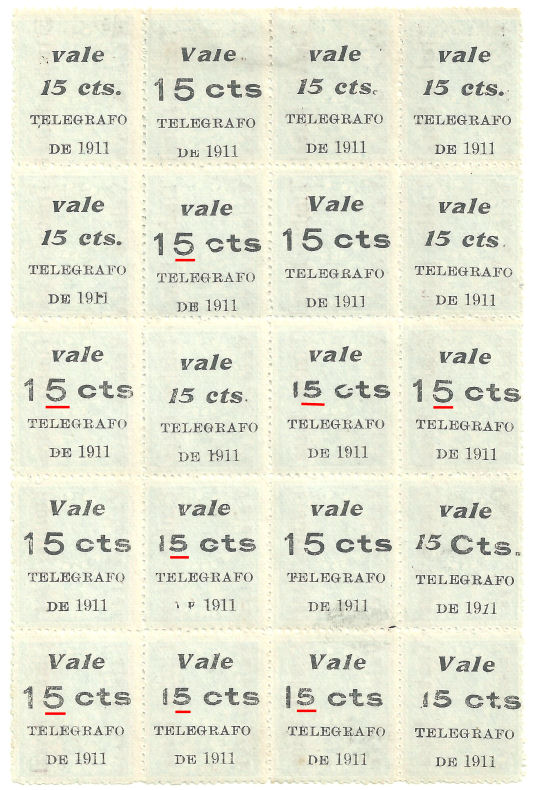
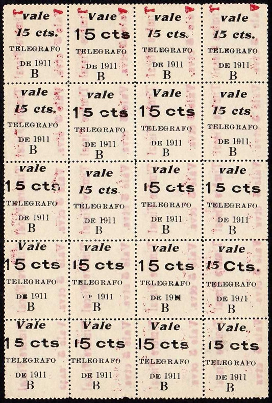
Also, not all the 'B's are the same size. Positions 7 and 10 are noticeably smaller. 18 is consistently flattened top and bottom.
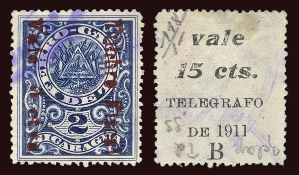
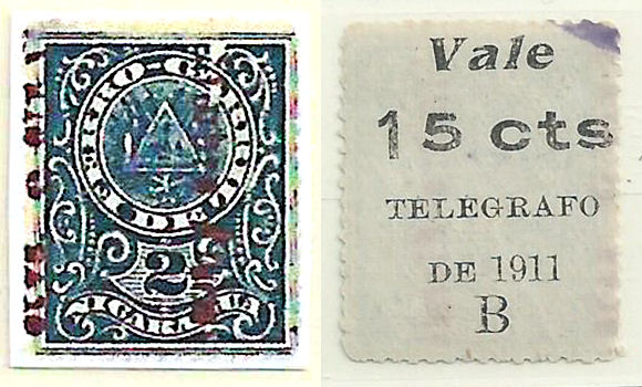
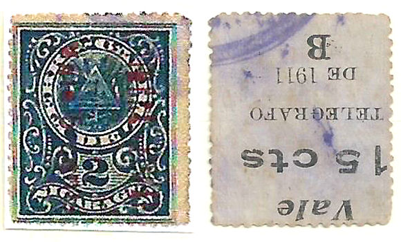
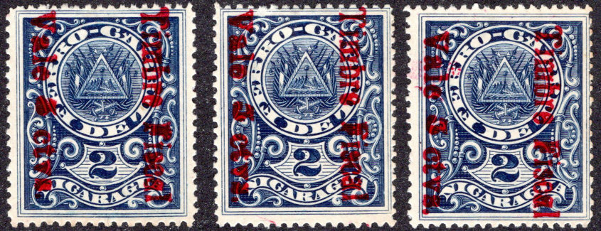
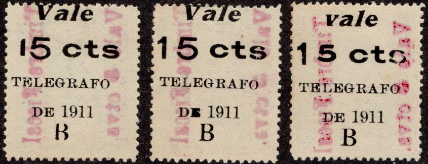
| RH # | Hisc. | Type. | Description | Mint | Used |
|---|---|---|---|---|---|
| RH33 | H32 | 44,(45),(75) | 15c on 5c on '2' dark blue (RH152) | 25.00 | 5.00 |
| RH33a | - | with 'ctvs.' inverted (RH152c) | - | - | |
| RH33b | - | 44,(45) | bright red fiscal Type 44 | - | - |
| RH33c | - | 44a,(45) | dark red fiscal Type 44a | - | - |
1912 Telegraph stamp of Nicaragua overprinted as shown.
Other details as before.
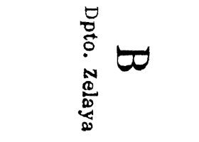 |
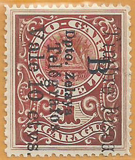 |
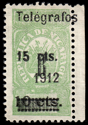 |
| Type 76A. (2mm spacing) (reading up or down) |
RH34 (only 2 known) Courtesy of Neal West |
Type 77,
RH35 courtesy of Clayton Rubec as Hiscocks book, page 221. |
| RH # | Hisc. | Type. | Description | Mint | Used |
|---|---|---|---|---|---|
| RH34 | - | 44,76A | 10c on '1' red (RH160) + B/opto zelaya on front | - | - |
| RH35 | H33 | 77 | 15c on 10c yellow-green (on RH171) | 75.00 | 60.00 |
CABO GRACIAS À DIOS
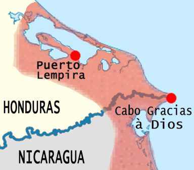
A number of Telegraph stamps are shown below with "CABO" overprints. It is known that forgeries of such overprints are plentiful.
I have no way of knowing which, if any of these are genuine. Only one of them (RH9) matches any of those described by Hiscocks.
Telegraph stamps of Nicaragua of Nos. indicated overprinted with 'CABO' in black.
Other details as before.
Though Hiscocks gave 1910 as the earliest date, the decree requiring stamps used in Bluefields and Cabo to be overprinted was issued 15 May 1904.
It was to be applied to the stamps in use in those areas at the time.
This 1901 stamp, RH87 would no longer be valid by 1904. They were overprinted for a reason.
Presumably then, this is a forgery.
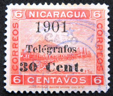
Image courtesy of Miguel Torres.
1910
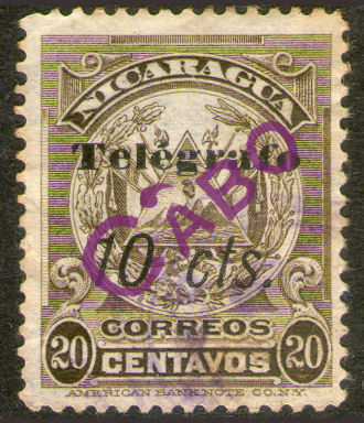
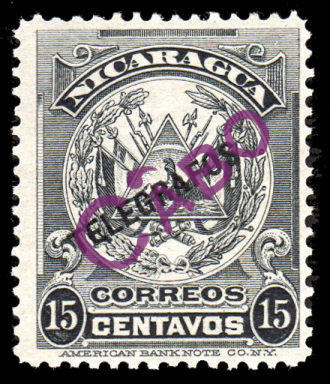 |
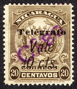 |
| Mockups of RH1 and RH2 based on the descriptions. Can anyone supply actual images of either of these ? |
RH1a this is on RH138. Image courtesy of Ron Waldston. |
Hiscocks did not know the style of the overprint, so I guessed type C1 (shown below).
However since RH1a has type C2 overprint (shown below), I have changed it to that.
1911 Fiscal (Destace de Ganado) stamps of Nicaragua (as used for No. 154, etc. of Nicaragua) with original
values and further overprinted CABO and Telegrafos and surcharged as necessary in black. Perf. 14.
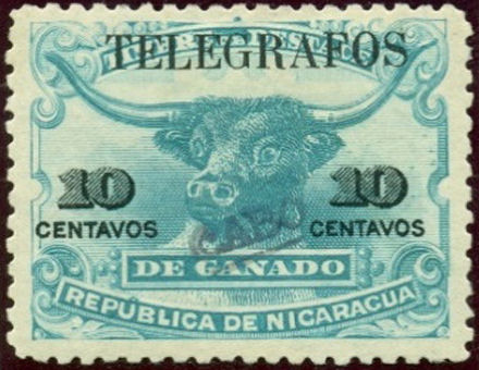 |
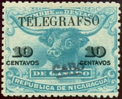 |
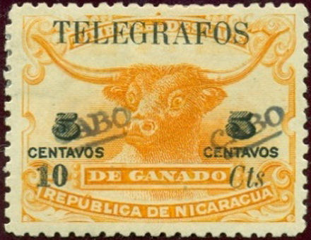 |
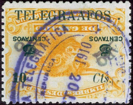 |
| RH3 (without period) | RH3a "TELEGRAFSO" | RH4 (without period) | RH4di "TELEGRAAFOS .", inverted |
| Images courtesy of Courtney Hess. | |||
The RH4di above with the clear telegraphic cancel of 20 October 1910 and a stop after TELEGRAAFOS is interesting in that it is not on the sheet of 154 that I have seen.
That would seem to imply that there was more than one setting of the overprint plate and that Hiscocks' H154e and/or H154g may indeed exist.
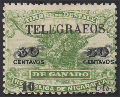 |
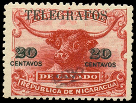 |
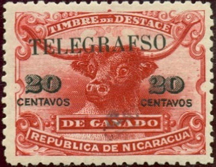 |
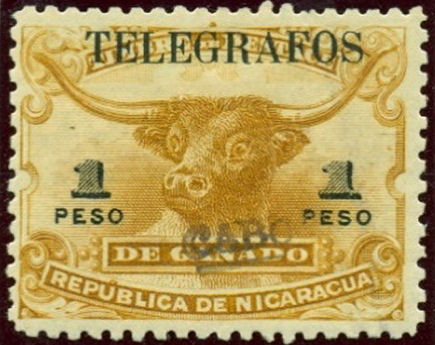 |
| RH6 (with period) courtesy of Dick Keiser. | RH9 (without period) courtesy of Clayton Rubec. | RH9a "TELEGRAFSO" courtesy of Courtney Hess. | RH10 (without period) courtesy of Courtney Hess. |
| RH # | Hisc. | Type | Description | Mint | Used |
|---|---|---|---|---|---|
| RH3 | H3 | 46 | 10c greenish blue | 85.00 | 85.00 |
| RH3a | - | error 'TELEGRAFSO' | - | - | |
| RH3b | - | error 'TELEGFAFOS' | - | - | |
| RH3c | - | error 'TELegrAFOS' | - | - | |
| RH3d | - | error 'TELEGRAAFOS' | - | - | |
| RH3f | - | error 'TElegrAFOS' | - | - | |
| RH4 | H4 | 46, 47 | 10c on 5c orange (Perf. 11½) | 100.00 | 100.00 |
| RH4i | - | inverted | - | - | |
| RH5 | H5 | 46, 47 | 10c on 20c carmine (Perf. 11½) | 125.00 | 125.00 |
| RH6 | H6 | 46, 47 | 10c on 50c yellow-green (Perf. 11½) | 125.00 | 125.00 |
| RH7 | H7 | 46, 47 | 10c on 1p yellow-brown (Perf. 11½) | 200.00 | 200.00 |
| RH8 | H8 | 46, 47 | 10c on 2p grey | 100.00 | 100.00 |
| RH9 | H9 | 46 | 20c carmine (Perf. 11½) | 50.00 | 50.00 |
| RH10 | H10 | 46 | 1p yellow-brown (Perf. 11½) | 150.00 | 150.00 |
Hiscocks added the following note:
| Note. Nos. 1 to 10 above are rare and I have not seen copies. I have not been able to discover which type of 'Cabo' overprint was used. Information would be welcome. |
My notes: It appears that when the surcharge (Type 47) was used, the "CABO" overprint was used to obliterate the old value, otherwise it was central.
The following may well pre-date the above, but for the time being I add them here to preserve Steve Hiscocks' numbering.
1910? Telegraph stamps of Nicaragua of RH77-84 overprinted as shown with 'CABO' in purple.
The Scott catalogue shows postage stamps with a similar overprint that they date as 1904-5.
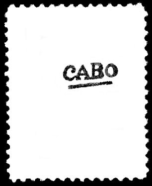 |
 |
| Overprint Type C1 |
RH11 (Type C1 on RH77) - courtesy of Alan Slater. |
At the bottom of the cancel it appears to say "CABO GRACIAS A ...".
| RH # | Hisc. | Type. | Description | Mint | Used |
|---|---|---|---|---|---|
| RH11 | - | C1/18 | 10c reddish violet (shades) | - | - |
| RH12 | - | C1/18 | 15c grey-blue (shades) | - | - |
| RH13 | - | C1/18 | 20c yellow-brown (shades) | - | - |
| RH14 | - | C1/18 | 30c steel blue (shades) | - | - |
| RH15 | - | C1/18 | 50c crimson | - | - |
| RH16 | - | C1/18 | 1p yellow-orange to orange | - | - |
| RH17 | - | C1/18 | 2p rose | - | - |
| RH18 | - | C1/18 | 3p deep blue-green | - | - |
1910? Telegraph stamps of Nicaragua of Nos. RH77-84 overprinted with 'CABO' as shown in purple.
The Scott catalogue shows postage stamps with a similar overprint that they date as 1905.
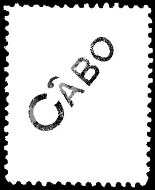 |
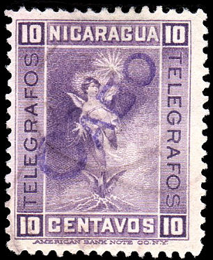 |
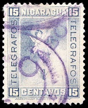 |
| Overprint Type C2 |
RH19 (Type C2 on RH77) - courtesy of Alan Slater. |
RH20 (Type C2 on RH78) - courtesy of Alan Slater. |
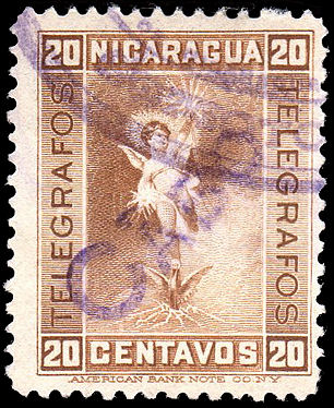 |
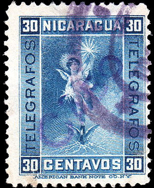 |
| RH21 (Type C2 on RH79) - courtesy of Alan Slater. |
RH22 (Type C2 on RH80) - courtesy of Alan Slater. |
| RH # | Hisc. | Type. | Description | Mint | Used |
|---|---|---|---|---|---|
| RH19 | - | C1/18 | 10c reddish violet (shades) | - | - |
| RH20 | - | C1/18 | 15c grey-blue (shades) | - | - |
| RH21 | - | C1/18 | 20c yellow-brown (shades) | - | - |
| RH22 | - | C1/18 | 30c steel blue (shades) | - | - |
| RH23 | - | C1/18 | 50c crimson | - | - |
| RH24 | - | C1/18 | 1p yellow-orange to orange | - | - |
| RH25 | - | C1/18 | 2p rose | - | - |
| RH26 | - | C1/18 | 3p deep blue-green | - | - |
The overprint on the above stamps are similar to those used on postage stamps of 1905.
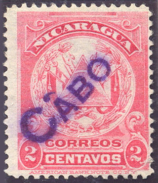
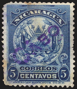
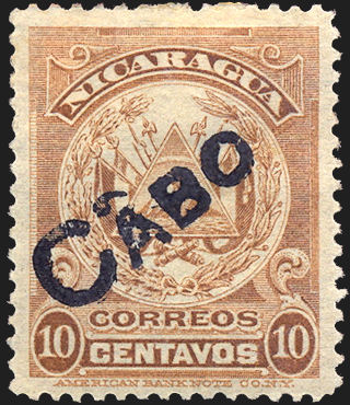
The Scott catalogue says that these with black hand-stamps are bogus. They also say that there are also "excellent counterfeits in violet".
It is reasonable to assume that such counterfeit hand-stamps were also applied to telegraph stamps.
Images courtesy of Rolf Lamprecht.
Postal use of Telegraph stamps.
It seems there was some postal use of Telegraph stamps, particularly in Bluefields.
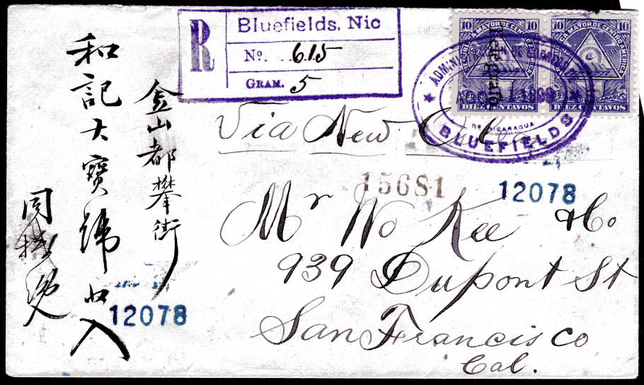
Bluefields, 11.8.1899 - Image courtesy of Alan Slater.
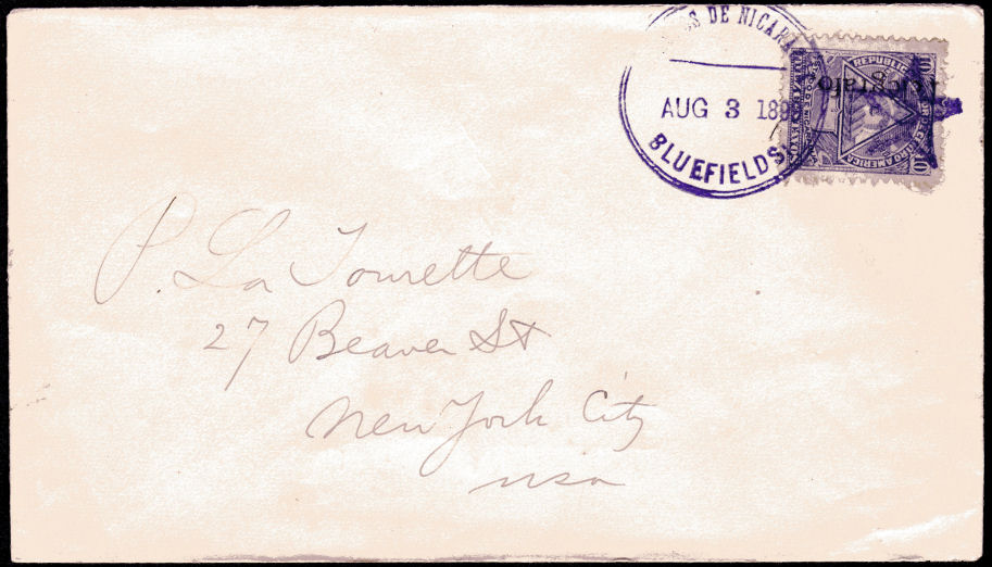
Bluefields, 3.8.1899 - Image courtesy of Alan Slater.
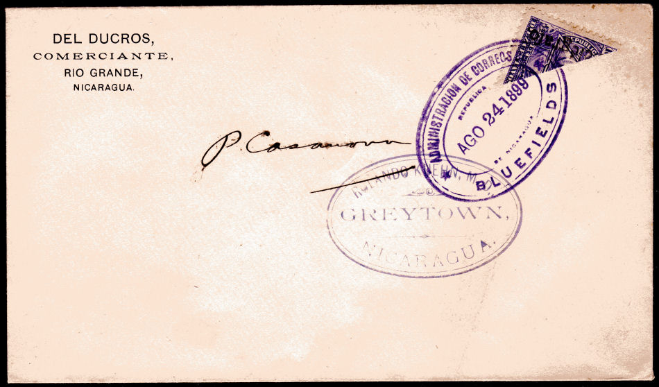
Bluefields, 24.8.1899 Bisected, apparently there was a stamp shortage so this was not uncommon in Bluefields at the time.
The lack of meaningful address indicates that it was philatelic in nature. - Image courtesy of Alan Slater.
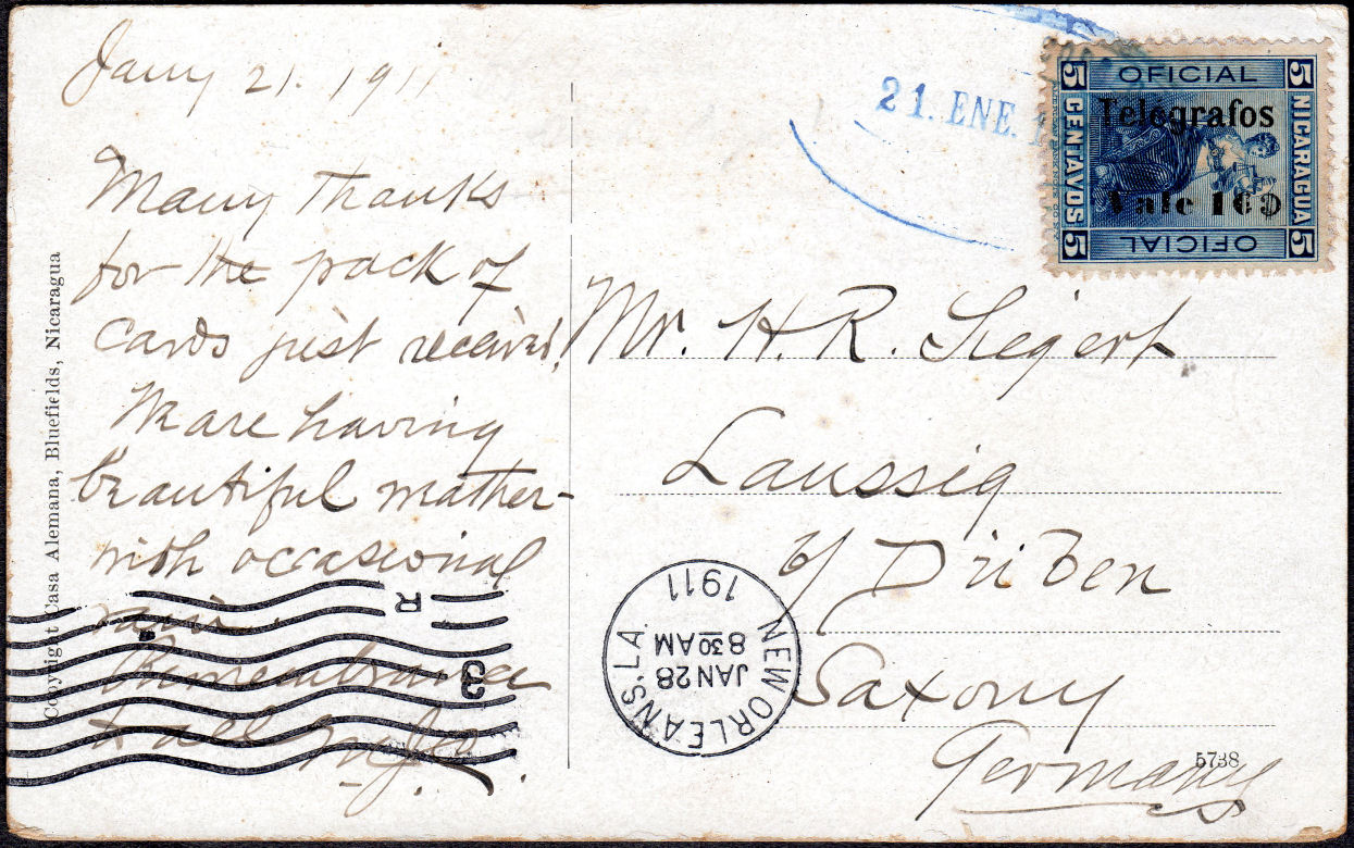
There was a shortage of stamps in Nicaragua in 1911, so they used anything they could for postage.
Courtesy of Alan Slater.
Telegraph Stationery.
I have been shown this 30c Telegraph cut-out and told that at least two similar examples are known.
It is 32mm diameter, black on cream and embossed.
Does anyone have more information or know of other values or colours ?
I still need quite a few images to complete this web-page.
If anyone can provide scans or information to help, I am happy to give appropriate credit.
