| Up a level | ||||||||||
 |
 |
 |
 |
 |
 |
 |
 |
 |
 |
 |
| Argentina | Bolivia | Chile | Colombia | Costa Rica | Cuba | Dominican Rep. | Ecuador | El Salvador | Guatemala | Honduras |
| Up a level | ||||||||||
 |
 |
 |
 |
 |
 |
 |
 |
 |
 |
 |
| Mexico | Morocco | Guinea | Nicaragua | Panama | Paraguay | Peru | Philippines | Puerto Rico | Uruguay | Venezuela |
Contributors: |
I have completely revised Hiscocks' original listing, though leaving references to the original designations. I have brought the prices up to date and added currency selection. The new designations have 'RH' numbers (Revised Hiscocks) to avoid confusion. CheckList Setup |
| Shortcuts to different sections | |||||||
| 1881 5c | 1881 10c | 1881 20c | 1881 50c | 1881 1p | Cat. Especializado | 1886 | 1888 + |
| Shortcuts to different sections | ||||||||
| 1902 perforated | 1904 | 1905? perforated | Obligatory Tax stamps | Cancels | AR stamps | Coupons | Via Galveston | Seals |
Colombia.
Steve Hiscocks wrote:
These stamps form a fascinating but very difficult study. There are many shade variations in both design and paper colours which make the printings
difficult to separate in some cases while even my own somewhat modest collection threw up two apparently new dies and three new value/perforation
combinations. The situation is not helped by the fact that cancellation with one or two pen strokes was virtually universal (I have a single dated
hand stamp cancellation). I would like to hear from anyone who has been able to conduct a more thorough study.
The stamps produced by the Colombian authorities for use in Panama, then under Colombian control, will be found listed under Panama.
My note:
Steve Hiscocks started looking at the different dies used. I have continued that process and found more. Even in the absence of explicit dates,
there does appear to be some logical sequences. I have added a number of items and had to do some extensive re-numbering.
1881 Lithographed on wove paper. No watermark or part of sheet watermark (see Note 6 after RH19). Imperf.
Printed in Bogotá by León F. Paredes and Demitrio Villaveces.
Around about 1883 the colours were changed, apparently in response to the UPU.
In 1886 the "United States of Colombia" became the Republic of Colombia and there were design changes to the stamps.
There are many different opinions on the early issues, mainly due to the lack of records and dated pieces.
Most people agree on the colours of the earliest stamps though, with the possible exception of the 1 Peseta value,
and I have tried to find the most likely sequence assuming only one thing changing at a time.
I have needed to add a few types but I've kept the listing compatible with the original where possible.
My images for the earliest issues are at 600dpi to show details.
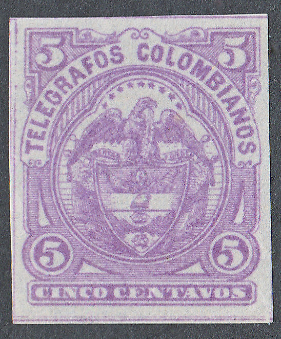
The Colombian coat of arms is central to the design of the low values (the first 1p depicts Samuel Morse). It was involved in many of the changes in this issue.
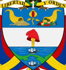
For that reason, a description is worthwhile.
Above the shield are the words "Libertad Y Orden" meaning "Liberty and Order". Below that are two 'cornucopia' separated by a pomegranate.
Below that is a 'Phrygian cap' on the end of a spear and below that, two ships separated by the Isthmus of Panama (then part of Colombia).
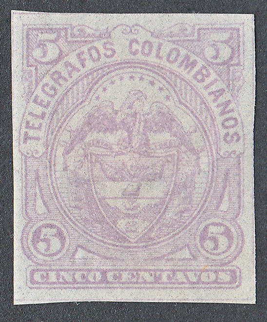
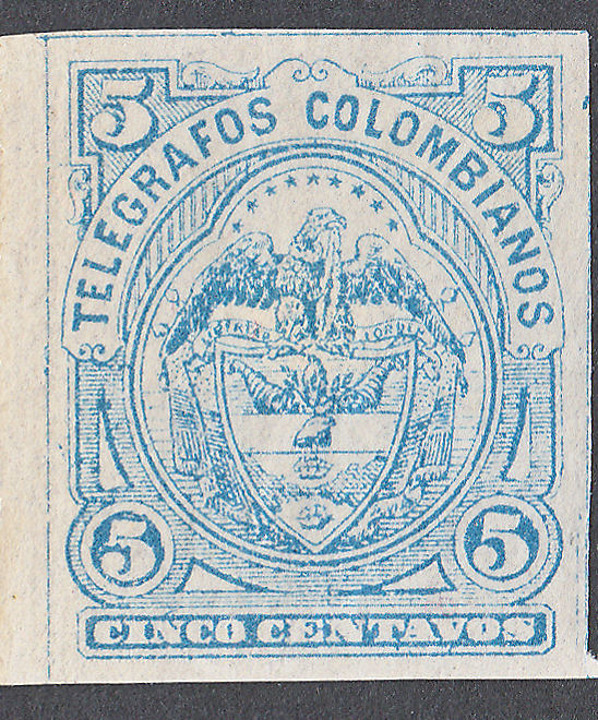
5c. (600 dpi)
 |
 |
 |
| Type I in lilac. (RH1) Lines of shading clearly printed. |
Type I in lilac. (RH1) Though lightly printed, the shading can be seen each side of the cap. I don't have any of these in blue, but they may exist. |
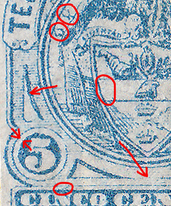
Type II in blue. (mark above 'N' of 'CINCO', RH7 ) Though strongly printed, the shading is mostly gone each side of the cap. I don't have any of these in lilac, but they may exist. |
 |
 |
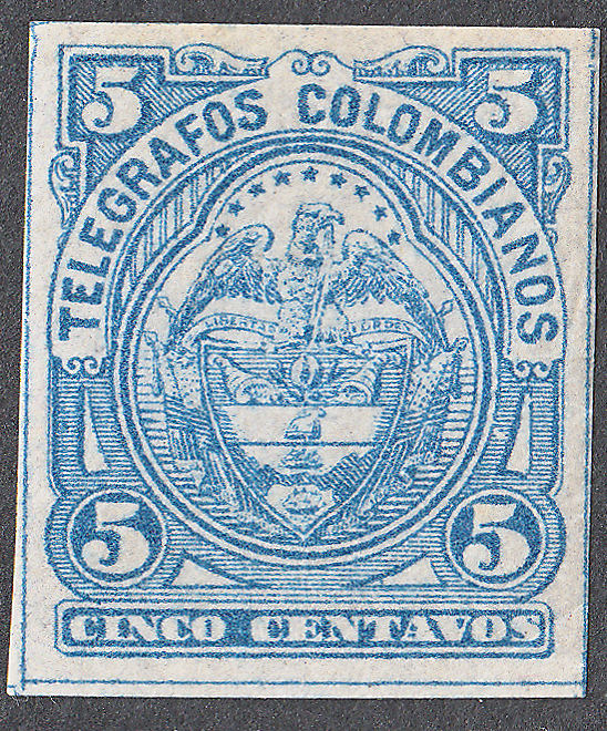 |
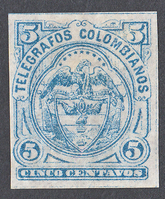
| Type II in blue (RH7), Shading reduced in the frame below the shield, but otherwise seems to be the same. |
Key areas of differences. Shading left or right. Size of '5', larger in type III (thinner white circle). |
Type III in blue (RH14). The shading is back and the eagles head is more upright. |
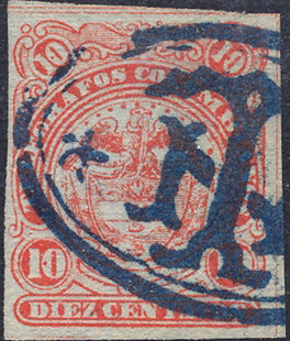
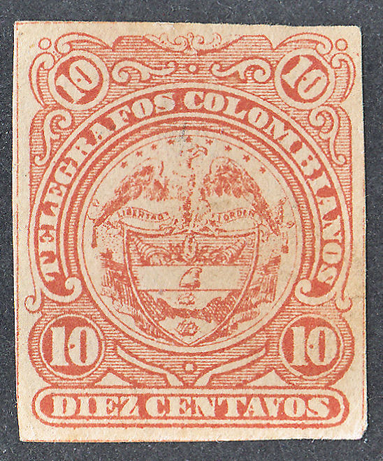
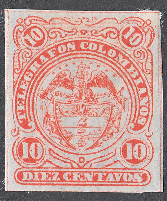
10c. (600 dpi)
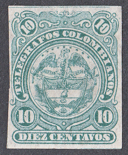
It was thought that there were just two types of the 10c with the first being in two colours.
Now I have a few more examples that I can look at closely however, it is not that simple.
 |
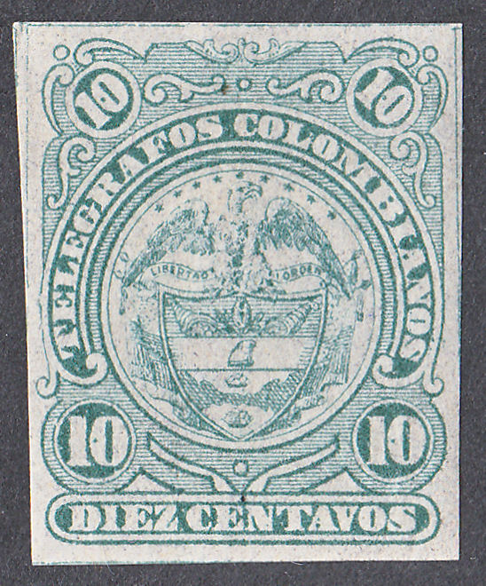 |
| Type I (RH2) in blue-green. Some variability depending on amount of ink. Note the pomegranate, cap, ships and shading below between the value tablets. |
|
 |
 |
 |
| Type I (RH8) in red. This is like the blue-green type. Mint ones seem to be elusive, whereas my RH8a are nearly all mint. |
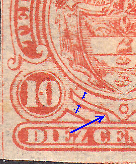
Type II (RH8a) in red. The 'split' in the pomegranate is confined to the top. The cap has a strong 'blob' in the right side. The top ship seems different. The horizontal lines between the bottom value tablets get progressively weak. |
Type II Key areas of differences compared to Type III below. 'Finger' raised and central or not. |
 |
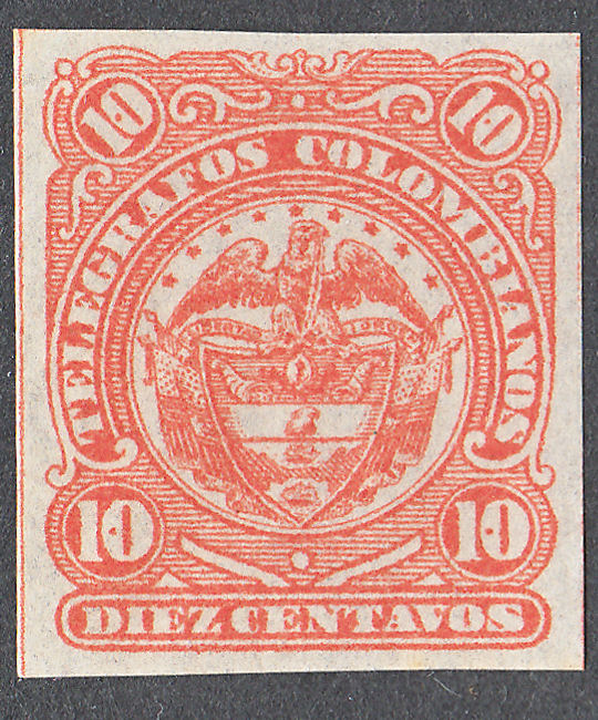
Type I in green and red, together with Type II in red have fairly small stars spread between the letters 'R' and 'B' at the sides. |
 |
Type III in red has larger, more prominent stars They spread between 'G' and 'BI' |
 |
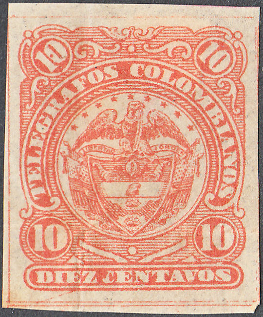 |
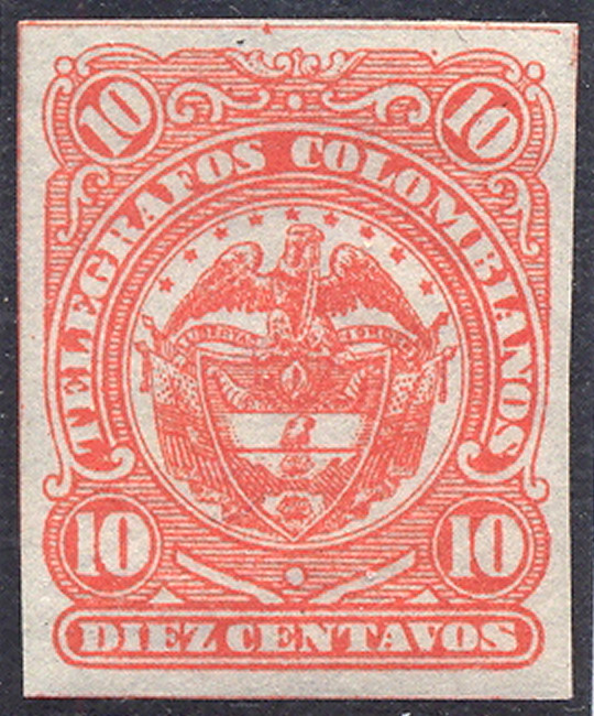 |
| Type III in red (RH15). The stars above the eagle are clearer and spread wider. |
Type III in red (RH15a). - Only one of the '0's has dots (see below). | Type III (RH15a) - None of the '0's have dots (see below) - From RL |
I have only a few examples of Type III. Until recently they have all been 'normal'.
I was puzzled by John Barefoot saying of them "no dots in the '0's of the '10's.", since mine had dots in all the zeroes, just like the previous issues.
I put it down to only seeing low-resolution images. Then I got one with only one dot.
I cannot see anything obvious suggesting a different plate, but the dot-sizes do seem to vary.
Perhaps the same plate has varying numbers of dots per stamp ?
Here is a strip of three:
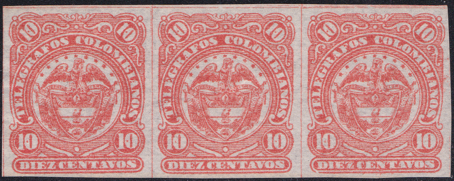
Clearly not very consistent with the dots.
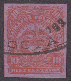
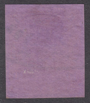
I additionally have this item. I do not know if the paper colouring is genuine !
For the moment I will ignore it.
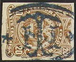
20c. (600 dpi)
 |
 |
 |
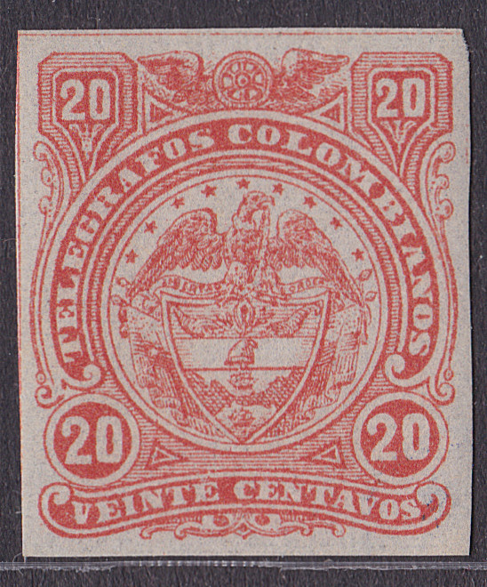
| Type Ia in red on bluish paper (RH3) (not yet seen in brown). |
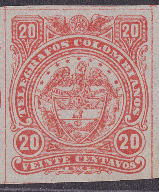
Type Ib (dent in back of 'L') red to orange-red (shades) (RH3a) (not yet seen in brown). |
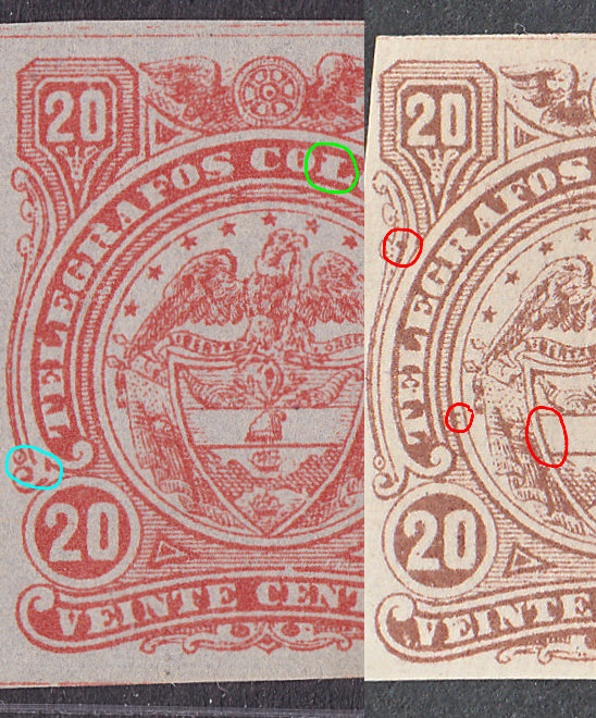
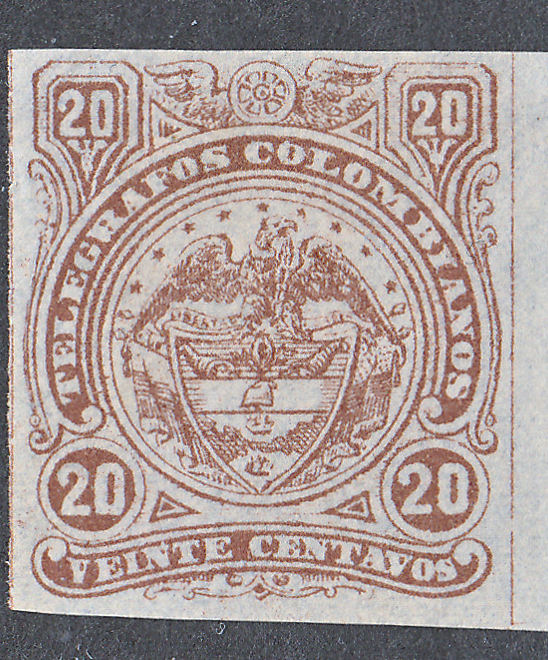
Details marked in red are specific to the brown printings. The flaw marked in blue is on all the red printings, but none of the brown. Most of the red printings have the flaw marked in green, used ones are usually without it. |
Though printing flaws on these stamps are so common that it is difficult to find examples without any, some flaws are consistent. Those are flaws on the plate.
Whether such a flaw is a new feature of all stamps on a different plate, or on just some stamps of the existing one is not always easy to determine.
I have 15 of the 20c red stamps. Only 3 of them are Type Ia, including the only convincingly used one and the only one with a dealers mark. I suspect that Type Ib are reprints.
Colombia did create reprints for some postage stamps of this period. Type Ia tends to be more red in colour while Type Ib are more red-orange, but much depends on toning of the paper.
The brown printings are distinctly different to the red ones, none are Type Ia or Type Ib.
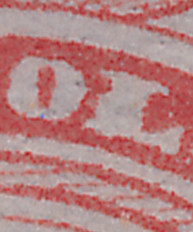

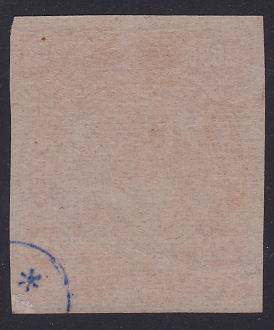
To clarify, here are closeups of Ib and Ia. It isn't so much as a dent in the back of the 'L' as the thickness of the 'L' increasing below the area.
It makes the 'L' look closer to the 'O'. I have added a scan of the back of this example of Type Ia.
Some countries that created reprints added a 'secret mark' to identify them (e.g. China). This may be such a mark.
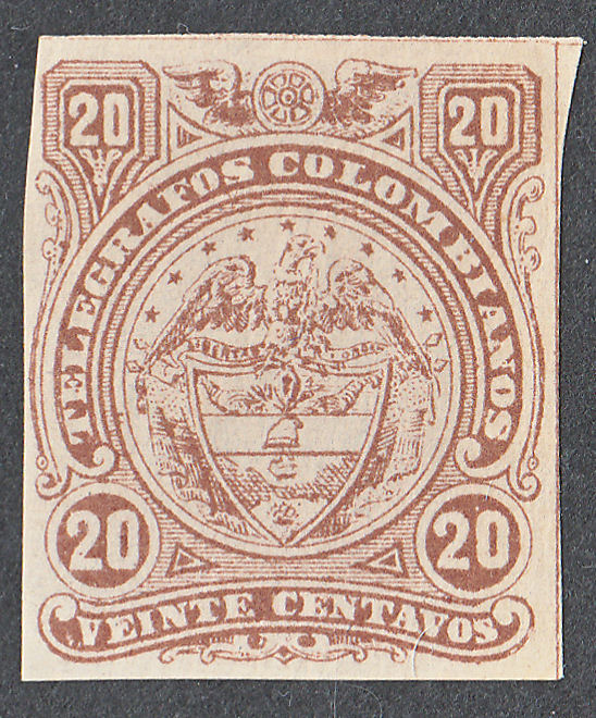
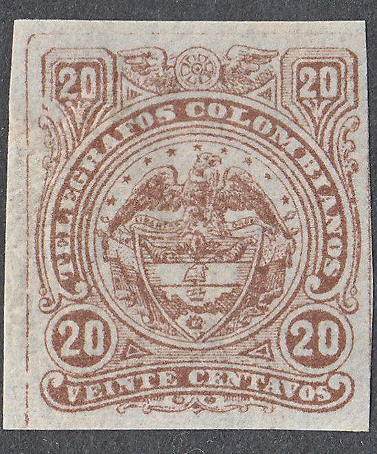
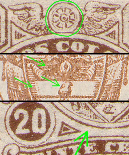
A comparison of central areas of the shield.


 |
 |
 |
| Type IIa in brown. (RH9) No shading on central and top shield-panel and cap. |
Type IIb in brown. (RH9a) Shading added, but different to the red printings. |
Type IIc in brown. (RH10) Shading removed from between lower value tablets. |
 |
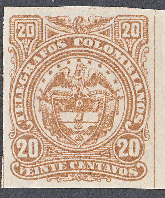 |
| Key areas of differences. wheel in 2D or 3D. Shading or not. Phrygian cap. |
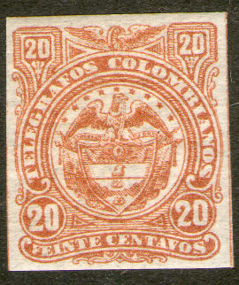
Type III in brown, wheel in 3D. (RH16) Eagles head more upright. Shading back, cap drawn badly. |
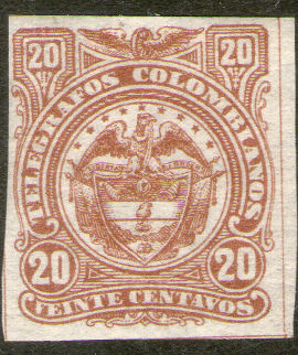
Shades of RH16:
 |
 |
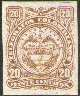 |
| RH16 - reddish brown. | RH16a - orange-brown. | RH16b - chocolate-brown. |
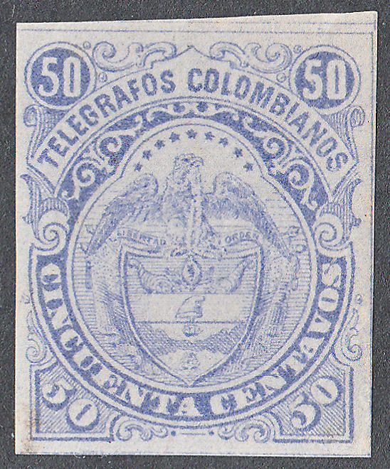
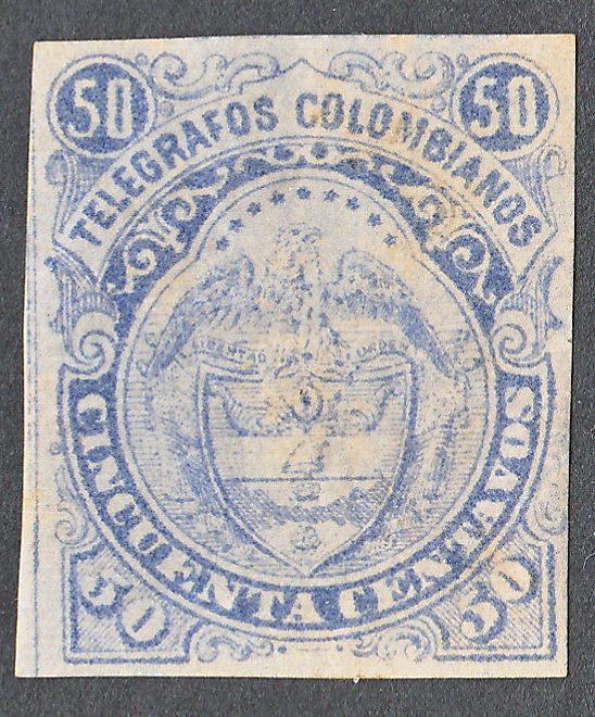
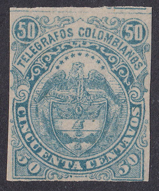
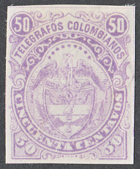
50c. (600 dpi) I have tried to find indicators to help in sequencing them.
 |
 |
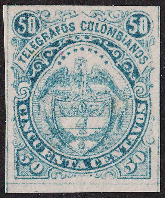 |
| Type Ia (RH4) in ultramarine, No 'Y' flaw. Good quality printing. | Type Ia (RH4a) in blue. Beginnings of 'Y' flaw (see below). | Type Ia (RH4b) in blue-green. No 'Y' flaw. Average quality printing. |
 |
 |
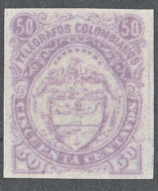 |
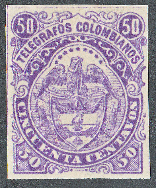
| Type Ia (RH4b) in blue-green. Beginnings of 'Y' flaw (see below). | Type Ia in lilac (RH11). Reasonable quality print, with no sign of 'Y' flaw and early type 'Phrygian cap'. Fine lines visible.. |
Type Ib in lilac (RH12). Poor quality print, but showing 'Y' flaw and early type 'Phrygian cap'. No fine lines visible.. |
 |
 |
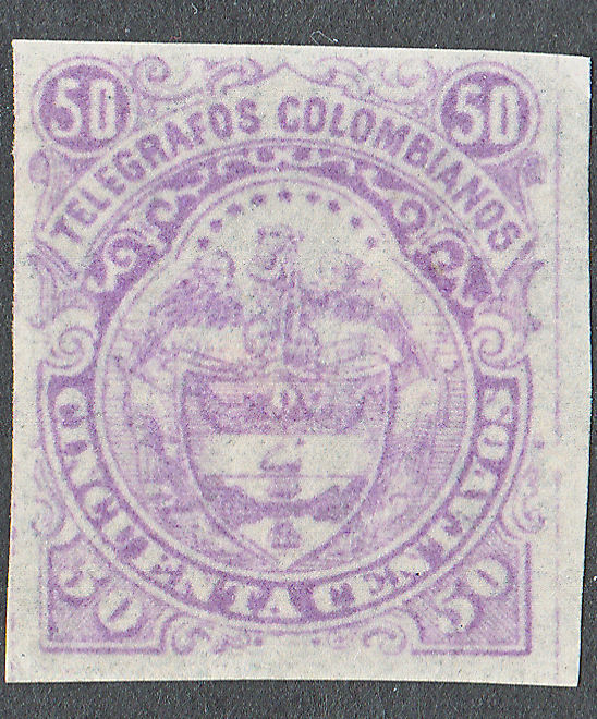 |
| Type II in violet (RH17). Cap changed (solid base), and also the shading each side of it. The ships are larger. |
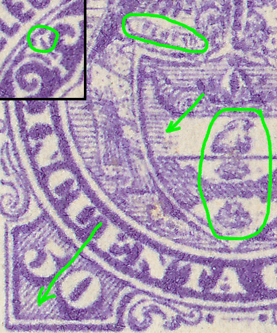
Key areas of differences. 'Y' flaw inset at top-left. Cap changes, ship sizes change. 'Shading behind '50' of varying visibility, motto varying clarity. |
Type II in pale violet (RH17). Quality degraded, but new type cap apparent and 'Y' flaw progressing. Fine lines just visible. |
 |
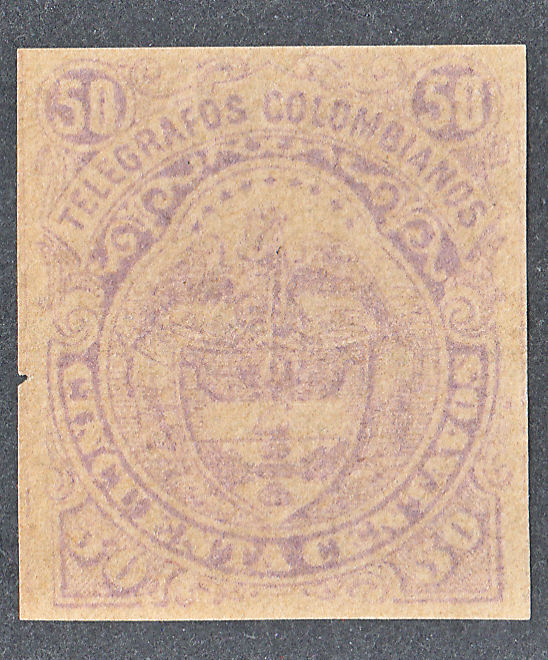 |
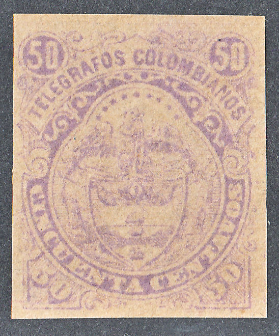 |
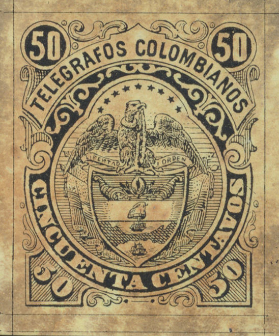
| Type II Proof showing some interesting flaws in addition to the 'Y' flaw. Note the two scratches half way up on the right and marks below the value in words. "CEN" of "CENTAVO" clearly joined, Image courtesy of Auktionshaus Christoph Gärtner. |
Type II in pale violet on buff (RH17a). Poor quality prints, showing 'Y' flaw. Fine lines visible. | |
The key difference is the Phrygian cap which changes from an unshaded base to a heavily shaded base.
The 'Y' flaw that is constant on all but one of my violet stamps, is only on one out of four of the blue.

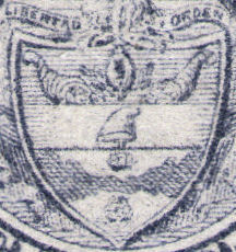
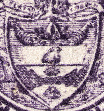
On the early example, the wording and cap are clear and the ships appear narrower than the cap.
On the later ones, the wording is hard to make out, the cap looks like a pregnant rabbit and the ships are wider.
The shading each side of the cap are slightly different.
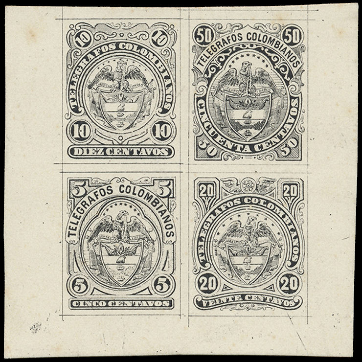
This combination proof is interesting as it presumably shows the state of these 4 values at the same point in time.
The 5c has no shading at each side of the cap and shows the scratch above the 'N' of 'CINCO', so Type II.
The 10c has a lack of shading between the values, so Type II again.
The 20c also lacks shading between the value tablets. Again Type II(c).
The 50c has a nice clear impression, complete with 'Y' flaw and 'rabbit', so Type II again.
If only it were dated! Image courtesy of Auktionshaus Christoph Gärtner.
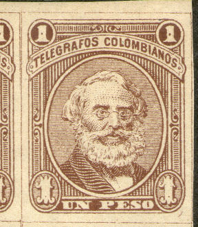
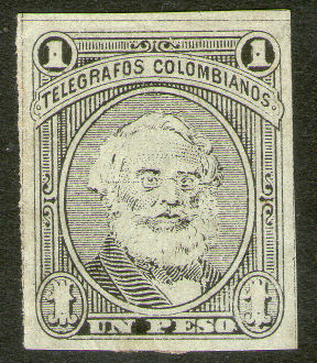
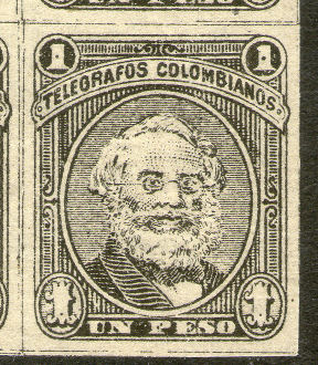
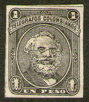
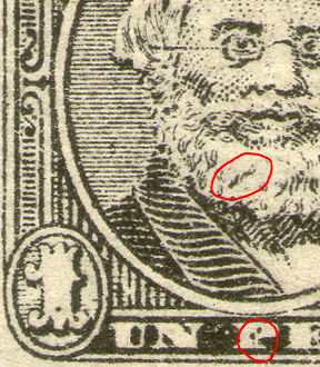
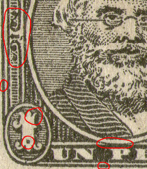
1p. Samuel Morse issue seems to have more different types than is at first apparent.
 |
 |
 |
 |
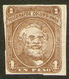 |
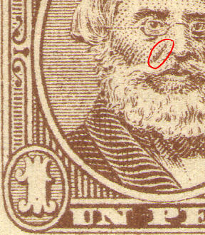
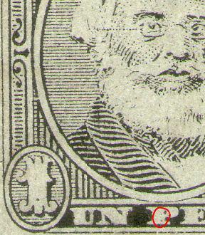
| Type I in brown (RH5). | Type I in black on greenish paper. (RH6) | Type II in black (RH13). | Type III in black (RH18). | Type III in brown (RH19). |
 |
 |
 |
 |
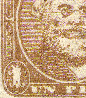 |
| Some of mine - Key areas of differences, though I am unsure of the sequence. | ||||
Again here, there are marked differences of quality between different Types. I have not yet seen Type II in brown.
It is interesting to compare the frame with the later (1901, very similar) One Peso type 24 below.
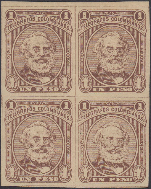
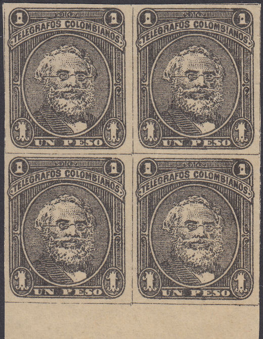
Blocks make it easier to distinguish plate flaws from random printing flaws.
 |
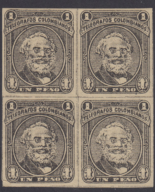 |
| Type I in brown (RH5). | Type II in black (RH13). |
 |
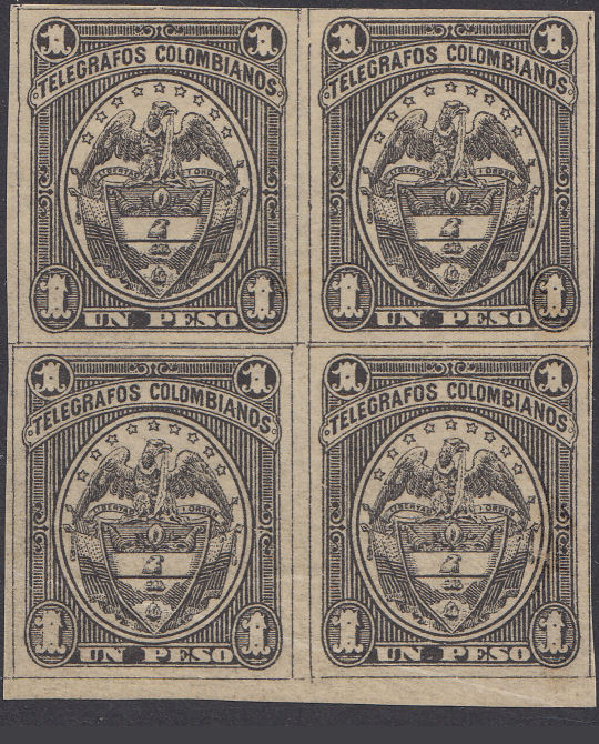 |
| Type III in black (RH18). | 1901 1 peso Type (RH35). |
Clearly there are (at least) 3 different Types of these.
I have labelled them as I, II and III, but it is not certain what order they were in.
Type III is different to the others. The 'guide lines' surrounding each stamp are different, the black spots in the '1's are bigger.
I notice that some postage stamps were later 'reprinted' (with different plates). Perhaps some of these are 'reprints'.
I would expect the frame on the 1901 stamps to be more similar to the last of the Samuel Morse stamps,
Also if 3 plates were produced, I would like to think that later ones were improvements.
It may be that Type III was an early attempt, followed by Type II and then Type I.
Or it might be that Type IIIs are 'reprints', with the 'arrow' being a 'secret mark'.
I have only seen (genuine-looking) used copies of RH6 in these stamps.
If there was little usage, and the stamps are not particularly rare, there seems little point in forging them.
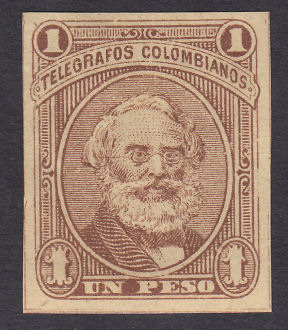
This would seem to be a Type I with the dots in the '1's virtually missing, the top-left is barely perceptible (RH5a).
| RH # | Type. | was | Description | Mint | Used |
|---|---|---|---|---|---|
| RH1 | 1 | H1 | 5c pale lilac to lilac (shades) Type I | 1.80 | 2.50 |
| RH1a | H1a | showing part of sheet watermark | 4.50 | 4.50 | |
| RH1b | H1b | on bluish paper | 2.50 | 3.00 | |
| RH2 | 2 | H2 | 10c greenish blue to bluish green (shades) Type I | 2.40 | 3.00 |
| RH2a | H2a | on bluish paper | 9.00 | 9.00 | |
| RH3 | 3 | H3 | 20c red on bluish paper Type Ia | 25.00 | 6.00 |
| RH3a | H3a | red to orange-red (shades) Type Ib | 4.50 | 4.50 | |
| RH4 | 4 | H4 | 50c ultramarine / bluish paper Type Ia | 4.00 | 3.60 |
| RH4a | H4a | blue / bluish paper Type Ia | 6.00 | 6.00 | |
| *RH4b | - | blue-green. Type Ia | 20.00 | 20.00 | |
| RH5 | 5 | H5 | 1p brown(shades) / buff (shades) Type I | 4.00 | 6.00 |
| *RH5a | - | without dots in '1's Type I | 30.00 | 30.00 | |
| RH6 | H12 | 1p black / pale green to greenish buff Type I | 6.00 | 9.00 |
* RH4b and RH5a have been added due to examples shown above.
| Note. See notes following stamps of 1886. |
1882? Wove paper. No watermark. Imperf.
| RH # | Type. | was | Description | Mint | Used |
|---|---|---|---|---|---|
| RH7 | 1 | H7 | 5c blue to greenish blue (shades) Type II | 3.00 | 1.80 |
| RH8 | 2 | H8 | 10c red Type I | 2.50 | 2.00 |
| RH8a | H8a | on bluish paper Type II | 12.00 | 9.00 | |
| RH9 | 3 | H9 | 20c light brown Type IIa | 3.00 | 3.00 |
| RH9a | H9a | on bluish paper Type IIb | 4.50 | 4.50 | |
| RH10 | 6 | H10 | 20c light-reddish brown (shades) Type IIc | 2.50 | 2.50 |
| RH10a | H10a | on bluish paper | 4.50 | 4.50 | |
| RH11 | 4 | - | 50c pale bright lilac (shades) Type Ia | 10.00 | 10.00 |
| RH12 | H16 | 50c pale bright lilac (shades) Type Ib | 4.50 | 5.50 | |
| RH13 | 5 | H6 | 1p black / buff (paper shades) Type II | 5.00 | 6.50 |
| Note. See Hiscocks' notes following stamps of 1886. |
CATALOGO ESPECIALIZADO L.T.
I have been shown pages from a specialised catalogue (in Spanish and also printed in 1982) called "CATALOGO ESPECIALIZADO L.T." that
is normally used by Colombian collectors. (can anyone supply more information? ISBN ?)
It is arranged rather differently to Hiscocks' book, making no reference to different dies except the clearly obvious ones, and using 'issue numbers' for the different series of stamps.
I attempted to merge/cross reference the two approaches but have now abandoned that due to inconsistencies.
Before 1886, 'CE' lists 5 series of stamps against 2 series listed by Hiscocks, but used stamps are not priced.
'CE' shows illustrations against each series, but is seemingly unaware of any die differences,
making the distinctions instead on the basis of colour and paper, without dated copies. Truly amazing!
'CE' lists a series for each year up to 1886.
My thanks to David Eraso Alvear of Davidcol on Delcampe for help with this.
'CE' starts (page 231) with some notes that I will attempt to translate:
| 1. Telegraph stamps are a true philatelic mode, since they were required for a form of social communication. |
| 2. In the early times of our philately postage and telegraph stamps were both collected. The second form has fallen into disuse because of the lack of them, and because they were discontinued. |
| 3. Our telegraph stamps were in effect for 25 years, from 1881 to 1906. |
| 4. Among these there are no known fakes. |
| 5. The major part of our series of telegraph stamps are imperforate. Perforated are scarce. |
| 6. They were printed in Bogotá by León F. Paredes and Demitrio Villaveces using monochrome lithography, on various papers, white or coloured, with a thickness characteristic of the time. |
| 7. The cancellations were usually in indelible black pen. Some however were also cancelled with rubber using black, purple or blue ink: a) Stamped "FRANCA" in pointed oval, black ink. b) Stamped monogrammed "TN" inside a double oval with blue ink (about the 1886 issue). c) Violet cancel with the word "cancelada" within double circle (about the 1896 issue). |
| 8. Viñetas (bullets). [seals] Early in the 20th. century we find that to seal telegrams 'bullets' were used without any face value. There are three types of them: Type I In red and chestnut imprint 'Lit. Nacional'. Type II In blue imprint 'Lit. Nacional'. Type III In brown tones imprint 'Lit. Colombia Bogotá '. |
I have detailed my reasons for rejecting the CE listing of these issues on my Colombia CE page.
Though I have given up on the much of the catalogue, there is one part that might have merit.
His list of the papers used in different years might be based on those used for dated postage stamps of the time. Here is his table:
| Issue | Year | Paper |
|---|---|---|
| 1 | 1881 | white |
| 2 | 1882 | blue and transparent |
| 3 | 1883 | white |
| 4 | 1884 | bluish |
| 5 | 1885 | white |
| 6 | 1886 | bluish |
I have to say that I find it suspicious that the paper colours alternate so regularly. I have my doubts.
Back to Hiscocks listing.
1886? (CE 6th. issue). Similar to above but from redrawn dies (see notes below). No watermark. Imperf.
| RH # | CE# | Type. | was | Description | Mint | Used |
|---|---|---|---|---|---|---|
| RH14 | 26 | 7 | H13 | 5c deep dull blue to dull blue Type III | 3.60 | 3.60 |
| RH15 | 27 | 8 | H14 | 10c red (slight shades) Type III | 3.00 | 3.60 |
| *RH15a | - | - | 1 or more dots missing from '0's | 10.00 | 10.00 | |
| *RH15b | 27a | - | perf.12 | - | - | |
| RH16 | 28 | 9 | H15 | 20c reddish brown (shades) Type III | 2.40 | 3.00 |
| RH16a | 28a | H15a | orange-brown | 3.00 | 3.60 | |
| RH16b | - | - | chocolate-brown | 6.00 | 4.00 | |
| RH17 | 29 | 10 | H11 | 50c reddish violet to pale violet (shades) Type II | 3.50 | 5.50 |
| *RH17a | - | - | 50c pale violet on buff Type II | 10.00 | 12.00 | |
| *RH18 | 30 | 5 | - | 1p black / straw Type III | 15.00 | 12.00 |
| *RH19 | - | - | 1888? 1p brown Type III | 25.00 | 25.00 |
* I have added RH15b to accommodate 'CE'#27a (27 is listed as red-orange). I have not seen one.
I have added RH18 as 'CE' lists a 1p value in the 6th. series distinguished only by the paper colour. I have some that could be this.
I have added RH17a and RH19 to accommodate types illustrated.
Hiscocks added the following 7 notes:
| Note 1. The 1881, 82 and 86 issues present problems in that there seem, from examination of my stocks, to be more dies than described in previous catalogues and, furthermore, when these are set in what appears to be a logical sequence they no longer match previously described colour shade sequences. Shades are however very variable and atypical examples could originally have been used so I have, pending further information, adopted the more logical die sequence. This is described in the following notes. Unfortunately very few Colombian Telegraph stamps were date cancelled — a cross, scribble, or number of unknown significance in pen or occasionally crayon was normal throughout the period. I would like to hear from anyone who can assign unambiguous dates to the various dies. |
| Note 2. The 5 cents are well behaved with the single new die being introduced in (reportedly) 1886. The 1881 is easily distinguishable by colour but the shades of the 1882 and 1886 issues overlap. There are however several die differences (see [types] 1 and 7) — the lower pair of '5's are larger and surrounded by a narrower white ring in Type II. The easiest difference to see, without copies of both for comparison, is in the white triangle above the lower left '5' — in Type I there is a heavy line down its right (inner)side and in Type II down its left (outer) side. |
| Note 3. The 10 cents of 1882 and 1886 are again of the same colour but the different dies are clearly illustrated in 2 and 8. |
| Note 4. The 20 cents seems to show three types (3, 6, 9). Type III is clearly distinguished by the wheel at centre top being directed out of the paper over your left shoulder with the wings issuing from its hub. Type I was used in 1881 (red) and 1882 (brown) while Type II (also brown) was presumably issued at some unknown date between 1882 and 1886. Type II differs from Type I in that the area between the "viente centavos" and the base of the medallion is un-shaded in Type II but shaded in Type I. |
| Note 5. Types I and II of the 50 cents differ in that in Type I the '50's in the two lower corners are against a shaded background while in Type II the background is white. Those of 1881 are clearly distinguishable by colour and are of Type I. The lilacs of Type I vary greatly in shade but are often bright and clear while those of Type II are usually paler and very indistinctly printed. Previous catalogues suggest that the brighter colour should be attributed to 1886 but this would mean the introduction of Type II in 1882 and a return to Type I in 1886. I have assumed Type I was used in 1881 and 1882 and Type II introduced in 1886. |
| Note 6. While all the preceding stamps have been described as having no watermark some are printed on paper bearing a sheet watermark 'A PIRIE & SONS' in partially double block letters, 160 x 18mm overall, down the sheet and thus affecting seven or fourteen stamps out of the sheet of 100. Observed in sheets of No. 1, No. 11 and No. 15(a). [Now RH1a, RH11?, RH16a] |
| Note 7. Illustrations 1 to 10 are at actual size (as compared with the usual reduction of 33%) to aid comparison. |
My Note: The watermark 'A PIRIE & SONS' relates to Alexander Pirie and Sons, Stoneywood Mill,
on the river Don near Aberdeen in Scotland. I am not aware of them producing blued paper.
It is also reported on RH8. These would be worth a premium.
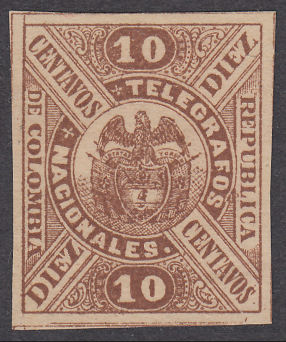
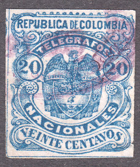
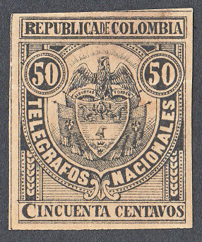
1888 (CE 7th. issue). Wove paper. No watermark. Imperf.
 |
 |
 |
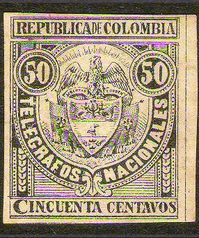 |
| Type 11 | Type 12 | Type 13 - RH22 | Type 13 - RH23 |
| RH # | CE# | Type. | was | 1888 Description | Mint | Used |
|---|---|---|---|---|---|---|
| RH20 | 31 | 11 | H17 | 10c brown / buff | 20.00 | 6.00 |
| RH21 | 32 | 12 | H18 | 20c dull blue / pinkish white | 30.00 | 6.00 |
| RH21a | - | H18a | blue / pinkish white | 30.00 | 6.00 | |
| RH21b | - | H18b | blue / yellowish white | 35.00 | 9.00 | |
| RH22 | 33 | 13 | H19 | 50c black / buff to yellow-buff | 6.00 | 4.50 |
| RH23 | 33a | 13 | H20 | 50c black / pale yellowish grey | 9.00 | 5.00 |
Hiscocks added the following note:
| Note. The 50c was printed in violet in 1902 (No. 40). |
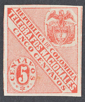
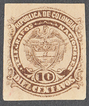
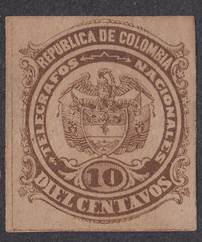
1891 (CE 8th. issue). Wove paper. No watermark. Imperf.
 |
 |
 |
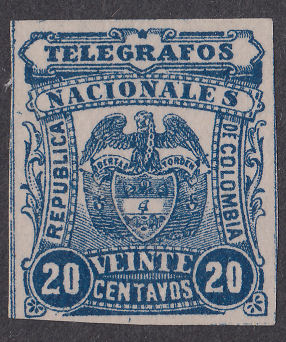 |
| Type 14 | Type 15 | Type 16 (head clear of frame) | Type 17 RH27 |
Hiscocks added the following note:
| Note. Types 15 and 16 differ in the size of the centre shield. |
My note: It is easier to see the differences in the distance between the eagles head and the frame above.
The 'CE' 9th. issue (numbered 37 to 39) was for the Department of Panama and so Hiscocks lists them as H1, H2 and H3 under Panama
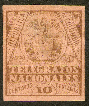
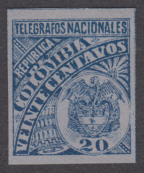
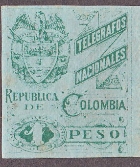
1896 (CE 10th. issue). Wove paper. No watermark. Imperf.
 |
 |
 |
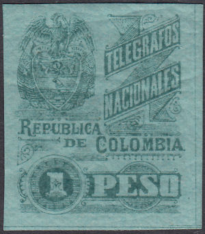 |
| Type 18 | Type 19 | Type 20 | Type 21 |
For Type 18 perforated see H52.
| RH # | CE# | Type. | was | 1896 Description | Mint | Used |
|---|---|---|---|---|---|---|
| RH28 | *40 | 18 | H25 | 10c yellow-brown (shades) / buff to salmon | 3.00 | 1.80 |
| RH29 | 41 | 19 | H26 | 20c deep greenish blue (shades) / pale blue | 4.00 | 1.80 |
| RH29a | 41b | H26a | deep greenish blue (shades) / bluish grey | 6.00 | 3.00 | |
| RH29b | - | H26b | violet blue / bluish grey | 12.00 | 4.00 | |
| RH29c | 41a | H26c | ultramarine / pinkish blue | 12.00 | 8.00 | |
| RH30 | 43 | 20 | H27 | 1p green to bluish green / pale green to bluish green | 12.00 | 6.00 |
| RH31 | 42 | 21 | H28 | 1p green (shades) / pale green (shades) | 15.00 | 10.00 |
* 'CE' list 40a as a perf.12 variety. Hiscocks listed this as H52 (RH54) below.
Some Type-19 shades I have, showing the backs. I will look out for more.
 |
|||
 |
|||
| RH29 | RH29a | RH29b | RH29c |
1901 (CE 11th. issue). Wove paper. No watermark. Imperf.
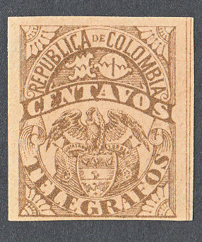 |
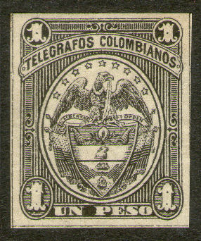 |
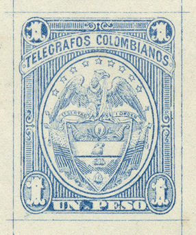 |
| Type 22 on buff - RH32 (see also RH45) | Type 24 - RH35 | Type 24 - Proof in blue courtesy of Auktionshaus Christoph Gärtner. |
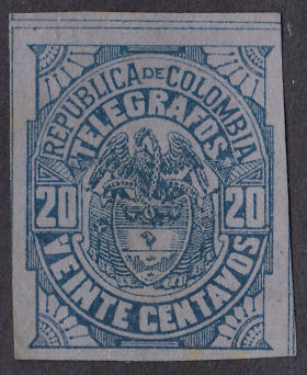 |
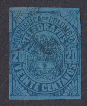 |
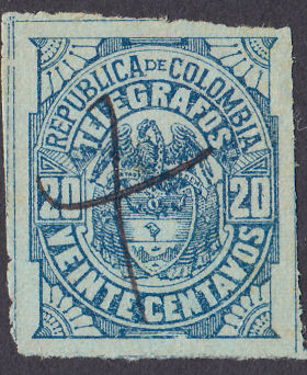 |
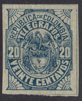 |
| Type 23 - RH33 | Type 23 - RH33a | Type 23 - RH34 shades | |
| RH # | CE# | Type. | was | 1901 Description | Mint | Used |
|---|---|---|---|---|---|---|
| RH32 | 44 | 22 | H29 | 10c bistre-brown (shades) / buff (shades) | 4.00 | 3.00 |
| RH33 | 45 | 23 | H30 | 20c blue / dull violet blue (shades) | 4.50 | 1.80 |
| *RH33a | - | - | blue / blue | 12.50 | 5.00 | |
| RH33b | *45g | - | blue / pink | - | - | |
| RH34 | 45a | 23 | H31 | 20c greenish blue (shades) / pale bluish green | 4.50 | 1.80 |
| RH35 | 46 | 24 | H32 | 1p black / pale yellow | 4.00 | 4.00 |
* I have added RH33a due to the single example shown that I have seen. It is distinctly different to the others.
*In 'CE' the 1901 20c stamps are all described as blue, but on different shades of paper. I have tried to match them up.
I have added RH33b to accommodate 'CE45g'. CE also lists this perf.12 as 'CE45e' and tête-bêche pair as 'CE45f', all with minimal prices.
The Yvert & Tellier 2005 catalogue does not list any of these. Until I see one, I will treat them as suspect.
For Type 22 see also RH45.
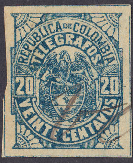
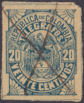
1902 (CE 12th. issue). Wove paper. No watermark. Imperf.
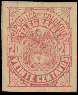 |
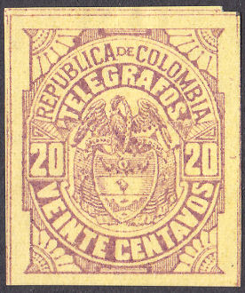 |
| Type 23 - RH36 | Type 23 - RH37 |
 |
 |
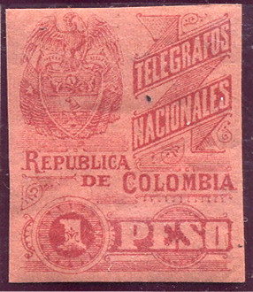 |
| Type 23 - RH39 | Type 23 - RH39a | Type 21 - RH40 - from RL |
| RH # | CE# | Type. | was | 1902 Description | Mint | Used |
|---|---|---|---|---|---|---|
| RH36 | 47 | 23 | H33 | 20c red / yellow | 15.00 | 15.00 |
| RH37 | 48 | 23 | H34 | 20c violet-brown / yellow | 50.00 | 50.00 |
| RH38 | *49 | 23 | H35 | 20c green / yellow | 60.00 | 60.00 |
| RH39 | *49 | 23 | H36 | 20c dull blue / pale greenish yellow | 8.00 | 8.00 |
| RH39a | *49 | H36a | blue / pale yellow | 10.00 | 9.00 | |
| RH40 | 50 | 21 | H37 | 1p rose / pink | 40.00 | 40.00 |
* In 'CE' these are all lumped together as 'azul verdoso' - greenish blue.
47, 48 and 49 are priced equally with 50 priced nearly 4 times as much.
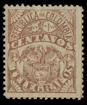
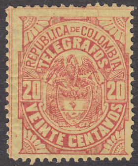
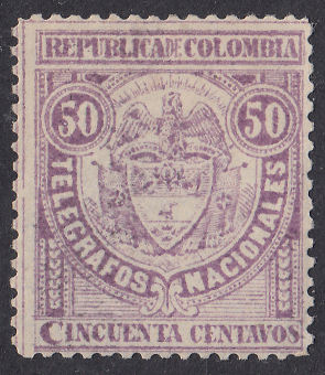
1902 (CE 13th. issue). Wove paper. No watermark. Perf. 13½
 |
 |
 |
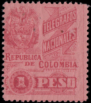 |
| Type 22 RH41 | Type 23 RH42 | Type 13 RH43 | Type 21 RH44 |
| RH # | CE# | Type. | was | 1902 Description | Mint | Used |
|---|---|---|---|---|---|---|
| RH41 | 51 | 22 | H38 | 10c brown / olive-green | 12.00 | 12.00 |
| RH42 | 52 | 23 | H39 | 20c red / yellow | 10.00 | 10.00 |
| RH43 | 53 | 13 | H40 | 50c violet / white | 12.00 | 12.00 |
| RH44 | 54 | 21 | H41 | 1p rose pink | 15.00 | 14.00 |
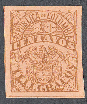
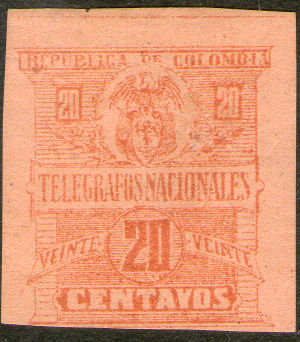
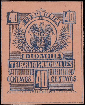
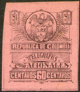
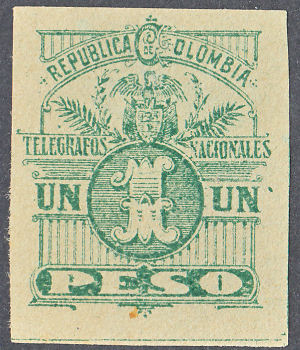
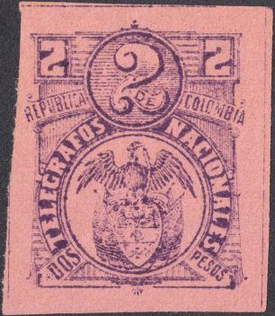
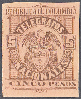
1904 (CE 14th. issue). Wove paper. No watermark. Imperf.
 |
 |
 |
 |
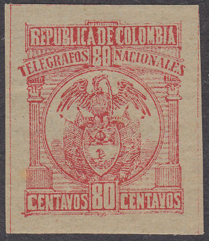 |
| Type 22 on cinnamon (RH45, see also RH32) | Type 25 RH46 | Type 26 RH47 | Type 27 RH48 | Type 28 RH49 |
 |
 |
 |
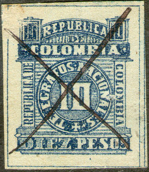 |
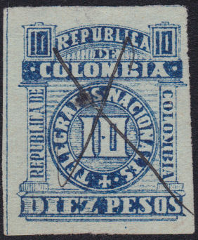 |
| Type 29 RH50 | Type 30 RH51 | Type 31 RH52 | Type 32 RH53 | Type 32 RH53a |
| RH # | CE# | Type. | was | 1904 Description | Mint | Used |
|---|---|---|---|---|---|---|
| RH45 | 55 | 22 | H42 | 10c yellow-brown (shades) / cinnamon | 2.40 | 1.80 |
| RH46 | 56 | 25 | H43 | 20c red / yellow-buff | 15.00 | 15.00 |
| RH47 | 57 | 26 | H44 | 40c blue / yellow-buff | 6.00 | 6.00 |
| RH48 | 58 | 27 | H45 | 60c brown / pink | 6.00 | 6.00 |
| RH49 | 59 | 28 | H46 | 80c red / pale greenish blue | 4.50 | 4.50 |
| RH50 | 60 | 29 | H47 | 1p green / pale green | 12.00 | 12.00 |
| RH51 | 61 | 30 | H48 | 2p violet / pink | 3.00 | 3.00 |
| RH52 | 62 | 31 | H49 | 5p brown (shades) / yellow-buff | 4.00 | 3.00 |
| RH53 | - | 32 | H50 | 10p blue / pale bluish yellow | 15.00 | 4.50 |
| RH53a | 63 | H50a | blue / pale blue | 18.00 | 6.00 |
Hiscocks added the following note:
| Note. The separation of [RH32] and [RH45] by colour is easy at the extremes — both the design and paper colours of [RH45] are much more 'golden' — but I also have copies of design colour of [RH32] on paper more appropriate to [RH45]. Pending further information I have not allocated these. There appears to be no change of die to help us. |
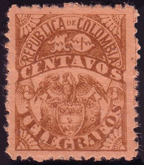
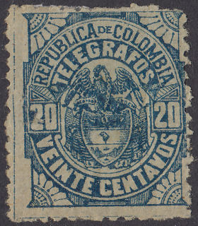
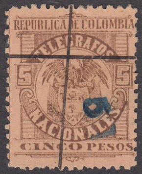
1905(?) Wove paper. No watermark. Perforated variously from 10½ to about 12.
Nominally about Perf. 11¾ unless otherwise stated.
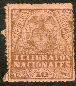 |
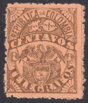 |
 |
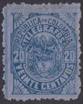 |
| Type 18 RH54a - pin-perf 15½ | Type #22 - RH56 (Perf. 11¾) | Type #22 - RH56a (Perf. 11¼) from RL | Type #23 - RH57 (Perf. 11¾) |
 |
 |
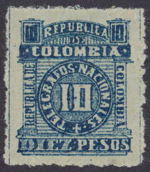 |
| Type #23 - RH58 (Perf. 11¾) | Type #31 - RH61 (Perf. 12) | Type #32 - RH62 (Perf. 11¾) |
The 10c type 18 is pin-perf measuring about perf. 15½ (perhaps privately done ?)
Hiscocks added the following 2 notes:
| Note 1. [RH55 and RH58] seem not to have been catalogued previously. |
| Note 2. The perforations of [RH54 to RH62] are usually very rough. |
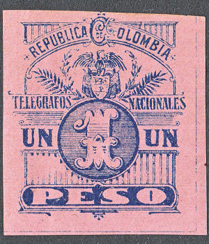
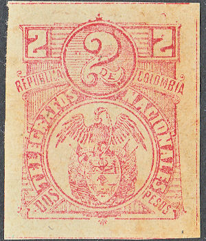
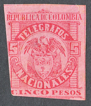
1906 (CE 16th. issue). Wove paper. No watermark. Imperf.
 |
 |
 |
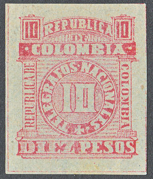 |
| #29 RH63 | #30 RH64 | #31 RH65 | #32 RH66 |
| RH # | CE# | Type. | was | 1906 Description | Mint | Used |
|---|---|---|---|---|---|---|
| RH63 | 69 | 29 | H60 | 1p blue / pink | 50.00 | 50.00 |
| RH64 | 70 | 30 | H61 | 2p carmine / pale green | 50.00 | 50.00 |
| RH65 | 71 | 31 | H62 | 5p red / pink | 70.00 | 70.00 |
| RH66 | 72 | 32 | H63 | 10p carmine / pale bluish green | 60.00 | 60.00 |
Obligatory Tax stamps.
As with many other countries, Colombia occasionally used obligatory tax stamps to raise money for various projects.
The Scott catalogue has been helpful in identifying such stamps, but it is not always clear whether
they were for postal purposes only or included telegrams.
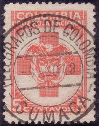
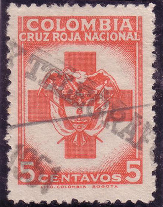
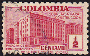
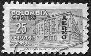
According to Scott, these were issued September 1947 Perf. 12½ and in 1948 Perf. 10½ to raise money for the Red Cross.
These two appear to have telegraphic cancels - from RL.
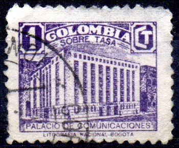
Whilst many of the obligatory tax stamps may have seen telegraphic usage, here are some that are more likely than most:
Cancels.
These were used on the early issues:
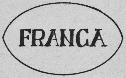
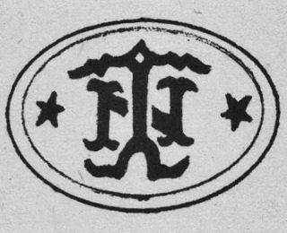
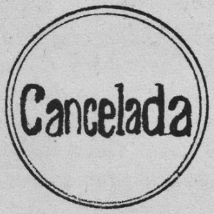
From 'CE'.
Examples seen:
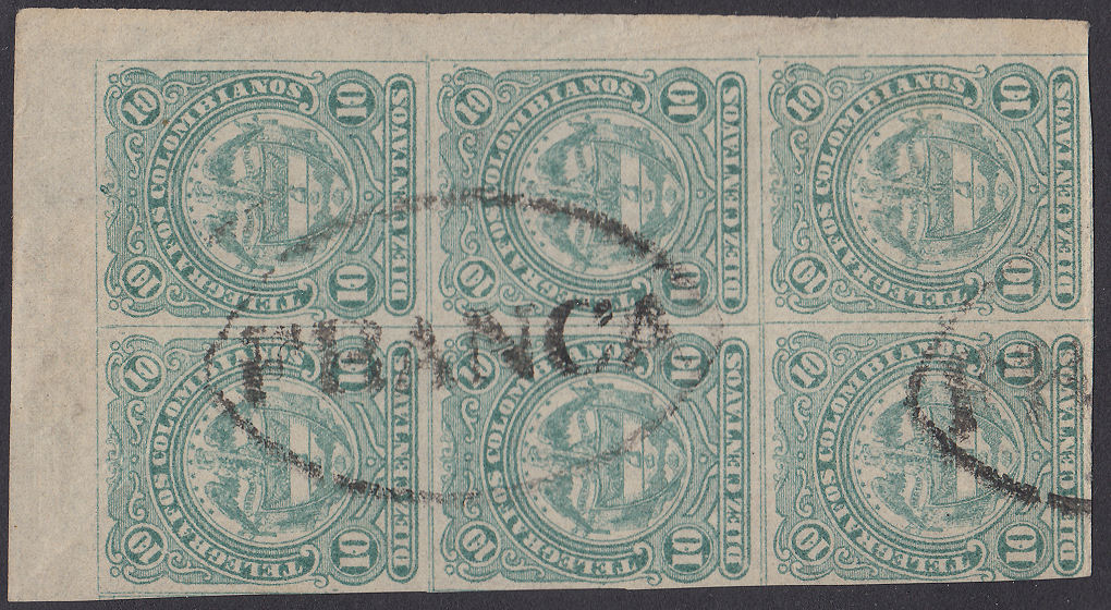
FRANCA
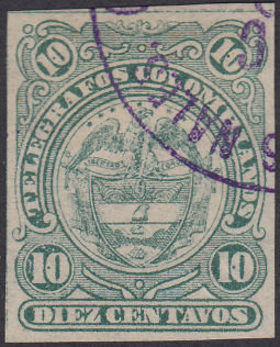
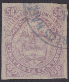
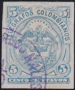
With the first one I thought this was a 'Telegrafos Nales' cancel. The other two make it clear that these are 'Correos Nales'.
I suppose it could be 'Telegrafos y Correos Nales', but the word order is usually 'Correos y Telegrafos'.
If these were used for postage, then examples on cover could provide valuable dating information.
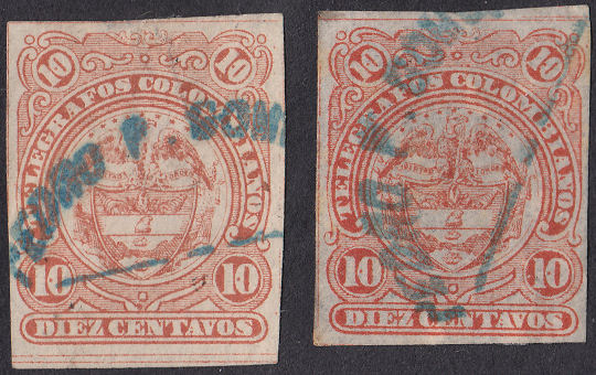
Pedro P. Gomez ? cancel (note the different sizes of these two stamps that were scanned together !).
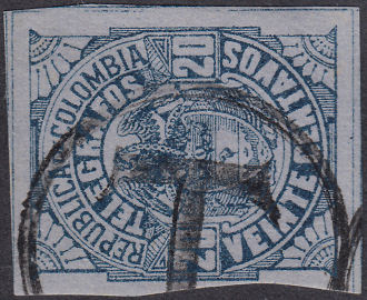
T ? cancel. Usually this kind of cancel stands for 'Taxe' meaning postage due, which was normally applied to envelopes but sometimes ended up on stamps.
However, Puerto Rico at least did deliberately, though erroneously, use them as cancels on telegraphs since they had not been told their purpose.
It should imply that this was used as a postage stamp. Perhaps it was not accepted as a postage stamp and thus resulted in postage being due.
However there are indications that quite a few were accepted postally.
Acknowledgment of Receipt stamps ?
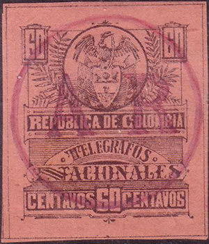
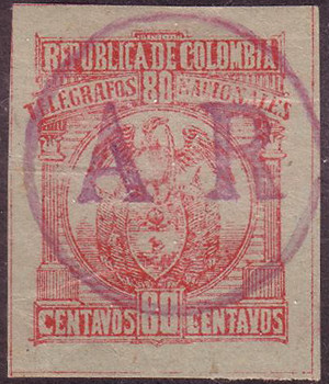
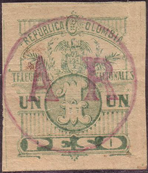
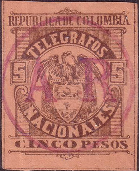
From 1893 to 1917 special stamps were issued with 'AR' as part of the design.
Only twice was an overprint of AR on normal postage stamps used, in 1903 and in 1904. They were not in circles.
The Scott catalogue has a note saying 'The handstamp "AR" in circle is believed to be a postmark.'
They do not state what stamps it is on, but their note appears just before the overprinted postage stamp of 1903.
Presumably there was a shortage of AR stamps around this time. Normal AR stamps were of 4c, 5c or 10c face values.
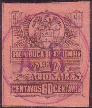
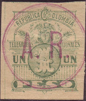
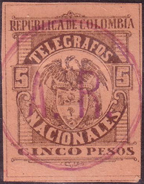
Rolf Lamprecht has provided scans of this series below with two types of AR on them:
These are from the same time period, but
If they are indeed cancels, then why these? Were they simply the first things that came to hand ?
They look like hand-stamps rather than cancels because they are carefully and centrally placed,
However, what purpose would they serve? The face values used are far higher than the normal AR stamps.
I suspect they were intended to create a saleable commodity.
There are probably other values from this set with AR on them, RH51 at least.
I am not sure why there were two types, perhaps one was used in 1903 and the other in 1904.
This pdf gives an idea of the normal use of 'AR'.
Telegraph Coupons
I'm not really sure of the purpose of these. The writing on the backs (all in shades of grey-black) translates as (approximately):
"This card can be exchanged free of charge for stamps of the Republic in the event of a claim for loss or delay in delivery of the telegram which this fee represents"
Translation courtesy of Bill from swheatlady on ebay, who adds: Sort of an early version of "If we don't deliver what we promised, you'll get a credit voucher, not a refund."
These would therefore seem to be analogous to the Telephone Coupons used in North America.
The backs of these have the instructions for use and the legal agreement.
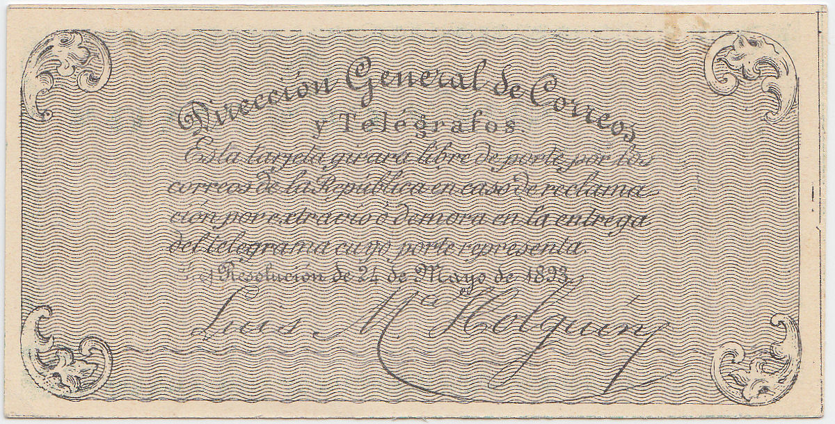
Esta tarjeta girará libré de porte por la correos de la República en caso de reclamación por extravio ó demora en la entrega del telegrama cuyo porte representa.
I'm not exactly sure what this translates to in English, online translation Google) says
"This card will be issued free of charge by the post office of the Republic in case of claim for loss or delay in the delivery of the telegram whose postage represents. "
Which doesn't make a lot of sense to me. Can anyone give a better translation ?
1893, Type 1 with 'rays' above the eagle. Imperf. Printed by Samper Matiz, Bogotá.
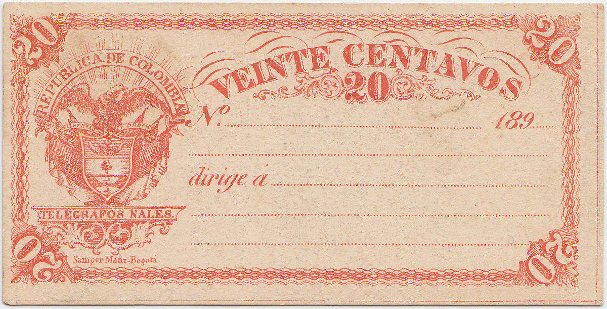
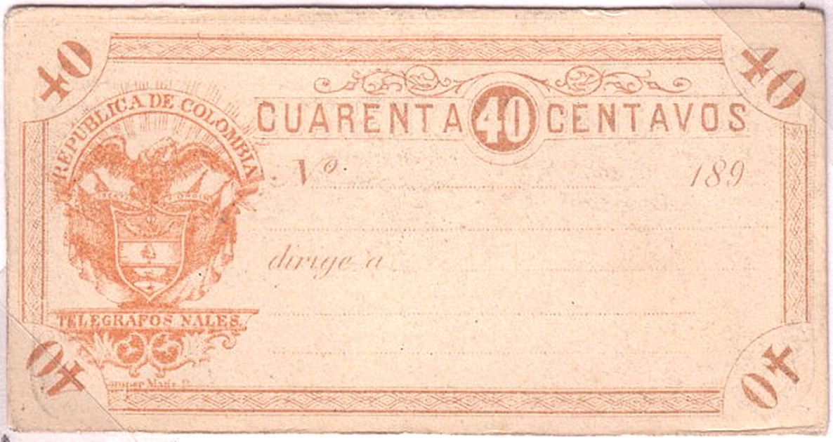
40c - from RL
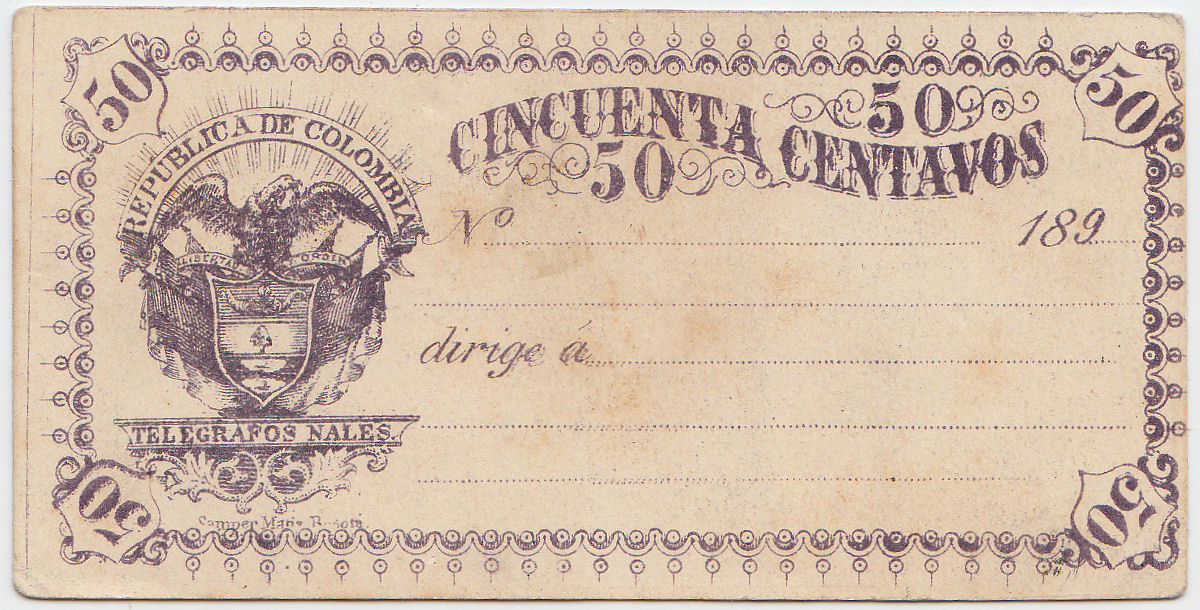
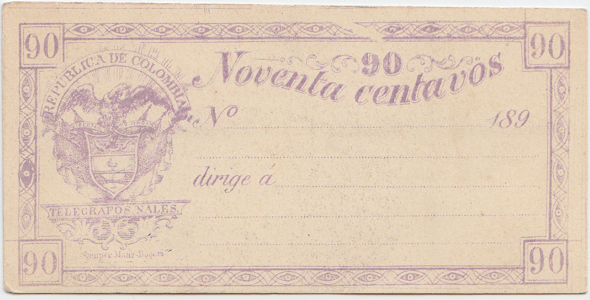
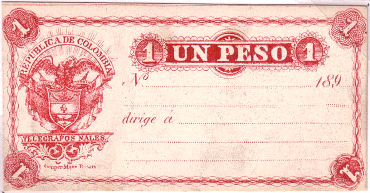
The 1 peso - from RL
According to swheatlady on eBay, these are all documented by Higgins & Gage.
| RH # | Type. | Description | Mint | Used |
|---|---|---|---|---|
| RC1 | 1 | 20c vermilion | - | - |
| RC2 | 1 | 40c orange-brown | - | - |
| RC3 | 1 | 50c violet | - | - |
| RC4 | 1 | 90c mauve | - | - |
| RC5 | 1 | 1p carmine | - | - |
There will almost certainly be more to add.
1896? Type 2 without the 'rays' above the eagle. Imperf. or Perf. 13¼-13½. Printed by Samper Matiz, Bogotá.
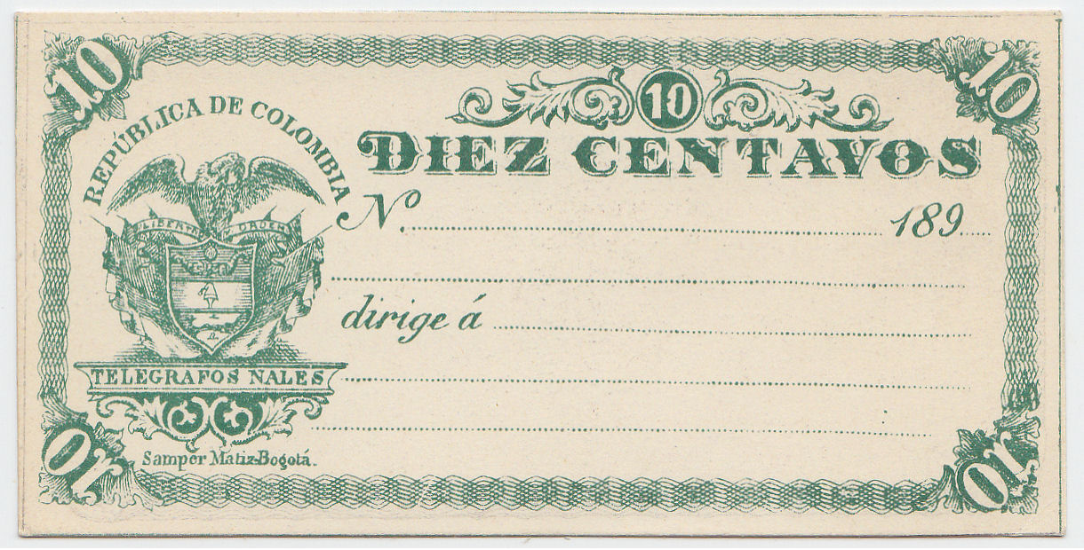
At first I thought that this 10c had been trimmed, but RL has another just like it.
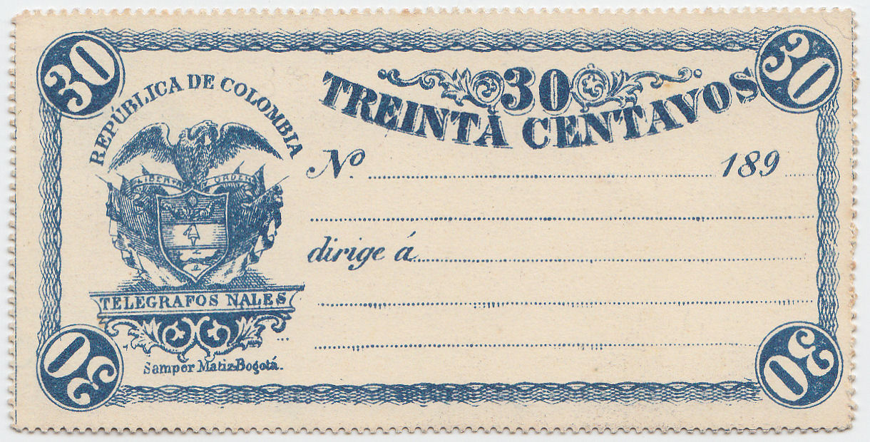
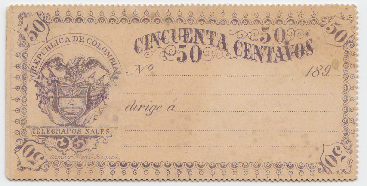
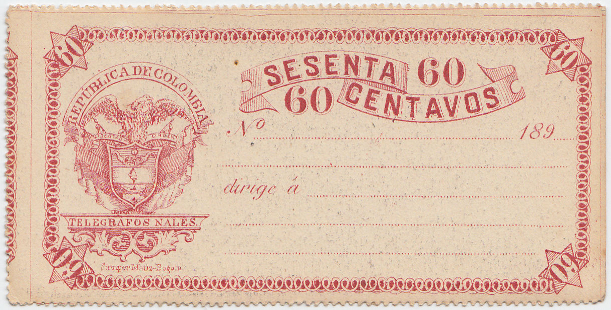
| RH # | Type. | Description | Mint | Used |
|---|---|---|---|---|
| RC5 | 2 | 10c green | - | - |
| RC6 | 2 | 30c blue | - | - |
| RC7 | 2 | 50c violet | - | - |
| RC8 | 2 | 60c red | - | - |
There will almost certainly be more to add.
Via Galveston
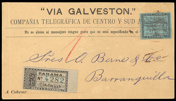
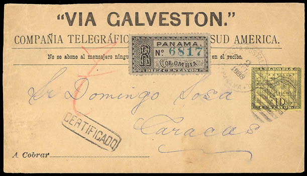
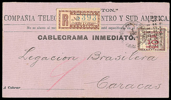
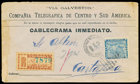
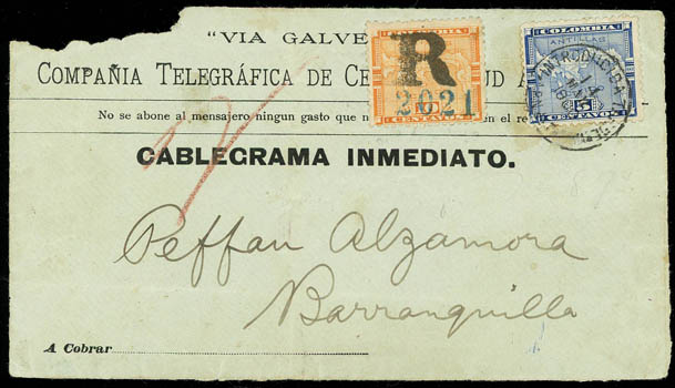
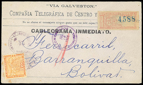
A range of different envelopes were used by the "Compañia Telegráfica de Centro y Sud America" to forward telegrams received via Galveston, Texas.
They each had a 10c registration label of some sort plus 5c(internal) or 10c postage. The later ones were also marked "CABLEGRAMA INMEDIATO."
Most had a Panama (then part of Colombia) duplex cancel
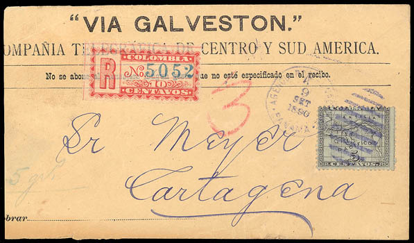
Panama to Cartagena, Colombia with 5c stamp and dated 9 September 1890.
Courtesy of Schuyler Rumsey Philatelic Auctions. (click on image for listing).
CABLEGRAMAs
Seals
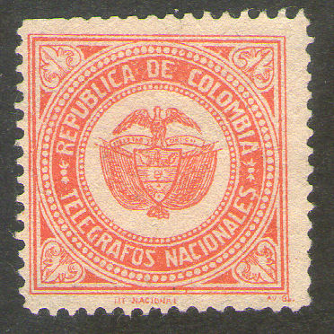 |
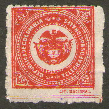 |
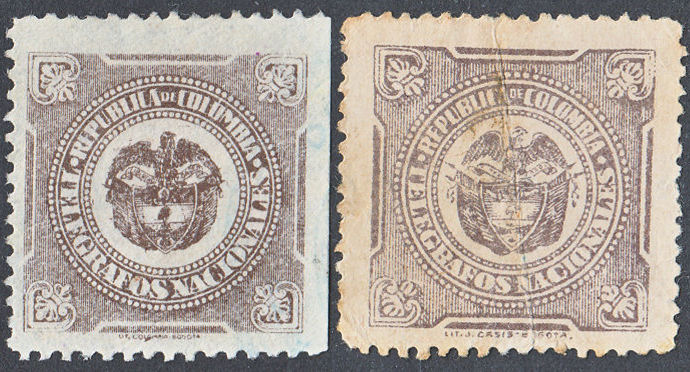 |
| Imprint 'LIT. NATIONAL' and 'AV-Gb.' on the left one and simply 'LIT. NATIONAL' on the right. | imprints of 'LIT. COLOMBIA-BOGOTA' and 'LIT. J,CASSIS, BOGOTA'. | |

The second type comes in a variety of colours.
Steve Hiscocks made a start on cataloguing seals of the world in a book he published in 2007.
It was his hope to update it later, but unfortunately that was not to be.
His original book can be viewed at
Telegraph Seals: A World Catalogue. There are links from the pages to my updates.
Alternatively you can view the latest page for Colombia.
If anyone can provide scans to help with this, I am happy to give appropriate credit.
Comments, criticisms, information or suggestions are always welcome.

Please include the word 'Telegraphs' in the subject.
Last updated 3rd. July 2023
©Copyright Steve Panting 2012/13/14/15/16/17/18/19/20/21/22/23 except where stated.
Permission is hereby granted to copy material for which the copyright is owned by myself, on condition that any data is not altered and this website is given credit.
